- Airtable Community
- Discussions
- Ask A Question
- Other questions
- How to add represent multiple columns in a graph
- Subscribe to RSS Feed
- Mark Topic as New
- Mark Topic as Read
- Float this Topic for Current User
- Bookmark
- Subscribe
- Mute
- Printer Friendly Page
How to add represent multiple columns in a graph
- Mark as New
- Bookmark
- Subscribe
- Subscribe to RSS Feed
- Permalink
- Report Inappropriate Content
May 05, 2020 03:49 AM
Hello everyone,
I am trying Airtable to prepare some reports. For this purpose, I need to create a graphs to represent month on month change in planned numbers as compared to actual numbers.
For Exmaple, I have 5 projects, say - P1, P2, P3, P4 and P5. I have planned some hours on each project for May and June. I am also tracking my actual work hours on these. We can use this data for create a graph:
|Project|Month|Planned Hours|Actual Hours|
|P1 |May|15|18|
|P2|May|18|12|
|P3|May|25|30|
|P4|May|20|23|
|P5|May|22|16|
|P1|Jun|20|10|
|P2|Jun|25|27|
|P3|Jun|15|20|
|P4|Jun|23|15|
|P5|Jun|30|40|- Mark as New
- Bookmark
- Subscribe
- Subscribe to RSS Feed
- Permalink
- Report Inappropriate Content
May 05, 2020 10:47 AM
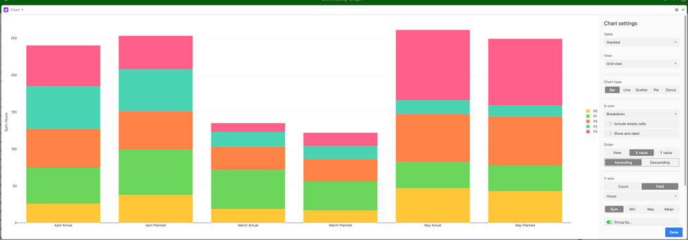
Hey! This can be achieved very easily with the chart block - You’ll need to reconfigure how you think about your data a little though. I’ve included the base here for you.
Hope that helps!
- Mark as New
- Bookmark
- Subscribe
- Subscribe to RSS Feed
- Permalink
- Report Inappropriate Content
May 06, 2020 02:35 AM
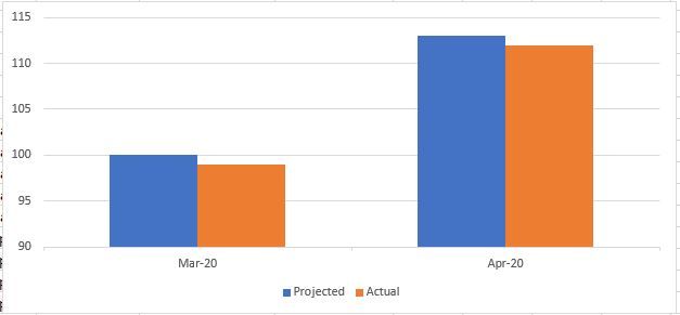
This is somewhat close to what I needed. However, still this is not the exactly I wanted. Here is an example of ideal representation:
This show planned and actual of each month together.
I can create the graph as shown above. But, I also want to keep Actual and Planned column separate as I would be using these columns in other tables.
- Mark as New
- Bookmark
- Subscribe
- Subscribe to RSS Feed
- Permalink
- Report Inappropriate Content
May 06, 2020 04:21 AM
Ah gotcha! Yeah - That’s definitely possible - Just break them out by Actual and Projected in the graph settings


