- Airtable Community
- Discussions
- Ask A Question
- Other questions
- Status Columns display options
- Subscribe to RSS Feed
- Mark Topic as New
- Mark Topic as Read
- Float this Topic for Current User
- Bookmark
- Subscribe
- Mute
- Printer Friendly Page
Status Columns display options
- Mark as New
- Bookmark
- Subscribe
- Subscribe to RSS Feed
- Permalink
- Report Inappropriate Content
Jul 07, 2020 12:47 AM
Hi team, long time Monday.com user, trying to move my company across to Airtable. One thing my team is pushing back on is the “look” of the status columns.
Here is an image of what my guys are used to seeing on Monday:
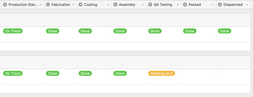
And then here is the corresponding data in Airtable
Is there a data type that looks similar to the Monday version? Alternatively, any browser tricks etc that I could use to make the data blocks bigger/more colourful? Custom CSS tool etc
Thanks
Andrew
- Mark as New
- Bookmark
- Subscribe
- Subscribe to RSS Feed
- Permalink
- Report Inappropriate Content
Jul 07, 2020 07:30 AM
Hi Andrew,
Unfortunately, Airtable has zero customizability when it comes to the look & feel of the different views. This is one of the bigger drawbacks of using Airtable. You can’t even color cells in Airtable. Your screenshot above is the most that you can do with colors in grid view (outside of adding a single vertical color stripe to the left of each row).
There are 5 views in Airtable (grid, calendar, kanban, gallery, form), and what you see is what you get. You can’t change anything at all about their look & feel. You can’t even change something as simple as font size or text wrapping, which is why text gets cut off throughout the system in calendars, kanban views, gallery views, linked record fields, column headers, etc.
You may be able to get very limited customizability from a few of the Airtable blocks, but most of those are dashboard-type summaries that you wouldn’t want to be doing data entry from.
Sorry for the bad news. Think of Airtable as a simple spreadsheet program combined with a simple database program. It’s the combination of these 2 simple tools that make people fall in love with Airtable. People love that they can be up & running with Airtable in a matter of minutes, and they love that they can interact with their data in many different ways — but it lacks the deeper customizability that you’re looking for.
This isn’t exactly what you’re looking for, but Stacker has developed different front-ends to Airtable with more security features than Airtable. And Pory.io has done something similar (although Pory is simply for viewing your data, not editing your data). Although even with those tools, you still won’t get much flexibility in user interface.
Airtable does have an API, so you can use external apps to interact with your underlying Airtable data. And Airtable is supported by Integromat and Zapier, so you can automate Airtable talking to other apps — such as Monday.com.
So, if you wanted to use Airtable for your backend data but use Monday.com as your frontend interface, your best bet would be to automate something with Integromat — which can send data back & forth between the two platforms.
- Mark as New
- Bookmark
- Subscribe
- Subscribe to RSS Feed
- Permalink
- Report Inappropriate Content
Jul 07, 2020 09:22 AM
Hi Andrew, and welcome to the community!
Just a wild idea (and a long-shot) - consider trying to get close to this requirement with the new Vega-Lite Block (it’s in beta but you can get access with one click). It does require a little JSON script declaration (which is a kind way of saying it’s programming, but not that hard). :winking_face:
This example in Vega might get you started - it’s basically a heatmap with labels, right? There’s also the idea of an iso-type grid which might be useful for these dashboard-like visuals.
I do a fair bit of production-level data science consulting and it’s rare to find a visualization that Vega-Lite cannot handle.
- Mark as New
- Bookmark
- Subscribe
- Subscribe to RSS Feed
- Permalink
- Report Inappropriate Content
Jul 08, 2020 11:32 AM
@Bill.French, I love how you find a solution for almost anything in the Vega-Lite Block. It feels a little bit like “If all you have is a hammer, everything looks like a nail”, but it sounds like this is a real game changing hammer for Airtable if you know how swing it!
- Mark as New
- Bookmark
- Subscribe
- Subscribe to RSS Feed
- Permalink
- Report Inappropriate Content
Jul 08, 2020 01:12 PM
More precisely, if you have two screwdrivers and you need to hammer a nail, use the one that looks most like a hammer.
Charting in Airtable (right now) is a binary choice; either you’re happy with Chart Block, or you’re not and that leaves only Vega-Lite as the final out. So, in that sense, this is an easy decision and recommendation.
- Mark as New
- Bookmark
- Subscribe
- Subscribe to RSS Feed
- Permalink
- Report Inappropriate Content
Jul 08, 2020 01:28 PM
LOL, that is both a hilarious and an apropos analogy.


