Help

Improvements to expand and edit records

cancel
Showing results for 
Search instead for 
Did you mean: 
Jordan_Scott1
Airtable Alumni (Retired)

Hi all!

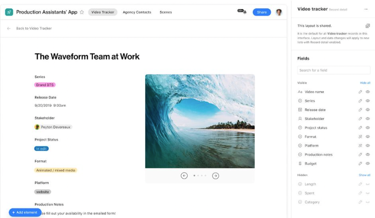
We are excited to share that as of today, we’ve made it easier for you - and your team - to expand and edit records in Airtable.

  • We’re making it easier to edit records while in the expanded view. We’ve increased the area around fields (including moving the field label to the left to save vertical space) in the expanded view for each record and made improvements to the activity pane.
  • We’ve also made it clear when a field is editable in expanded view so your collaborators can easily make edits.
  • We’ve added a persistent action bar so that common actions like changing between records, turning on comments, and the record title all stay in the same place, even as you scroll through the details.

You can expect these updates to be reflected in your bases in the next two days. We’d love to hear feedback from you about this change, so please leave your feedback below!

115 Comments
Rebecca_Elam
9 - Sun
9 - Sun

im so confused. im seeing changes but they are not what you’re saying they are. are we being tested on?

kuovonne
18 - Pluto
18 - Pluto

Thanks for the notification.

I like the fact that field names are no longer in upper case and reflect the same case that they are configured with. I also like how they wrap.

I miss seeing the icons for the field types.

I do not like the instructions to start tying in fields that do not have any text. In some cases, fields need to be editable but users should not be typing in them, such as when a field should be set by a script or set by a person with a different job. I feel that there could have been a better way to communicate that the fields are editable.

Rebecca_Elam
9 - Sun
9 - Sun

all else i will say, i have 4 airtable users other than me in THIS PARTICULAR project and I had to answer 900 questions and complaints about this change. people freaking out thinking they broke things. even i did a hard refresh when i first saw it.
When asked if they thought it might be easier once they got used to it they said no they prefer the old interface and feel that the change sets them back in their airtable comfort and training.

Grow_With_Jen
7 - App Architect
7 - App Architect

Agree, inviting users to type in fields that are empty is counterproductive. They may be filled in later through automations, or they may be empty for a reason. It’s hard enough to train SOP’s when the fields are just empty, but it’s just unnecessary to invite people to “start typing” instead of just clearly defining the short answer field in the view.

Kamille_Parks
16 - Uranus
16 - Uranus

I will echo all the points @kuovonne noted, both positive and negative. I will also add that I like that long text fields don’t take up more space than they need to.

My personal wishlist of improvements to the Expanded Record View:

  • Must-have improvements to make it usable again
    • Put the field icons back so we know what the field type is.
    • Editable fields should have a background or border unless you’re looking at a shared view, in shared views the “clean” look would be fine. Placeholder text should be a field setting or a global setting that can be turned on/off
    • Link Record Fields take up an inordinate amount of space (same was true for the previous design). Airtable has three designs for how linked records look: the full preview with certain fields displayed, the blue “pill box”, and the white pill box as seen in form views. There should be a toggle for displaying linked records in a more compact way.
      • You’d be legends if linked records could be displayed as a nested grid as opposed to just pill boxes. Edited to add: if you’re going to adjust UI, its preferred that it becomes more usable, not just moving things around on screen.
  • Other items that could be useful
    • Perhaps a toggle for displaying a field’s description directly below the field name? Default behavior should still be using info icon like current.
    • Near as I can tell the expanded record view always shows fields in the order they appear in the view from which the record was expanded, but if its expanded from some external area (i.e. a linked table or an app), it follows the field order of the first view of the host table. Some control over which view’s field order gets shown would be great.
Grow_With_Jen
7 - App Architect
7 - App Architect

Control + F is not longer able to be used with the expanded record, this needs to be resolved as we can’t get the browser to search the record, only the grid below which is greyed out because the record is open. For long records, it is difficult to see the data you need.

Adrian_Head
6 - Interface Innovator

The icons are definitely a big miss here, especially in larger more complicated bases!

Karlstens
11 - Venus
11 - Venus

Yah, I too am thinking the soft text “Start typing…” would be confusing in many situations especially where there’s automation doing the typing, and that Field Icons are definitely needed.

May we nudge Airtable Devs ever so softly to start to develop/include Field Colours, that could then be used in this new fancy Expand And Edit Records dialogue window? :winking_face:

mdmtr
6 - Interface Innovator

Kamille’s suggestions are great, particularly the one about displaying linked records in a grid. That would be legendary.

Hendrik_Yang
9 - Sun
9 - Sun

+1 for this. Imagine it can act as subform or subtable and you can specify which column on that linked record to be displayed.