Help

Update to colors in Airtable

cancel
Showing results for 
Search instead for 
Did you mean: 
Simon_OShea
Airtable Employee
Airtable Employee

Hi everyone, I’m Simon, a manager at Airtable on Product Design, overseeing our new Design Systems team. I’m excited to share some updates that we’ve recently made to colors on the platform, designed to improve the Airtable experience. These updates include:

  • Increased vibrancy and contrast of core colors. We’ve refined both the contrast of text and colors against backgrounds.
  • A dark, high-contrast color palette: 10 brand-new colors available to Pro and Enterprise teams.
  • Greater distinction between color combinations, such as those used to indicate status in multiple select fields. 
  • Improved support for people with anomalous trichromatic and dichromatic color vision.

We hope these updates help your daily workflows, and we’ll continue to refine and make improvements over time. Thanks to the community for your continued, thoughtful feedback, and as always, we welcome you to submit new product ideas to help us shape the future of Airtable.

To learn more about applying color in Airtable, see these Airtable Community resources:

Update (6/1/23): It was previously stated that the high contrast color palette was available to Plus users. We’d like to make the correction that this color palette is available only to Pro and Enterprise teams. We apologize for any inconvenience.

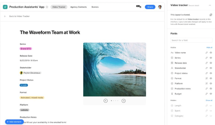
Color_2023_05_2x.png

9 Comments
Karlstens
11 - Venus
11 - Venus

Can we please have configurable colours within an interface, so that active record fields or conditions met within an interface will apply the fields colour to the region? It's frustrating to have access to colours but no real way to leverage them.

Karlstens_1-1683424396054.png


Similarly, the Gallery View and the KanBan view could use some extra features to allow the background and/or borders of stacks and cards to also be coloured.

Karlstens_2-1683424410099.png


Karlstens_0-1683424381717.png


I've wanted these colour features ever since first using Airtable.

Kamille_Parks
16 - Uranus
16 - Uranus

Hi @Simon_OShea . Are there plans to make the color palette consistent throughout the product? Its pretty inconsistent now.

The available color set of 40 hues (10 colors, 4 shades each) is the same for select field choices, checkboxes/ratings (just the colors, not the shades), record color conditions, the Base itself, and interface groups. The available colors differs for the following, and I'm not sure why:

  • Custom Extensions have access to 50 hues (10 colors, 5 shades each), not 40. All colors should ideally be available everywhere, so the full 50 should be applied to all examples above.
  • Button fields only have 27 hues (9 colors, 3 shades each). I suspect someone forgot to push the new “ultra dark” shade to buttons. Also for some reason, buttons don't have access to any of the “teal” options? This feels like the most random color limitation.
  • Interface buttons are limited to 4 color options.
  • The background color for Interface “containers” only have three options: transparent, gray, and whatever the interface color is. All colors should be selectable, ideally.
Tobias_LGKR
7 - App Architect
7 - App Architect

Thank you. But custom colors, that's what we would really need. To make Interfaces more of a brand experience. Especially the two colors (ok, it's only one when you substract the grey) for interface backgrounds based on the base color are extreeeeemely limiting for design.

Simon_OShea
Airtable Employee
Airtable Employee

@Karlstens Thank you for sharing this feedback. We’ll take this into consideration with future updates to Interfaces.

@Kamille_Parks We hear you and thanks for pointing out these specific examples. Consistency is something were striving for with future updates to the system. 

@Tobias_LGKR Thanks, were continually looking at ways to improve brand experiences, while improving the accessibility of interfaces. Well take this feedback onboard.

Jon_Stephenson
7 - App Architect
7 - App Architect

@Simone PLEASE can you background colour fill fields when creating a new record or editing an existing one, white on white is not a great combination as it is now!

RonniEloff_VKDe
7 - App Architect
7 - App Architect

Love to see color so I can highlight required fields in Forms and interface form.

Lise_Rubarth
5 - Automation Enthusiast

Thank you for all the work with colors, but it would be even better if there was a checkmark or something to show a palette that was color-blind safe colors or use some combination of colors and patterns to help differentiate. There are an estimated 300 million people in the world with color vision deficiency. 1 in 12 men are color blind (8%). 1 in 200 women are color blind (0.5%)I myself am color blind .

Celeste_Bancos
7 - App Architect
7 - App Architect

I wish we had an option for less vivid colors on Interface buttons. The light grey button is so light that I can barely tell it's not just white. The red, green, blue and charcoal buttons are all so dark/bright that they really stand out. I'd love for one or two options that are more in the middle between these two extremes.

I want a button that stands out just a little bit from the fields around it without overpowering the page.

danaalane
4 - Data Explorer
4 - Data Explorer

Please please please allow us to use custom brand colors on interfaces! This would be a gamechanger!