- Airtable Community
- Discussions
- Ask A Question
- Base Design
- Re: Please, please tell me the home screen won't b...
- Subscribe to RSS Feed
- Mark Topic as New
- Mark Topic as Read
- Float this Topic for Current User
- Bookmark
- Subscribe
- Mute
- Printer Friendly Page
Re: Please, please tell me the home screen won't be updated like the free account
- Mark as New
- Bookmark
- Subscribe
- Subscribe to RSS Feed
- Permalink
- Report Inappropriate Content
Oct 25, 2022 01:10 PM
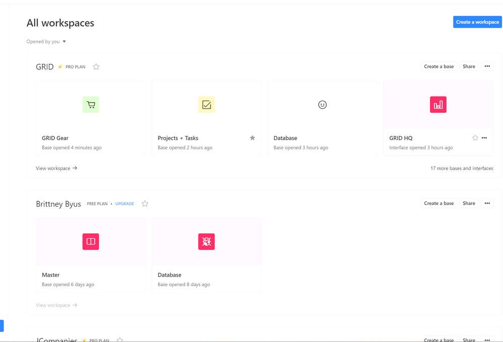
My sister is on a free account and she noticed her home screen changed. Please, please tell me this isn’t going to happon the Pro account. It’s so much less user-friendly. The icons are micro sized (which wastes a massive amount of space) and the icons don’t move in the order you want them (has to be alphebetically, etc).
I absolutely LOVE Airtable and it makes work so much better but this is not an improvement.
Can someone let me know if this is happening across all accounts?
Thank you!!
- Mark as New
- Bookmark
- Subscribe
- Subscribe to RSS Feed
- Permalink
- Report Inappropriate Content
Nov 10, 2022 01:12 PM
My co-worker opted for the change not knowing what the new Home Page would look like-- she really regrets having done so. After having her show me what her Home Page looks like now I am delaying the change for as long as I can. I still have the old Home Page, and I have the option to update.
My co-worker has been using Airtable for 4+ years and mentioned to me that it took her far too long to figure out how to create a new Workspace on the new home page… that sounds terrible.
- Mark as New
- Bookmark
- Subscribe
- Subscribe to RSS Feed
- Permalink
- Report Inappropriate Content
Nov 10, 2022 02:49 PM
Please make sure that she sends an email to support@airtable.com about her experiences.
- Mark as New
- Bookmark
- Subscribe
- Subscribe to RSS Feed
- Permalink
- Report Inappropriate Content
Nov 16, 2022 07:53 AM
I sent an email to the support desk and this was the reply:
“I am sorry for the unexpected change! It may not seem like it at first, but the new home screen does boast more organizational prowess than the earlier version of the dashboard UI, giving you the ability to search for specific bases both via workspace and throughout your entire base catalog. You can also star workspaces, interfaces, and bases for easier access, and pin up to 3 bases in each individual workspace. It’s built to support speedier access to key bases and reduce clutter in the process.
We do of course understand if you don’t love the new changes at first glance, but we would encourage you to give the new layout a sincere college try considering that there are several new features to work with. This article will give you an overview of what exactly is going on in the new home page to help it feel more familiar as you go. If you feel inclined, and we would positively welcome it, you can formally submit your feedback to us as we’d love to take note of what we could improve!
Thanks again for understanding, and we’d like to apologize if this caught you off guard at all. Let me know if you have any more questions!”
So annoying and not helpful. Everything requires extra clicks, it’s ridiculous and way less efficient.
- Mark as New
- Bookmark
- Subscribe
- Subscribe to RSS Feed
- Permalink
- Report Inappropriate Content
Nov 16, 2022 08:09 AM
Unbelievable!!!
- Mark as New
- Bookmark
- Subscribe
- Subscribe to RSS Feed
- Permalink
- Report Inappropriate Content
Nov 16, 2022 08:42 AM
The “college try” statement infuriated me! In my email to them, I laid out my reasoning for disliking the new interface, so if any human actually read my email, they’d know that I had indeed already tried working with it. OY!
- Mark as New
- Bookmark
- Subscribe
- Subscribe to RSS Feed
- Permalink
- Report Inappropriate Content
Nov 17, 2022 02:38 AM
I don’t seem to have the new home screen. Am on a Pro plan
- Mark as New
- Bookmark
- Subscribe
- Subscribe to RSS Feed
- Permalink
- Report Inappropriate Content
Dec 21, 2022 05:32 AM
My home screen has (thankfully) remained the same so far. Has anyone been able to change back who had a dashboard "update"?
- « Previous
- Next »

