- Airtable Community
- Discussions
- Ask A Question
- Interface Designer
- Re: Creating charts with sums from two different f...
- Subscribe to RSS Feed
- Mark Topic as New
- Mark Topic as Read
- Float this Topic for Current User
- Bookmark
- Subscribe
- Mute
- Printer Friendly Page
Re: Creating charts with sums from two different fields
- Mark as New
- Bookmark
- Subscribe
- Subscribe to RSS Feed
- Permalink
- Report Inappropriate Content
Jan 23, 2022 05:20 AM
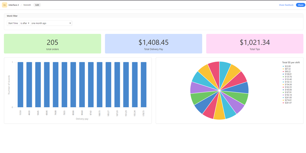
Trying out interfaces for the first time by creating a summary for my delivery earnings base. Starting pretty simple. I want to create a bar graph and pie chart comparing the sums from two different fields: the delivery pay and tips fields. So far I can only figure out how to make charts with just one of the fields, like this:
Is there a way to do this?? I can’t find anything but I feel like there must be a way to do this.
- Mark as New
- Bookmark
- Subscribe
- Subscribe to RSS Feed
- Permalink
- Report Inappropriate Content
Jan 24, 2022 10:11 AM
@mars_b, a lot of us are looking for this kind of functionality as you can see from this thread (along with others, I’m sure).
No response from Airtable so far. 😕
- Mark as New
- Bookmark
- Subscribe
- Subscribe to RSS Feed
- Permalink
- Report Inappropriate Content
Jan 26, 2022 03:14 AM
Ah, thank you! I figured there must be other people talking about this, but I couldn’t Google this in a way that anything came up.

