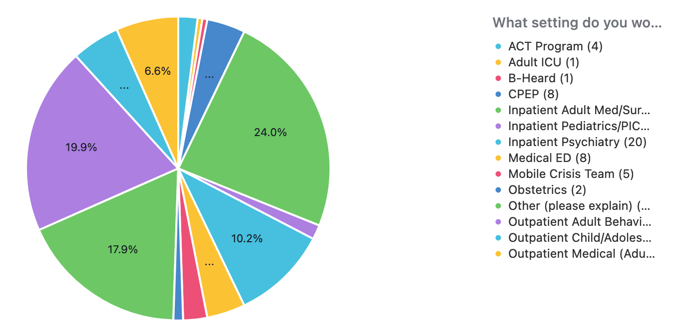
Unfortunately, Airtable’s charts are extremely limited, with no ability to customize them further.
Your only option is to turn to external apps. You can either:
1. Use an external interface app that supports charts, such as Noloco, Softr, Glide, or JetAdmin.
I give step-by-step instructions on how to use Noloco on this episode of the BuiltOnAir podcast.
or
2. Use an external charting app, and then you can automate those external charting apps with Make.
One quick & easy tool that lots of people enjoy is QuickChart.io, which can be fully automated with Make’s QuickChart’s integrations.
Make also supports other charting & graphing tools as well, like Image-Charts, Databox, Tableau, and more.
Of course, you can also create charts & graphs with Microsoft Excel or Google Sheets, which can also be fully automated with Make. Many of my clients just go down this path.
There is a small learning curve with Make, which is why I created this basic navigation video to help. I also provide the links to a few other Make training resources there as well. For example, to instantly trigger your Make scenarios from Airtable, check out this thread.
p.s. If you have a budget for your project and you’d like to hire an expert Airtable consultant to help you with any of this, please feel free to contact me through my website: Airtable consulting — ScottWorld