The Community will be temporarily unavailable starting on Friday February 28. We’ll be back as soon as we can! To learn more, check out our Announcements blog post.
- Airtable Community
- Discussions
- Ask A Question
- Interface Designer
- Interfaces: chart labels obstructing view
Topic Options
- Subscribe to RSS Feed
- Mark Topic as New
- Mark Topic as Read
- Float this Topic for Current User
- Bookmark
- Subscribe
- Mute
- Printer Friendly Page
Interfaces: chart labels obstructing view
Topic Labels:
Interface Designer
Solved
Jump to Solution
0
4190
3
Comment Post Options
- Mark as New
- Bookmark
- Subscribe
- Subscribe to RSS Feed
- Permalink
- Report Inappropriate Content
Apr 03, 2023 06:34 AM
Hi all,
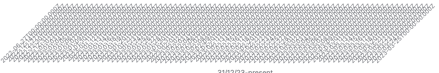
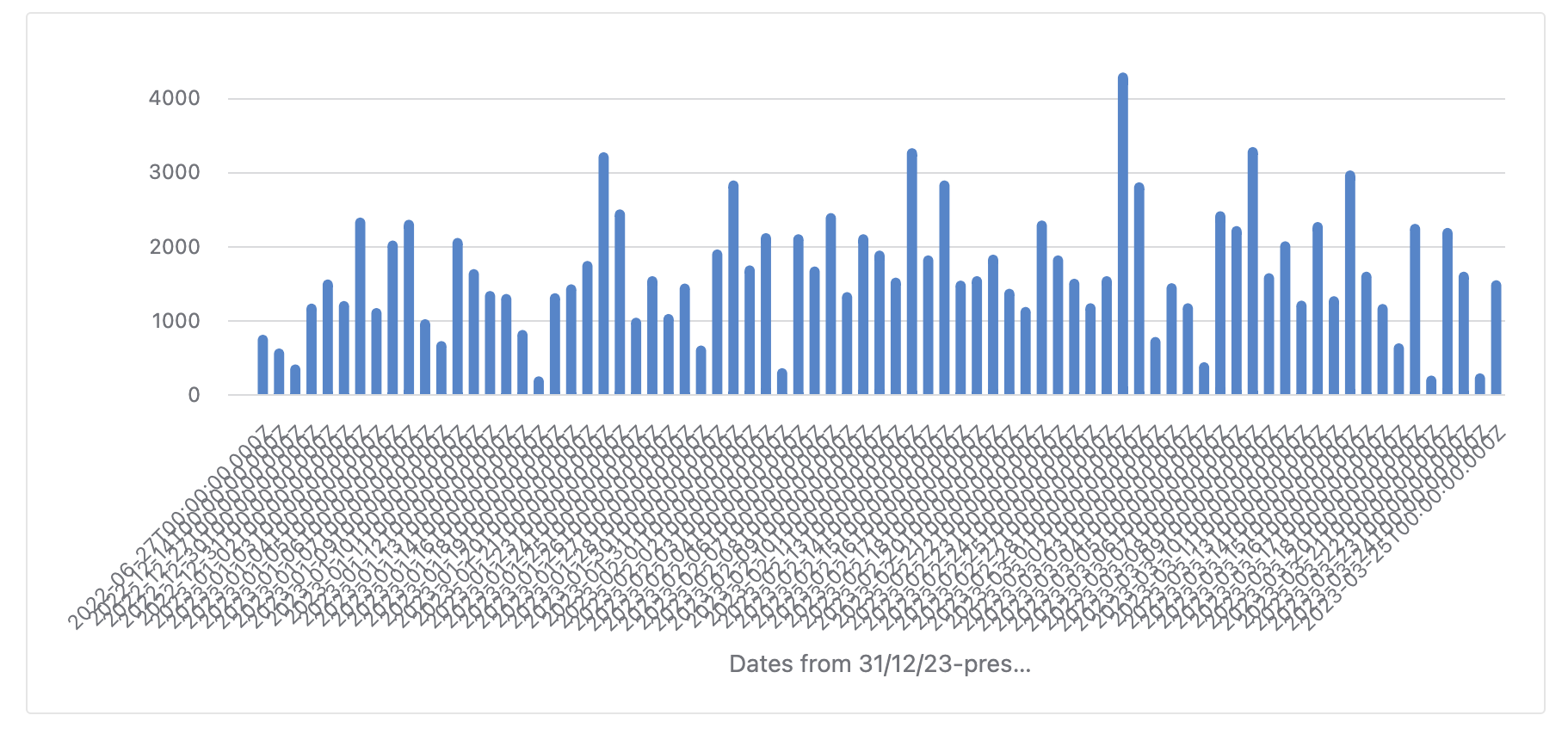
Thank you in advance for your help 🙂 I'd love to get some suggestions for removing all the labels at the bottom of this chart in one of my interfaces. It has got the dates as the x-axis. I can't find a way to remove the labels so they don't look cluttered. Any suggestions?
Solved! Go to Solution.
1 Solution
Accepted Solutions
Solved
See Solution in Thread
Comment Post Options
- Mark as New
- Bookmark
- Subscribe
- Subscribe to RSS Feed
- Permalink
- Report Inappropriate Content
Apr 05, 2023 03:53 AM
The solution that I found was the data field was being regarded as a 'long text' instead of a 'date' field which made it confusing for Airtable to correctly label the x-axis.
3 Replies 3
Comment Post Options
- Mark as New
- Bookmark
- Subscribe
- Subscribe to RSS Feed
- Permalink
- Report Inappropriate Content
Apr 03, 2023 10:05 AM
Are you asking for the X axis to have no data? So it would be blank and only the numbers on the Y axis?
Comment Post Options
- Mark as New
- Bookmark
- Subscribe
- Subscribe to RSS Feed
- Permalink
- Report Inappropriate Content
Apr 03, 2023 10:08 AM
Apologies for the confusion. I've attached a screenshot specifically of the part that I'd like to remove/hide
Solved
See Solution in Thread
Comment Post Options
- Mark as New
- Bookmark
- Subscribe
- Subscribe to RSS Feed
- Permalink
- Report Inappropriate Content
Apr 05, 2023 03:53 AM
The solution that I found was the data field was being regarded as a 'long text' instead of a 'date' field which made it confusing for Airtable to correctly label the x-axis.
