- Mark as New
- Bookmark
- Subscribe
- Subscribe to RSS Feed
- Permalink
- Report Inappropriate Content
Nov 14, 2021 08:45 AM
I believe this will be a fairly common request and it’s something I noticed right off the bat when designing a dashboard interface for one of my “aggregation tables” for an e-commerce store that’s being fed data from Shopify.
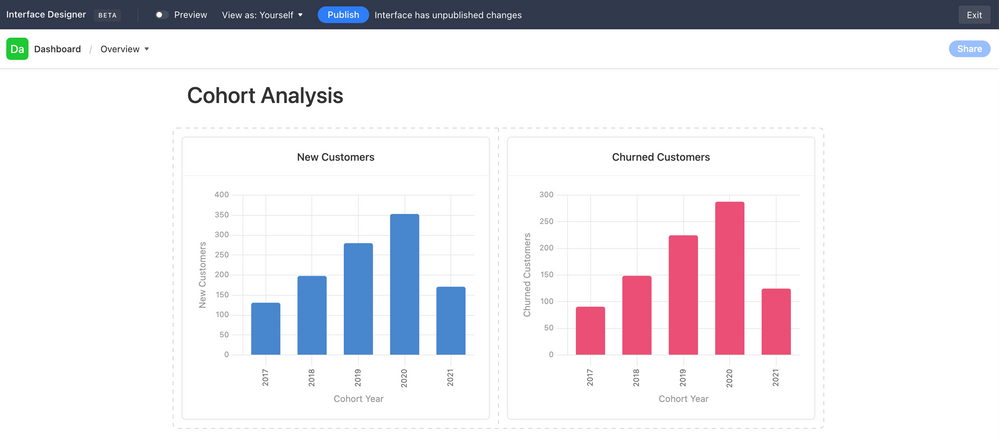
Use Case: New Customers vs. Churned Customers in a given Cohort Year
Currently, it seems I have to create two separate charts, like so…
Ideally, I would like to lay these two charts “on top of each other.” They’re both drawing data from the same table, so the X-Axis is the same. The Y-Axis is just 2 different columns’ values in the same table & rows.
- Mark as New
- Bookmark
- Subscribe
- Subscribe to RSS Feed
- Permalink
- Report Inappropriate Content
May 03, 2022 03:57 AM
Hi @Will_Dale thanks for sharing this!
Unfortunately, it wouldn’t work for us as we have such a BIG database already set up with data in different columns, such as income, expenses, profit… by year, so our intention is to layout each of these metrics in the same table as a comparative
Anyone from Airtable team that could give us some feedback on that feature request?
Many thanks
- Mark as New
- Bookmark
- Subscribe
- Subscribe to RSS Feed
- Permalink
- Report Inappropriate Content
May 03, 2022 04:09 AM
It would be great if you could select which field you wanted to appear on the chart as a series, but that can’t be done yet. Hopefully Airtable will roll this out soon.
- Mark as New
- Bookmark
- Subscribe
- Subscribe to RSS Feed
- Permalink
- Report Inappropriate Content
May 27, 2022 09:58 AM
Ditto. Don’t make me depend on Google Sheets for charts and graphs! I’m working with a company that sells seats at Live Training (yes we made it through the pandemic, at least so far:-). Customers can buy 3 types of seats. I need to display those.
- Mark as New
- Bookmark
- Subscribe
- Subscribe to RSS Feed
- Permalink
- Report Inappropriate Content
Oct 14, 2022 06:27 AM
+1 for this feature request, it would be very helpful to be able to display multiple metrics on the same chart to save space and allow comparison.
- Mark as New
- Bookmark
- Subscribe
- Subscribe to RSS Feed
- Permalink
- Report Inappropriate Content
Nov 01, 2022 01:18 PM
+1 — It’s crazy that after all this work in Airtable I have to export to Google Sheets just to compare two columns in a chart.
- Mark as New
- Bookmark
- Subscribe
- Subscribe to RSS Feed
- Permalink
- Report Inappropriate Content
Nov 02, 2022 01:09 AM
+1; my clients could really use this. eg: compare sales and price offers vs dates
- Mark as New
- Bookmark
- Subscribe
- Subscribe to RSS Feed
- Permalink
- Report Inappropriate Content
Nov 14, 2022 05:33 AM
Shocked we don’t have this basic functionality.
- Mark as New
- Bookmark
- Subscribe
- Subscribe to RSS Feed
- Permalink
- Report Inappropriate Content
Jan 20, 2023 03:28 AM
AT team please spend a 2 week sprint getting this done. Surely not difficult to add multiple field options in the Y-axis configuration. This really is basic/bog standard functionality we all expect to see here!
- Mark as New
- Bookmark
- Subscribe
- Subscribe to RSS Feed
- Permalink
- Report Inappropriate Content
Feb 10, 2023 11:43 PM
Yes! This is such a default feature for graphs that it's surprising there is no such feature yet... until this is available AirTable Interfaces are far inferior to Sheets or Excel. Airtable graphs are terrible (but I love everything else!).
- Mark as New
- Bookmark
- Subscribe
- Subscribe to RSS Feed
- Permalink
- Report Inappropriate Content
Feb 10, 2023 11:51 PM
Yes! This feature is a must for proper interfaces...

