

Hi team,
Is there a way to create a stacked bar chart that goes to 100%; i.e. showing the % split of records instead of simply the absolute count of records.
I have this chart to roughly measure conversion rate from various sources;
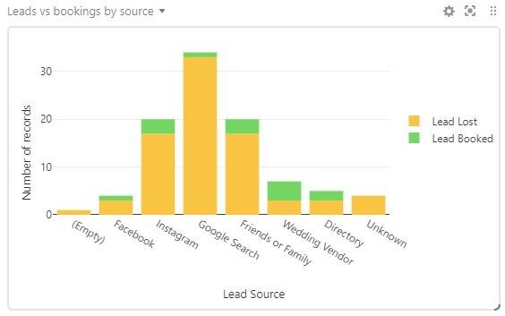
But it would be even better if each bar extended to 100% and instead showed the percentage of records from each source that either booked or were lost.
Is it possible to create something like this; either by manipulating the data via formula, or with a chart/app option that I’m missing?
