The Community will be temporarily unavailable starting on Friday February 28. We’ll be back as soon as we can! To learn more, check out our Announcements blog post.
- Airtable Community
- Discussions
- Ask A Question
- Other questions
- Recreating Chart from Excel in Airtable
Topic Options
- Subscribe to RSS Feed
- Mark Topic as New
- Mark Topic as Read
- Float this Topic for Current User
- Bookmark
- Subscribe
- Mute
- Printer Friendly Page
Comment Post Options
- Mark as New
- Bookmark
- Subscribe
- Subscribe to RSS Feed
- Permalink
- Report Inappropriate Content
Mar 19, 2024 05:12 PM
Hello,
I am trying to create a stacked bar graph in Airtable like the one I made in excel, but there's something I'm not quite understanding about how the chart extension tool works in Airtable. I cannot group the different day ranges under the record #, only the total, not the individual segments stacked. Any help would be appreciated, thanks.


Solved! Go to Solution.
1 Solution
Accepted Solutions
Solved
See Solution in Thread
Comment Post Options
- Mark as New
- Bookmark
- Subscribe
- Subscribe to RSS Feed
- Permalink
- Report Inappropriate Content
Mar 19, 2024 07:18 PM
Hmm, could you provide a screenshot of the way your data's set up?
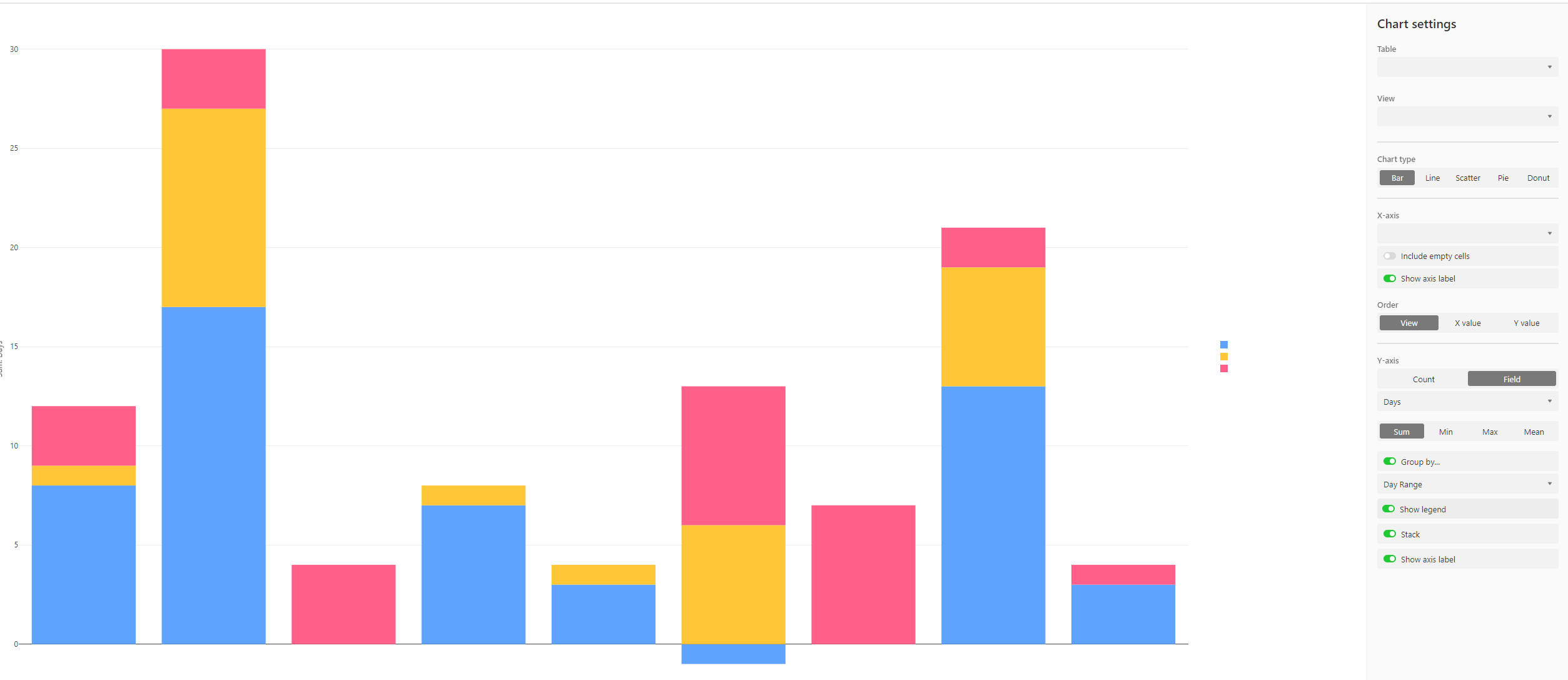
I managed to create this:
And my data's set up like so:


Link to base
Might need to manipulate your data a bit so that the chart can display it the way you want!
Reply
5 Replies 5
Solved
See Solution in Thread
Comment Post Options
- Mark as New
- Bookmark
- Subscribe
- Subscribe to RSS Feed
- Permalink
- Report Inappropriate Content
Mar 19, 2024 07:18 PM
Hmm, could you provide a screenshot of the way your data's set up?
I managed to create this:
And my data's set up like so:
Link to base
Might need to manipulate your data a bit so that the chart can display it the way you want!
Reply
Comment Post Options
- Mark as New
- Bookmark
- Subscribe
- Subscribe to RSS Feed
- Permalink
- Report Inappropriate Content
Mar 20, 2024 11:07 AM
Thanks for responding Adam, you are correct that I needed to manipulate my data to display the chart in the way I wanted.
One last thing, how did you get the stacked bar chart to be horizontal in Airtable? I can only get it to be vertical.
Thanks again!
Comment Post Options
- Mark as New
- Bookmark
- Subscribe
- Subscribe to RSS Feed
- Permalink
- Report Inappropriate Content
Mar 20, 2024 07:58 PM

Reply
Comment Post Options
- Mark as New
- Bookmark
- Subscribe
- Subscribe to RSS Feed
- Permalink
- Report Inappropriate Content
Mar 21, 2024 09:28 AM
Comment Post Options
- Mark as New
- Bookmark
- Subscribe
- Subscribe to RSS Feed
- Permalink
- Report Inappropriate Content
Mar 21, 2024 07:32 PM
Ah, yeah, I'm making a chart in an interface, sorry about that!
