- Airtable Community
- Discussions
- Ask A Question
- Other questions
- X axis in chart app adding extra random info with ...
- Subscribe to RSS Feed
- Mark Topic as New
- Mark Topic as Read
- Float this Topic for Current User
- Bookmark
- Subscribe
- Mute
- Printer Friendly Page
X axis in chart app adding extra random info with parenthesis
- Mark as New
- Bookmark
- Subscribe
- Subscribe to RSS Feed
- Permalink
- Report Inappropriate Content
May 19, 2022 09:39 AM
Hey all!
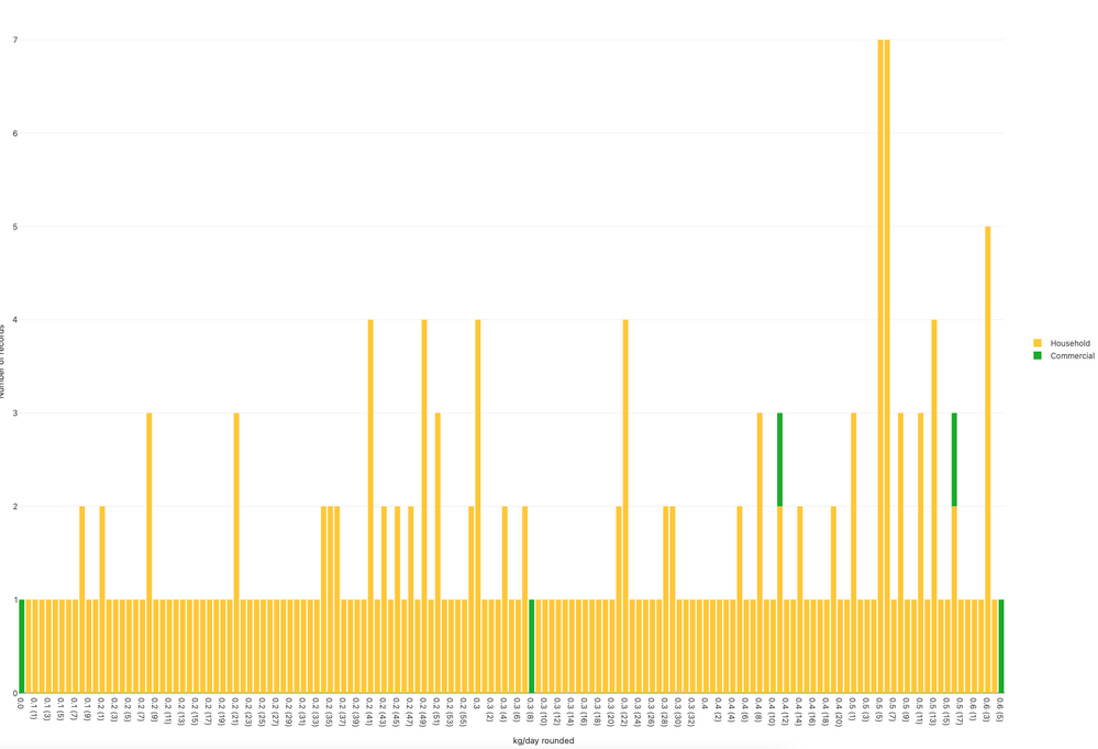
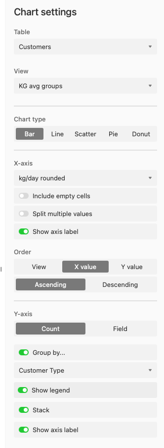
I have a simple bar chart I want to show the total count (Y axis) for a given formula field. My view grouping does this very well, but when represented as X-axis in my chart, the chart app adds a parenthesis value to the label unexpectedly, growing the number of X-axis values significantly. Attached is view of values (only 7 unique values for X) and how they’re being messed with in the chart. Chart settings added as well.
Any advice is greatly appreciated in advance, thanks!
Solved! Go to Solution.
Accepted Solutions
- Mark as New
- Bookmark
- Subscribe
- Subscribe to RSS Feed
- Permalink
- Report Inappropriate Content
May 19, 2022 09:21 PM
Hey Bryan, I think this is happening because, even though the “KG/DAY ROUNDED” field is displaying values to one decimal place, it actually contains values that are more than one decimal place.
May I see the ROUND() function you’re using? It should have a precision of 1 for your situation
- Mark as New
- Bookmark
- Subscribe
- Subscribe to RSS Feed
- Permalink
- Report Inappropriate Content
May 20, 2022 11:36 AM
Thank you Adam_C!
This was exactly it. I had the ‘Format’ of the function set for 1 decimal, but when I wrapped my whole function with round(X,1), the chart now works as it should.


