
Hi there! I’m Rosalind – a product marketing manager at Airtable focused on helping teams build powerful, custom applications that make work more efficient. I’m eager to share that we have just launched support for pivot tables in interfaces!


Starting today, all users on a Teams plan or higher will have access to pivot tables directly in interfaces.


What is a pivot table?


A pivot table is a powerful data analysis tool for succinctly summarizing and analyzing large datasets. The format of a pivot table lets you rearrange and aggregate data dynamically, making it easier to identify patterns, trends, and insights. 


Historically, the only way to use pivot tables in Airtable was via the Pivot table extension. With the launch of this new feature, you can easily add pivot tables directly to an interface page without relying on an extension.


How can you use a pivot table?


Aggregate and summarize your data. Pivot tables allow for the aggregation and summarization of large datasets into manageable blocks of information. You can use a pivot table to quickly condense vast amounts of data into meaningful summaries, such as totals, averages, counts, and percentages.


Explore your data from multiple perspectives. Pivot tables offer dynamic analysis capabilities, making it easy to slice and dice your data in different ways. With the ability to rearrange specific fields, you can quickly switch between different dimensions and hierarchies to uncover patterns, trends, and outliers.


Customize how your data is displayed. Pivot tables provide a high degree of customization and flexibility, allowing you to tailor your analysis to fit your team’s specific needs and preferences. From adjusting layouts and formats to applying filters and sorting, pivot tables give you full control over how your data is presented and analyzed – making it easier to derive actionable insights.


Where can you access pivot tables in Airtable?


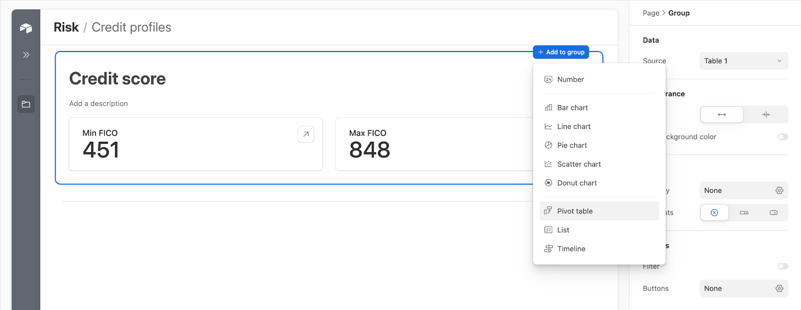
Initially, pivot tables will only be supported in dashboard layouts. To add a pivot table to a dashboard, open the “+ Add to group” menu and select “Pivot table”


For more information on selecting row and column groupings, splitting multiple values, determining what is displayed in your table, and accessing underlying records from a pivot table, you can read through the support article on the dashboard layout here.


We’re excited to see what you can do with pivot tables! As we continue to add new features to interfaces, we’ll be sure to keep you updated here and on our What’s New page.

So useful!  Is there a training session planned for this function add?  


You can't group by multiple fields though.


WooHooo!! You guys are killing it! This is awesome! 🥳🥳


@kschnaenberg We don't have a dedicated training session planned for pivot tables but I can absolutely bring that back to the team! In the meantime, I recommend checking out the support article here to get started with pivot tables. We also plan to host dedicated webinars on working with interfaces in the coming weeks which may be useful as well.


@Matthew_Carrano at the moment, grouping is limited to a single field. That said, we hope to expand our pivot table capability in the coming months.


Pivot Tables need to be placeable on Detail Pages and ideally "legacy" page types (like blank and record review) to be most useable.

Its a good start, but using 2-3 fields for columns/rows would be great.


Fantastic addition to interfaces. My question is: is this view available to free users? If I recall, this used to only be available to people on paid plans.


This is super awesome pivot tables are starting to be integrated into Airtable functionality! Is it planned to be able to export the pivot tables to .csv files or added to the base views? 

Those additions would be game changers for workflows. 


Would be very very useful if we can group multiple fields in the current Pivot table. We hope it's on the backlog 😉. Great feature! Cheers, Sjors


@Joseph_Roza this is only available for paid plans similar to the pivot table extension


@bsimpson_1015 we don't have any plans at the moment to add the pivot table element to the base, as we are investing in dashboarding through Interfaces moving forward given they are a much more visually appealing surface for both reporting and collaborating. The pivot table extension is still available in the data tab, though. 


This is great! But why can't i use it in a normal interface board? =( 


It would be nice, if the table height would be adjustable, fixed or expand with number of records. It's very limited at the moment, only 9 rows are shown and there is no way to extend it as far as I can see. Nothing else on the page so looks really weird apart from being annoying having to scroll when there is actually enough space to display all rows in the table. 


Oh wait, I saw now the arrow in the published table that extends all the rows, but no scroll bar for the width. 


@Rosalind_Lutsky it would be great to be able to create charts out of pivot tables.


@Rosalind_Lutsky @Kelly_OShaughne 


We love the pivot tables in Airtable’s dashboard interfaces, but many of my clients are having a big usability problem with them.
 
I’ve created a Loom video for you here to describe the usability problem:

https://www.loom.com/share/e707412fb99c4131a2cf7a6f52d84b2d?sid=b2c895f2-c0e4-42bd-82cf-93371e32517d

— ScottWorld, Expert Airtable Consultant Since 2018


@ScottWorld thank you so much for taking the time to create this Loom! Incredibly clear and helpful. I actually ran into this myself a few weeks ago; it's helpful to have more validation on this need. I will take this back to the team!


Thanks so much, @Kelly_OShaughne!


We just launched a couple quality of life improvements for pivot tables in Interfaces!
  • You can now toggle the visibility of the labels of the axes (they are shown in the top-left cell in the pivot table)
  • You can now toggle the visibility of the row and column totals (the bottom row and right-most column in the pivot table, respectively)

You can learn more in the support article on the dashboard layout


@Zack_Snyder  ... any chance we can get a download as CSV for pivot tables in interfaces? this is a critical need for my teams.


@matt_stewart1 it's on our radar! No timeframe at the moment but will update here with any progress


It's frustrating there isn't a way to filter down the data. What I want to do (and currently can't) could be accomplished either by:

  1. Enabling the ability to group by more than 1 field, or
  2. Enabling the ability to have a filter control in the interface which is referenced by the pivot table

@CalumM You can use the properties panel on the righthand side of the screen to set filters on both the dashboard group and the pivot table itself. See the Filter by control in the Data section in the properties panel. Hope that helps!


@Zack_Snyder unfortunately that doesn't solve my need. When I mentioned "Enabling the ability to have a filter control in the interface which is referenced by the pivot table", I was referring to dynamic filtering within the interface, like you can do in non-dashboard interfaces. The method you describe is basically hard coding the filter into the interface with no ability for users to change the filtering easily


Hey, love this extention. However, I would really like to export the data from the table via copy/paste or .csv. The extention in the data tab has this functionallity.  I am now printing the pivot table as PDF and then I use the excel import data from PDF function to pull the data from the pdf. Which works but is a cumbersome workaround. 


Reply