- Airtable Community
- Discussions
- Ask A Question
- Formulas
- Viewing financials over time
- Subscribe to RSS Feed
- Mark Topic as New
- Mark Topic as Read
- Float this Topic for Current User
- Bookmark
- Subscribe
- Mute
- Printer Friendly Page
Viewing financials over time
- Mark as New
- Bookmark
- Subscribe
- Subscribe to RSS Feed
- Permalink
- Report Inappropriate Content
Apr 16, 2024 11:46 AM
Hi,
I'm using AirTable to track potential sales opportunities and would like to visualise on a chart the revenue per month. This is similar to the Gantt chart view but instead would show the size of revenue rather than simply a project.
For example, if an opportunity lands on the 15th April that will last 2 months, completing on the 15th June and worth £100k, this would be spread over those months. I.e. £50k in April, £100k in May, and £50k in June. Then a bar chart would total all these by month.
In Excel this is relatively easy - you create a column for each month that calculates how much of the revenue in each month (can just about do that here but it's not easy). Then you create a bar chart for the table and it shows it easily. Can't find a way to do that in AirTable or with an app.
Any and all help is much appreciated!!
Dan
- Mark as New
- Bookmark
- Subscribe
- Subscribe to RSS Feed
- Permalink
- Report Inappropriate Content
Apr 16, 2024 07:41 PM
Yeah, you're going to need to create a new table just for that chart I believe
The variable amount based on the number of days makes this pretty tricky, and it seems like you'd need a table just for that kind of calculations I think. So for your example of 15 Apr - 15 June, you'd need a table that had 3 records, one for each month, and you'd probably need a script to help you figure out the allocations if you want this done automated
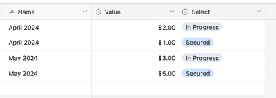
You'd then need to create a table just for this chart where each record in this table would be a single month-year, e.g. "Apr 2024", "May 2024", and you'd link these appropriately to the records in the previous table and have a rollup to sum up the values per month, and you'd create the chart for this table
- Mark as New
- Bookmark
- Subscribe
- Subscribe to RSS Feed
- Permalink
- Report Inappropriate Content
Apr 17, 2024 04:17 AM
Thank you for this. That makes sense.
I believe I can create columns that calculate the amount of revenue for each month. Does that need to be in a separate table?
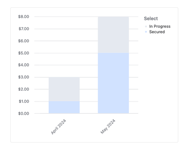
For the separate table for the chart, each line needs to be a month year. Is there a way to full automate this (like in Excel)? As a nice-to-have, ideally I'd like a stacked chart which then shows 'in progress', 'secured', 'likely'; is that feasible?
Thank you again!
- Mark as New
- Bookmark
- Subscribe
- Subscribe to RSS Feed
- Permalink
- Report Inappropriate Content
Apr 17, 2024 05:47 AM
re: I believe I can create columns that calculate the amount of revenue for each month. Does that need to be in a separate table?
As long as you're able to populate the chart data table (i.e. the one where each record is a month-year) with the appropriate data you're good to go, really. I couldn't think of how to do that dynamically and so defaulted to having a separate table for it; I'd love to know how you do it!
---
re: For the separate table for the chart, each line needs to be a month year. Is there a way to full automate this (like in Excel)?
Hm, like pre-create all of the month year combos for you? Might need a script for that really. Depending on how you're populating the chart data table your automations might handle this for you
re: As a nice-to-have, ideally I'd like a stacked chart which then shows 'in progress', 'secured', 'likely'; is that feasible?
Yeah, but you'd need to set up your data so that your chart data table was able to distinguish which amounts are what status, does that make sense?


