
These two features are great but take up a lot of valuable space in the views sidebar. When you have more than a few views, the less you need to scroll, the better. Perhaps a small Plus (+) icon button at the bottom to open up the create a view option/menu and a small Sparkle icon button at the bottom to open suggested views…better yet, those suggested views appear on the create a view menu.
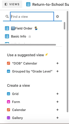
I hate the “suggested” part.


Hi there! You can actually hide these by clicking the gear icon next to the view search, and toggling off the view suggestions. Hope that helps 🙂


Hi there! You can actually hide these by clicking the gear icon next to the view search, and toggling off the view suggestions. Hope that helps 🙂


That’s helpful! Thanks! Now to just slim down those new view buttons! 🙂


Adam from Airtable here.


The “Show view suggestions” section no longer exists in our UI. The image that @Jason included above is no longer relevant as the “Suggested views” section has been removed as a feature. If anyone is still seeing the previous version of the UI, then please let me know.


Reply