
Histogram and other charts in Chart Block

  • February 26, 2019
  • 4 replies
  • 37 views

Forum|alt.badge.img+1

Hi there, really loving Airtable but seems like the Chart Block is a little under powered…

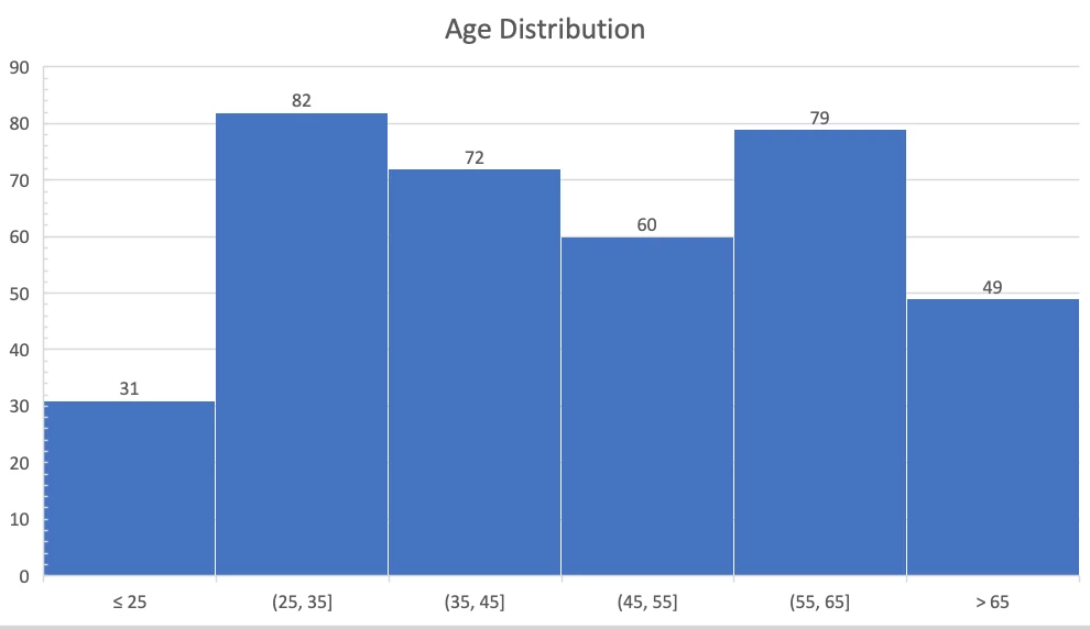
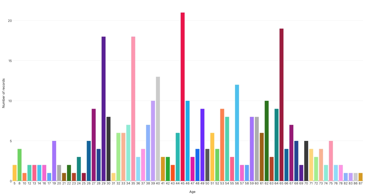
Minimally it seems like integrating basic statistical plots like histograms, box plots, and violin plots, could be really helpful for creating useful dashboards.

Additionally some useful things like radar plots and maybe even contour plots would be great to see added.

I know this isn’t a dataviz platform by design, but then again it kind of is so making charting/plotting a bit more of a first class citizen would be cool to see.

4 replies

  • New Participant
  • April 5, 2019

A histogram would be very useful for me!


Forum|alt.badge.img

I really need the radar chart. I have seen one do it, but I don’t know how?
Any ideas?


  • New Participant
  • January 5, 2021

Reporting data with a more complex chart type would be excellent for us as well – something like Excel’s histogram. I have age data for people who use our services, and I’d like to make a distributed chart showing age in groups of 10 years, or at least in customizable bucket sizes like I can in Excel. (see attached image)

However, when I try to do the same with the Charts app, I can only seem to get a graph that looks like this (see below) because I can’t groups y-axis data into buckets.


  • Participating Frequently
  • December 22, 2021

Me too! Need a radar chart to bring over some info we still have in Excel… hopefully soon!