
Please revise/remove Airtable Field Type Icons

  • July 24, 2017
  • 9 replies
  • 50 views

Forum|alt.badge.img+4

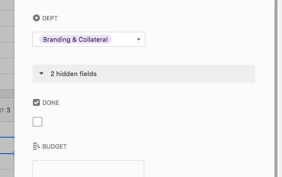
When viewing an individual record, the Field Type icons are really making it confusing for my users. In particular, the Checkbox icon looks like a checkbox that has already been checked. So my users look at the record below, and assume the project is “done”. Similarly, the Single Select icon looks like a dropdown menu, and users keep trying to click it.

Honestly, I don’t now why you need to identify the field type at all. But at very least, we need icons that don’t look like data or like UI elements.

9 replies

Forum|alt.badge.img+11
  • Participating Frequently
  • July 26, 2017

I second the need for this request. Not for confusion sake, but so that I can minimize column widths more easily. The ability to get it smaller is hindered by the field type icon.


  • New Participant
  • July 28, 2017

If you do this you have to remove all the field type icons from everybody’s screens, and I’m not in favor of that.
I can clearly see that your DEPT field is a drop-down, single-select field.
It tells me and my users that I have to select one thing in that field.

And I know that your DONE field is unchecked.
And if I want to mark it as done… I need to check the box below.
A little training can go a long way.


Forum|alt.badge.img+4
  • Author
  • Known Participant
  • July 28, 2017

If you have to train people to interpret a user interface, it’s a bad user interface.


  • Participating Frequently
  • July 28, 2017

Respectfully, I disagree here. Any non-trivial product (especially software kits that amplify human creative ability) will have some amount of necessary complexity; a great design abstracts away the unnecessary complexity without throwing the baby out with the bathwater.

No design is perfect, but IMO it would be impossible to deliver the same expressive capability of a product like Adobe Photoshop or even Apple’s GarageBand without some learning curve.


Forum|alt.badge.img+4
  • Author
  • Known Participant
  • July 28, 2017

Howie, I don’t want to get lost in a theoretical debate. I initiated this post to communicate ACTUAL problems I’m having with training my team on this product.

But for the record, I spent years as a college professor teaching intro-level Adobe Creative Suite classes, and I never once had to explain to a Photoshop student, “No that’s not a checkbox, that’s an icon.”


Forum|alt.badge.img+17

Excuse me for writing in this old topic, but I just landed here searching.

@BenInDallas, I would tell the users: if the icon is the status of the field, what is the checkbox bellow? I think that the difference between the icon and the control is a very small thing to learn.

Also, maybe the field name helps on the confussion, 4 characters just next to the icon. I’m thinking some word to work best, like “Completeness”, or “Is this proyect complete?”. More deeply, ‘Complete’ checkboxes always makes me think on Statuses, could it be expressed in a Single Select?

Last idea, maybe it would be great to separate field title and icon from the control ifself.


  • New Participant
  • May 16, 2018

Please push icons to right so they show, but you can resize columns so they are hidden
I have a lot of columns, and having to SCROLL is much more of a usability issue than showing icons


Forum|alt.badge.img
  • New Participant
  • January 4, 2023

A I A really A don't A understand A why A Airtable A doesn't A provide A a A way A to A hide A these A annoying A icons.   


Forum|alt.badge.img+2
  • New Participant
  • July 20, 2023

[a sentence] I really wish users had the option of hiding these icons [punctuation].