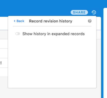
The right column of the expanded view where the revision history and comments are shown needs some UX improvements. Currently I feel I cannot invite clients of ours to use the comments as means of communication, because this view is far too cluttered with irrelevant information of rev. history.
It’d be great if I was able to only see comments, next to each other. Even better would be if I could actively toggle on to see the revision history. In my context, comments are far more useful than the rev. history.

Separate comments and revision history
 +12
+12

Enter your E-mail address. We'll send you an e-mail with instructions to reset your password.