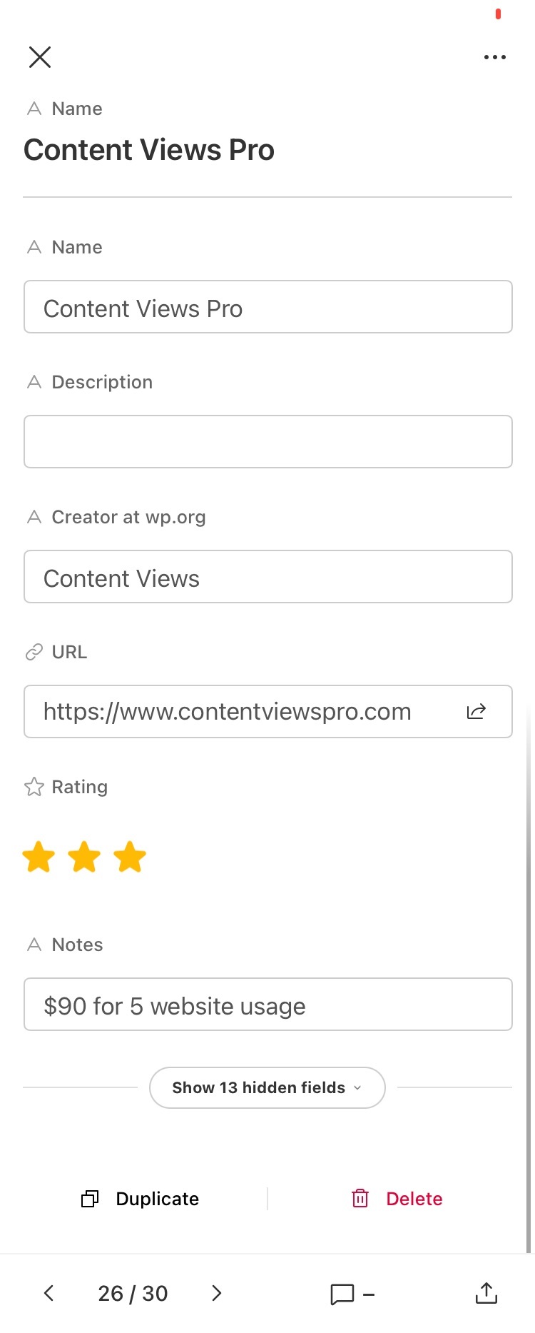
The flat design that airtable now has for their iphone app, is making the usability worse and rubbish.
Now there is a newly lost sense of hierarchy, there is too much visual noise and the vis-a-vis pairing of keys to their corresponding values, is now lost.
Can the old design be put back?


