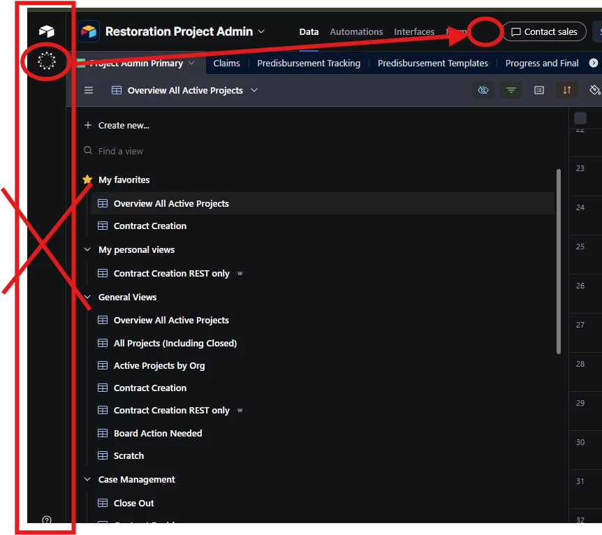
The left sidebar, which contains nothing but the new LLM button, can no longer be collapsed. In an interface that is essentially a series of excel-like rows and tables, every inch of my screen is valuable, especially on a laptop screen. This bar of empty space actively slows down my workflow as it increases the amount of scrolling sideways I have to do, and it also throws off my muscle memory by moving all of the tabs over, and pushes the actual useful information on the left side of the screen away from the edge of the screen where I am used to finding it.
Please add an option to move the LLM button to the top right, next to the base history and contact sales buttons, where there is a ton of empty space already. Or, add an option to minimize the sidebar, like we used to be able to. Or better yet, give us an option to hide the LLM button entirely if we are not interested in using it.
I know every CEO believes that LLMs are the next big thing that must be included in any technology, but using up the entire left side of the screen to smash it into our disinterested faces is a bad move, from the perspective of one user who uses Airtable 6 hours a day and is asked annually if Airtable is still worth our department’s (substantial) annual subscription fee.