I am trying to make a graph that will demonstrate clients that are coming to these mandatory briefings, however I have to use two date fields to represent their attendance since each client has two opportunities to attend one of their mandatory briefings.
The fields are:
ISSUANCE BRIEFING (1st ATTEMPT)
ISSUANCE BRIEFING (2nd ATTEMPT)
and there is
IB1 Attended <-- Single Select field that is for selecting Attended or not Attended for the first briefing
IB2 Attended <-- Single Select field that is for selecting Attended or not Attended for the second briefing.
Due to AirTable limitations, I cannot easily show in a bar graph where it has a combination of all people attending each briefing, and can be grouped by attended and not attended and/or distinguish how many people in this meeting are going to their first attempt or second.
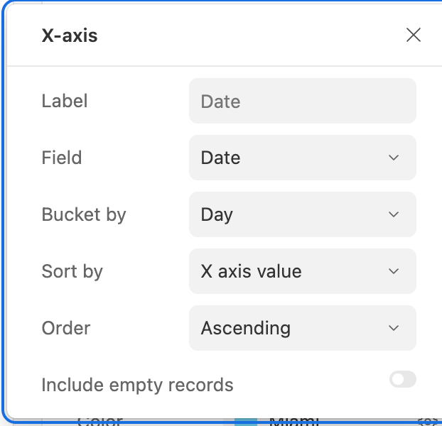
AirTable forces only one X value.
So I am looking for automations or ways to visually represent this data.
Drew


