
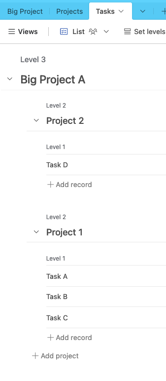
Love the new list view in the interface designer that allows for hierarchies of info, however I'm having an issue w/ formatting!  I've noticed that if I have more than 2 levels, it's the second level that has the bolded, larger heading text. This not only makes no sense, but it looks horrible and makes it visually hard to digest when one record starts and another ends in a long status list. Is there a way to make the top level have the bold heading text? 

Hm, could you share a screenshot of what you see?  This is what I see which seems to make sense to me:


Hm, could you share a screenshot of what you see?  This is what I see which seems to make sense to me:


Well, it would be great if mine looked like that, but no matter what I do it turns out like this:


Well, it would be great if mine looked like that, but no matter what I do it turns out like this:


That's...so interesting.  If you could invite me to an example base I'd love to take a look at this to see what I could figure out


That's...so interesting.  If you could invite me to an example base I'd love to take a look at this to see what I could figure out


Shared via PM.


That's...so interesting.  If you could invite me to an example base I'd love to take a look at this to see what I could figure out


Follow up!  It turned out it was due to the field we were displaying being a long text field.  Once we converted it into a single line text field it displayed as expected!


For anyone following this thread - this workaround should no longer be needed. If a long text field is the first visible field at levels 2 or 3, the List will show it with the same larger text style that you get with single-line text fields.


Reply