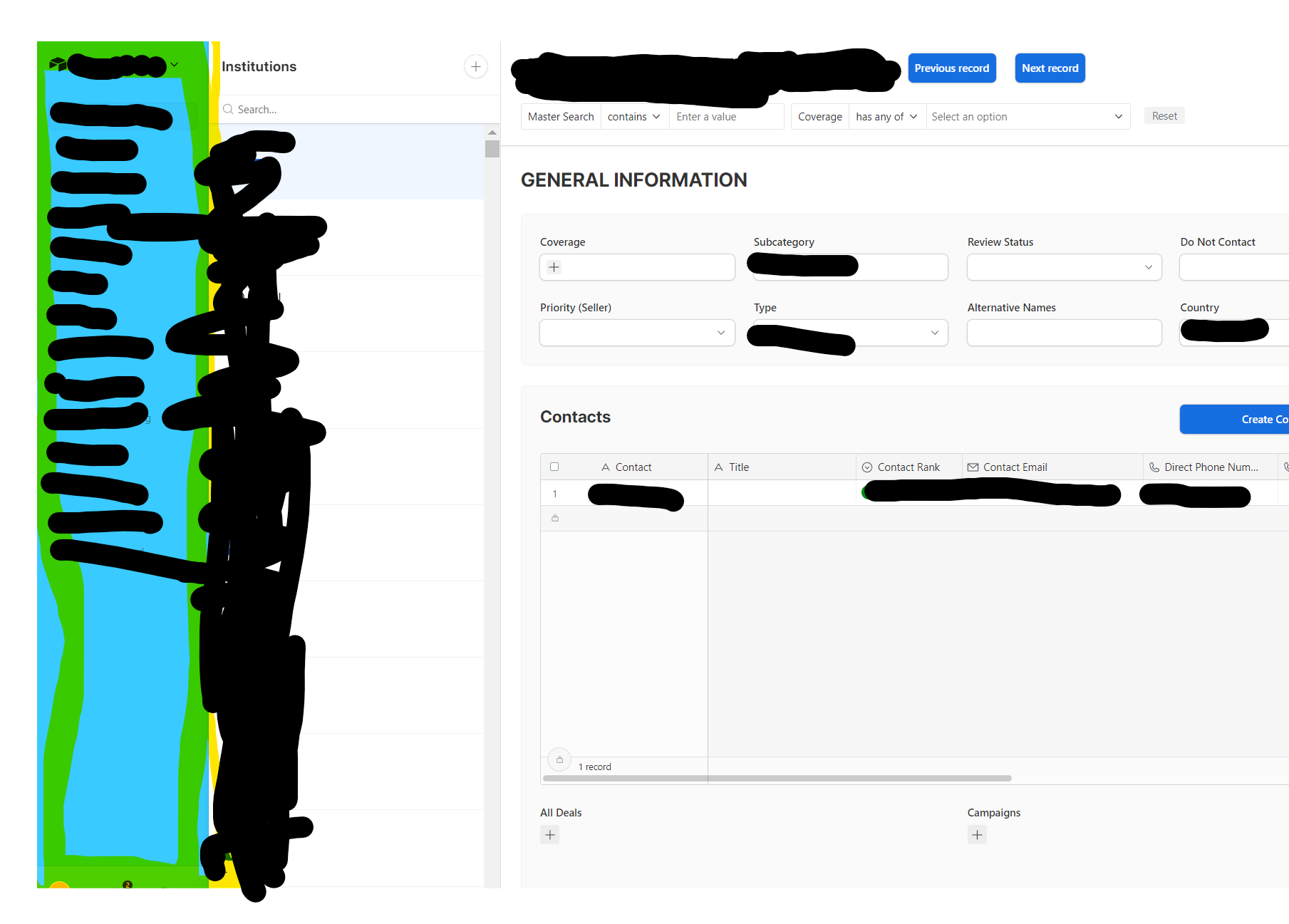
Previously had the blue bar highlighted on the left on the with each subsection to chose from and this was originally show across the top bar. Unfortunately, Airtable recently updated their format and now this bar appears on the left side as shown and the format is much worse. Has anyone run into this issue and is there an easy fix? Really annoyed that Airtable is changing Interface designs.. Thanks! 


Post in this thread: https://community.airtable.com/t5/announcements/introducing-new-ways-to-harness-the-power-of-ai-build-apps-and/ba-p/153034


Supposedly I saw an announcement they are rethinking this entire left side bar.  (I SO HOPE SO) cause honestly it's a terrible waste of real estate, especially for those of us that create our own navigation so folks don't go places they are not supposed.


Supposedly I saw an announcement they are rethinking this entire left side bar.  (I SO HOPE SO) cause honestly it's a terrible waste of real estate, especially for those of us that create our own navigation so folks don't go places they are not supposed.


@RonniEloff_VKDe Be sure to post in the official thread on this topic. Nobody from Airtable is seeing your comments here, and quite honestly, they probably aren’t reading comments in the official thread, either. 


Reply