Hi Airtable Community,
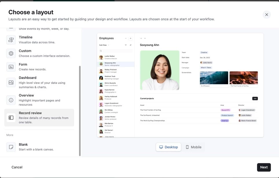
I’m trying to reproduce the Record Review layout shown in Airtable’s setup preview, the one with an employee list on the left and a large profile card on the right. In that preview image, the record detail area shows:
A profile picture (Attachment field) on the left
And, directly to the right of it, several fields like “Team,” “Start Date,” and “Manager” displayed inline, where the field label and its value appear on the same horizontal line, for example:
Team: Creative
Start date: Dec 28 2022
Manager: Julia Harris
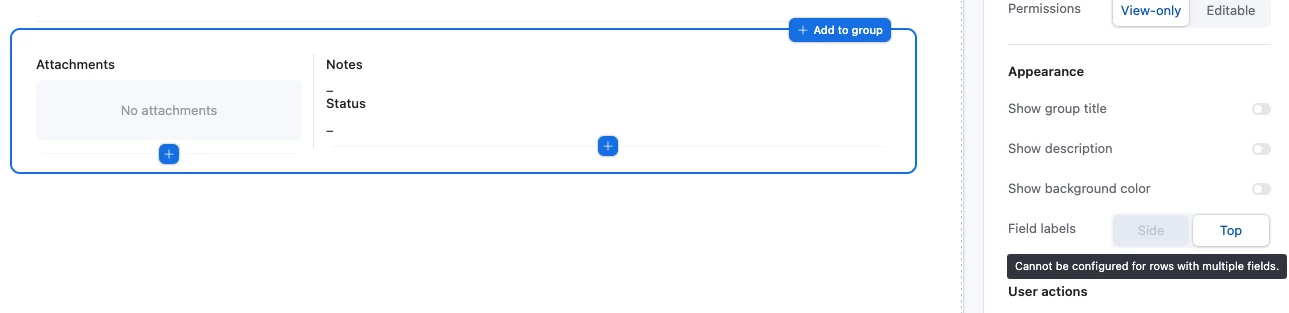
I’m attempting to achieve this exact side-by-side layout in my own Interface. Here’s what I currently have:
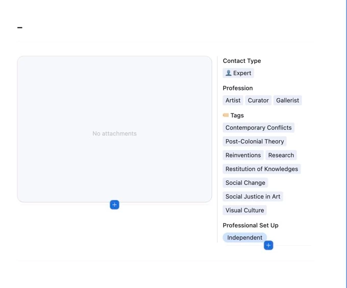
I’ve successfully positioned the Attachment field (Profile Picture) on the left, and I can place other fields (such as “Contact Type”) to its right.
I’ve set the Style of “Contact Type” to Pills, which correctly displays the values (“Expert | Partner”).
However, the field label (“Contact Type”) always appears above the values rather than beside them.
In other words, the current behaviour in my Interface is:
Contact Type
Expert
Whereas in Airtable’s Record Review preview, it would appear inline like this:
Contact Type: Expert | Partner
The only label controls I can find are:
“Show labels for entire row”
“Hide labels for entire row”
…but there doesn’t seem to be an option for inline label-and-value display (label and value on the same line).
Any help would be greatly welcome
Thanks
Ladi