
Is there a way to make a graph with multiple sources of data. E.g. two y values (same data type). Seems like it should be easy! Many thanks

Solved
Charts with multiple data sources
Best answer by Bill_French
Hi Tanya, and welcome to the community!
I don’t believe this is possible with Airtable’s Chart Block, but since Vega-Lite supports multi-layered charts and there’s a new beta block for Vega-Lite, I suspect this may be possible. I think you’re after something like this -
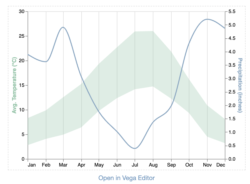
Even if this doesn’t help for this requirement, you should get the Vega-Lite beta block if you’re into data visualization and looking for ways to break the bounds of the Chart Block. Even though it’s “beta”, there’s a link to sign up and get access in your account immediately via the form.
This topic has been closed for replies.


Enter your E-mail address. We'll send you an e-mail with instructions to reset your password.