Help

Changes to Sidesheet Behavior

Topic Labels: Interface Designer
14846 45
cancel
Showing results for 
Search instead for 
Did you mean: 

@Phil_Rose @LarsJohnson 

I'm not sure who to direct this to, so I hope one of you can help.

I need to get some idea of what is going on with the changes that seem to be going on.  I have a interface designed for a client, and finally have reached the point were I am getting to have them upgrade their production account.  To get ready I needed to make some final changes based on their feedback using my test account.

I needed to add some list pages with sidesheets that are where some fields are made editable.  The ones I have on the existing test interface were easy to format and allowed resizing of the fields as well as positioning several on a line.  A partial section looks like
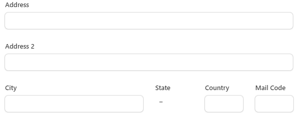
BillH_0-1689362164803.png

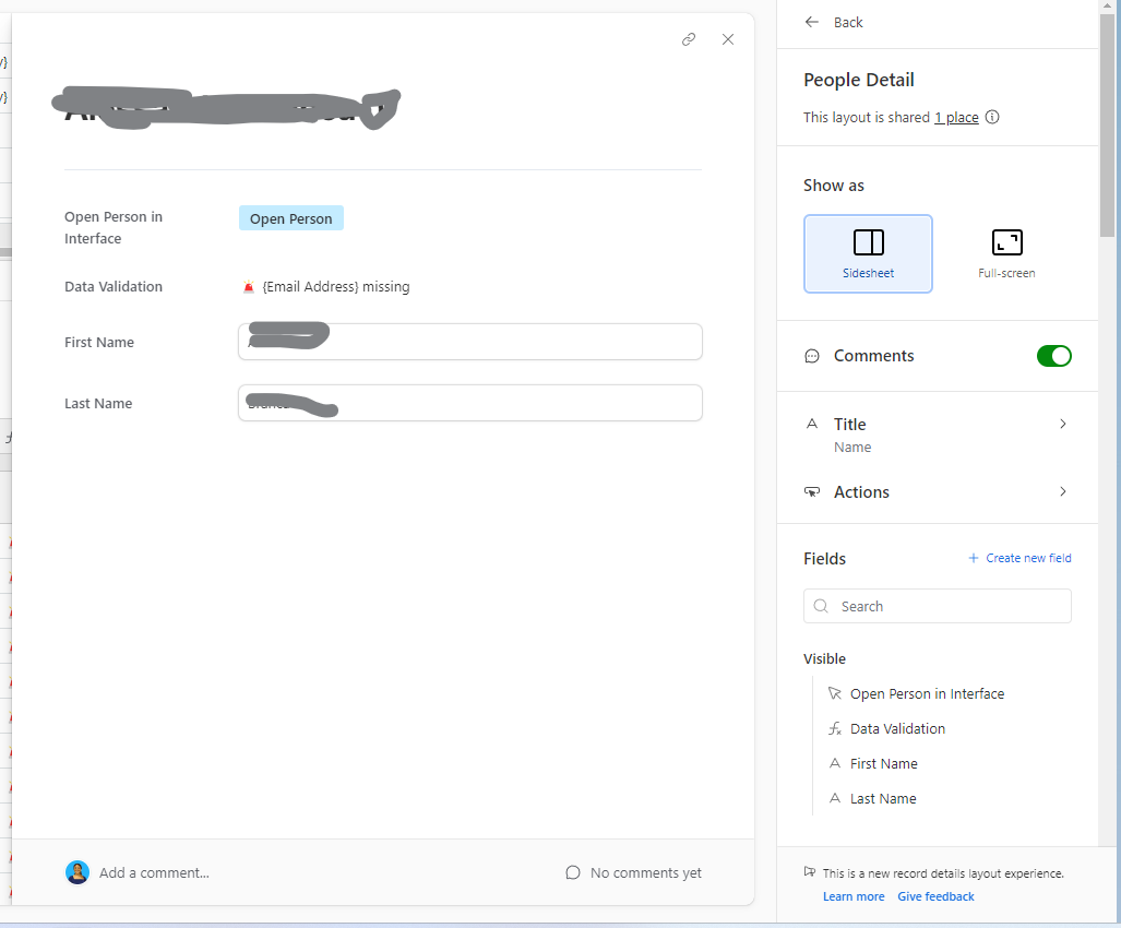
With the changes that have been made all I can do is stack the fields with the labels to the left 

BillH_1-1689362283854.png

This is totally unacceptable.  I know it looks like a minor thing, but this was only the simplest example.  When you multiply the issue over the number of fields and pages it's much more serious.

It's taken months to get everyone in agreement on how this is to look and behave, and now I can't deliver what they agreed upon.  

Please let me know that you will be rolling back these changes.


45 Replies 45
Joseph_Roza
7 - App Architect
7 - App Architect

I just experienced this too. Are they removing the ability to have custom sidesheets, or are they all going to be this boilerplate list? It's a huge step-back for flexibility.

Not everyone has access to them yet. Can you clarify any of the following so those who don’t see this behavior yet have a more complete idea of whats going on?

  • You mention side sheets, but that is one of two types of detail pages. Does this only affect your side sheets, or does it also affect your full screen detail pages as well?
  • Were existing detail pages modified, or is this only appearing on new detail pages you recently created?
  • Can non-field elements like charts, record pickers, etc. still be placed on the detail page? If so, do those go in sections or “loose” on the page?
  • Do fields have to be in a section to be on the page? Like, if you want to avoid the section behavior is that possible?
  • Other screenshots show a toggle for “column” and “row”-based sections. I suspect you are reffering to the column layout. What do the row sections look like?
  • Is this behavior only in place of you drag from the right side bar, or does it also affect layouts if you use the “Add element” floating menu at the bottom right?
Joseph_Roza
7 - App Architect
7 - App Architect
  • You mention side sheets, but that is one of two types of detail pages. Does this only affect your side sheets, or does it also affect your full screen detail pages as well?

This also affects full screen. 


  • Were existing detail pages modified, or is this only appearing on new detail pages you recently created?

It appears to only affect new detail pages. Not existing. 


  • Can non-field elements like charts, record pickers, etc. still be placed on the detail page? If so, do those go in sections or “loose” on the page?

Nope. Maybe they plan on implementing? I don’t know, but they’re not available right now. 


  • Do fields have to be in a section to be on the page? Like, if you want to avoid the section behavior is that possible?

I’m not sure what you mean. 


  • Other screenshots show a toggle for “column” and “row”-based sections. I suspect you are reffering to the column layout. What do the row sections look like?

I didn’t see this, but maybe it’s being rolled out?

  • Is this behavior only in place of you drag from the right side bar, or does it also affect layouts if you use the “Add element” floating menu at the bottom right?

There is no more ‘Add Element’ section. 

  • You mention side sheets, but that is one of two types of detail pages. Does this only affect your side sheets, or does it also affect your full screen detail pages as well? 

The behavior is the same whether it's a sidesheet or full screen.

  • Were existing detail pages modified, or is this only appearing on new detail pages you recently created?

So far it is limited to new pages, but I'm hesitant to experiment on the existing pages until I get some response from airtable.  I've wasted a lot time today trying to figure out what was going on with the pages I was creating and what might be different about them, hoping to find a solution.

  • Can non-field elements like charts, record pickers, etc. still be placed on the detail page? If so, do those go in sections or “loose” on the page?

I don't use any of those, it's supposed to be a simple data page.


  • Do fields have to be in a section to be on the page? Like, if you want to avoid the section behavior is that possible?

There are no sections on the page.  Are we talking about the same sheets?


  • Other screenshots show a toggle for “column” and “row”-based sections. I suspect you are reffering to the column layout. What do the row sections look like?

What screenshots?  I'm referring to the simple sidesheet, that's all.

  • Is this behavior only in place of you drag from the right side bar, or does it also affect layouts if you use the “Add element” floating menu at the bottom right?

I didn't drag anything, and there is no "Add element" floating menu.

kuovonne
18 - Pluto
18 - Pluto

Wow. This is a really horrible change. The blue "+ Add element" button no longer appears when designing a new side-sheet. (Previously created side sheets seem to be okay, but I am afraid to touch them.) I can only add fields for the current record using the configuration panel on the right. It's like a throwback to the old record expanded view.

kuovonne_0-1689374312674.png

This button is missing when I am working on a new side-sheet or full-screen record details!

kuovonne_1-1689374727981.png

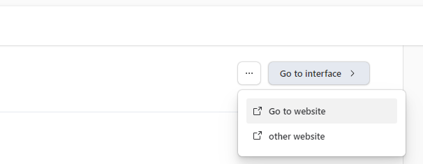
I cannot put a button wherever I want--buttons can only go at the top of a section, and if there is more than one button, it goes in a menu. What the heck? I should be able to put buttons next to the data that they relate to. I have some side sheets with multiple buttons that need to be pushed in a workflow as a person fills in data. Users fill in data, push a button, fill in more data, push another button, fill in more data, and then push another button. Properly for the workflow, the button should appear in the same section as the data, but below the data. But this design groups all for a section together at the top of the section, and even hides buttons.

kuovonne_2-1689375067776.png


These changes aren't even tied the new page layouts. I started this interface page as a blank page and started adding in elements, including elements from multiple tables.


When designing my side-sheets, I often used a two-column design. The left column was for editable values. The right column included help text and formula fields that provided feedback on the editable values. For example, if two of three fields needed values, my formula field would give warnings if only one was filled out. I also put lesser used editable fields in the right column (for example, overrides) so that those fields were out of the way when normally scanning down a column of fields to enter. My users found these designs intuitive and easy to use. They liked the help text and the formula feedback next to where they did data entry, but out of the way of the normal flow. I can no longer create these designs.

I am feeling very angry about this.


@ScottWorld Care to share your thoughts on this change?

Kamille_Parks
16 - Uranus
16 - Uranus

Reposting here for visibility, the below was originally posted here.

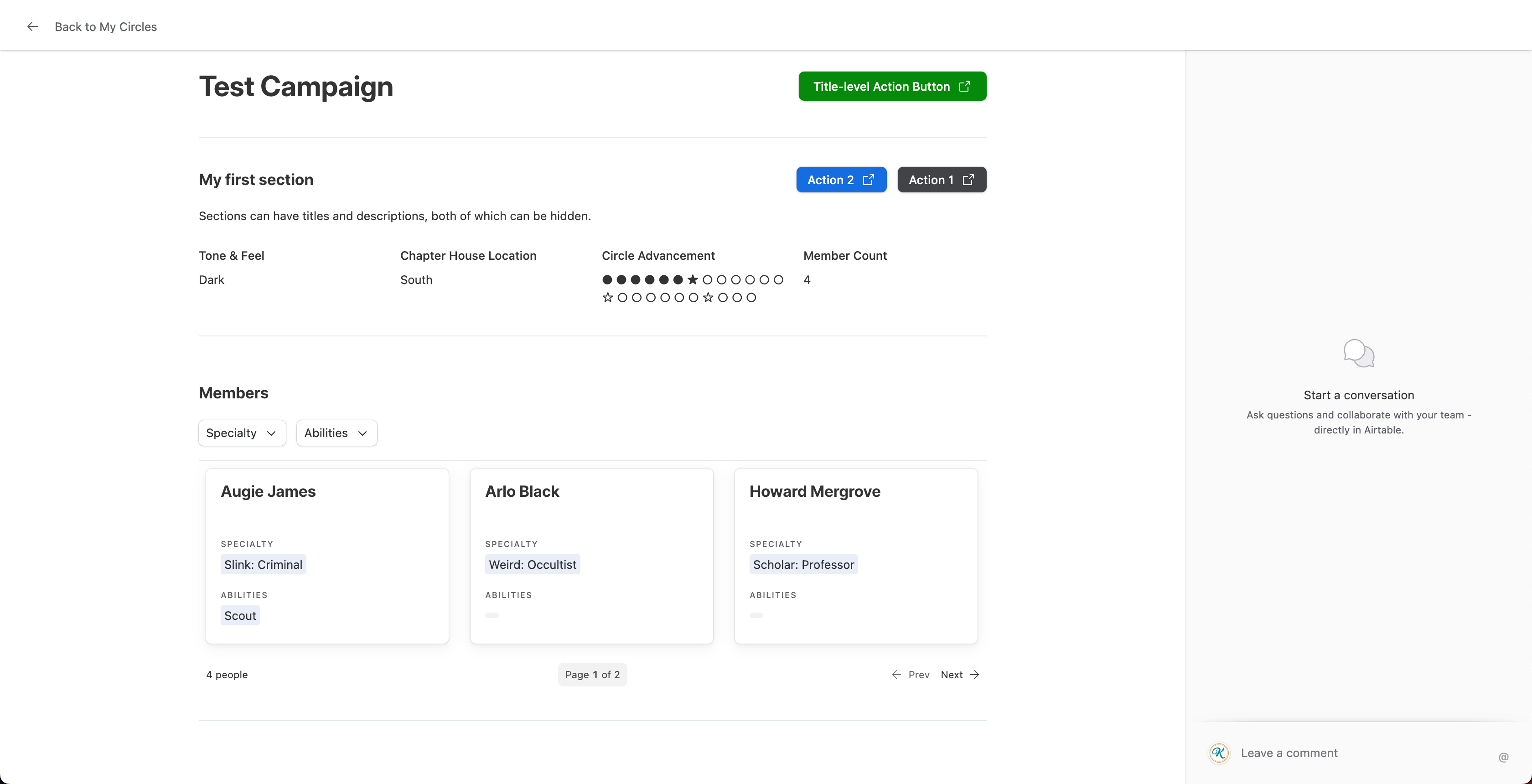
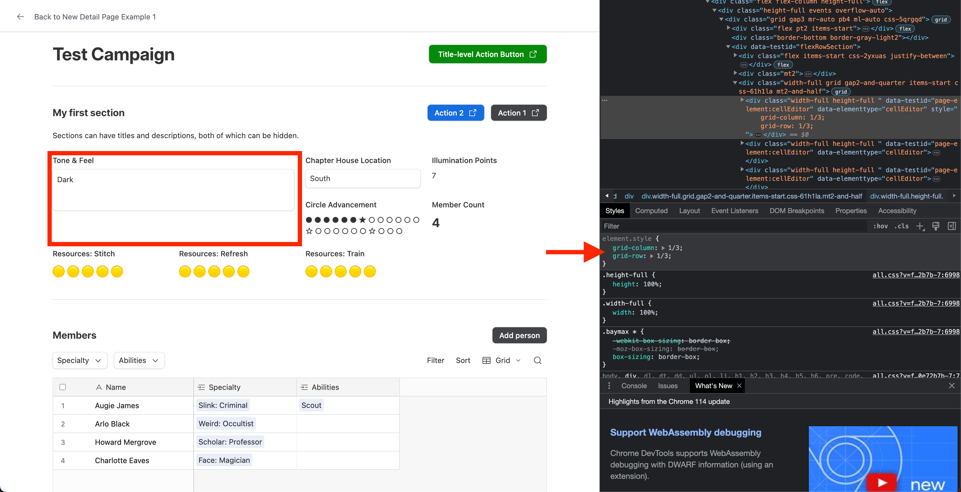
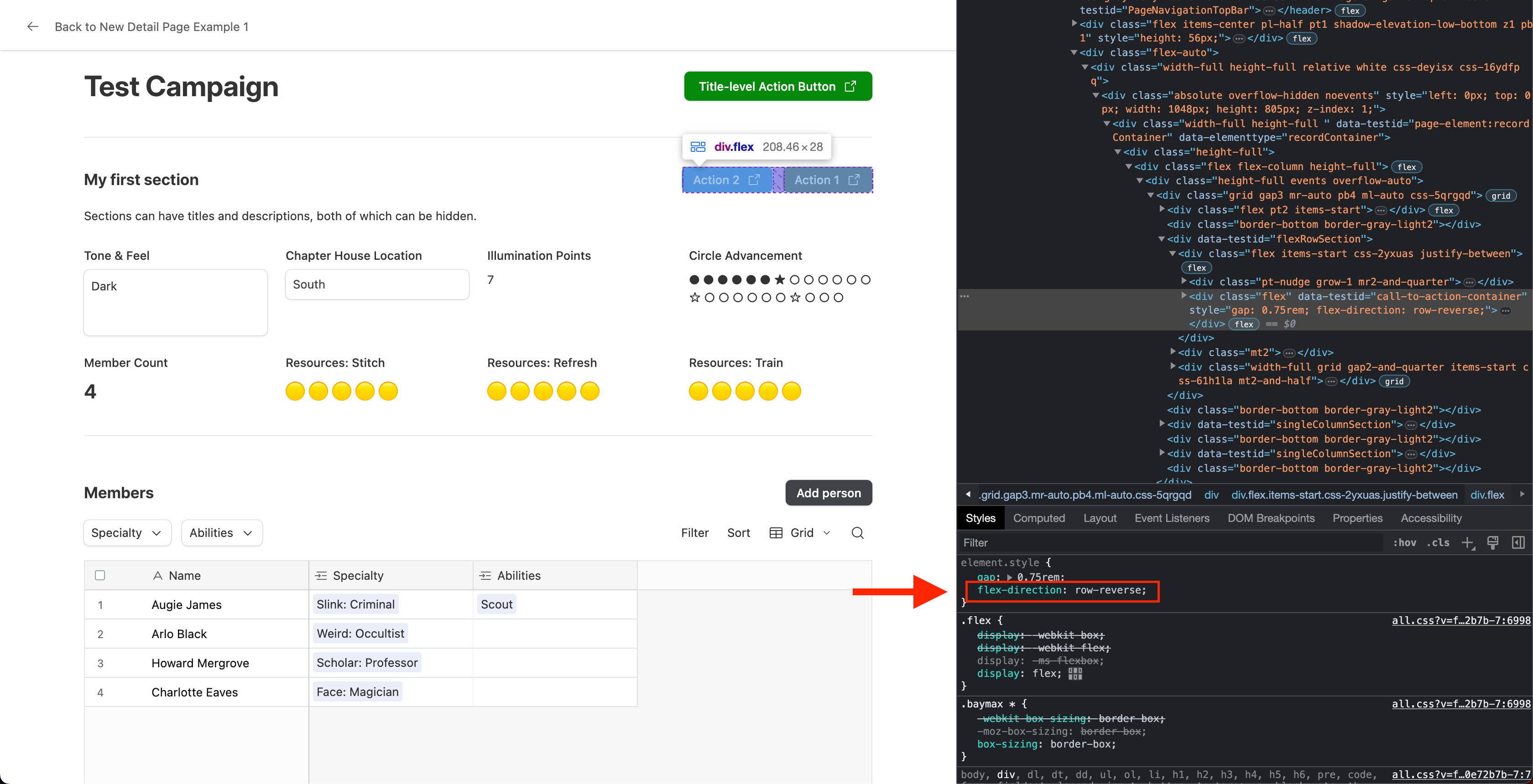
I now have access to the new layouts and have a few thoughts. Here is a screenshot of a full page detail layout for reference:

Screenshot 2023-07-14 at 4.26.10 PM.png


Positives:

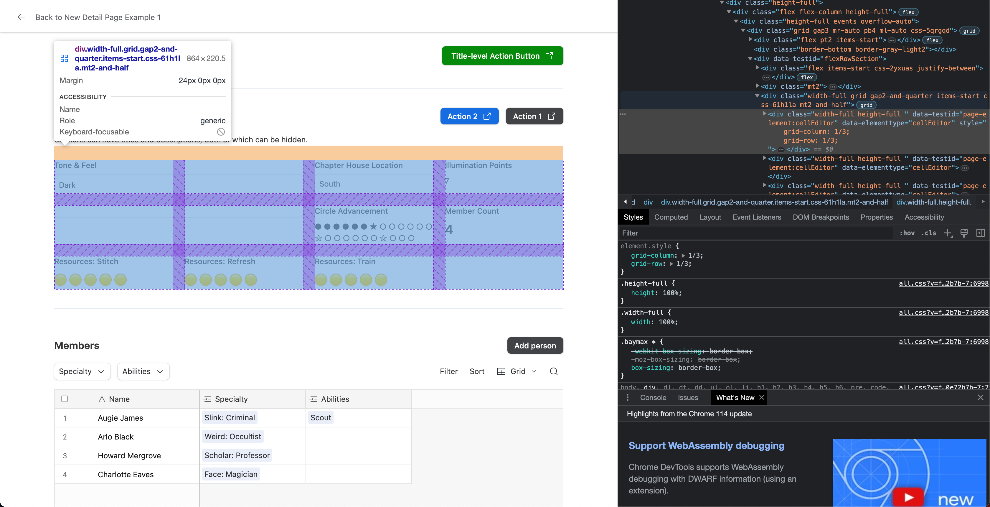
  • You can still make fields side-by-side. For whatever fields are visible, you add them to a section and make that section use row instead of column.
  • Sections can have titles and descriptions, both of which can be turned off section by section. Descriptions can use rich text, and titles have 2 size options.
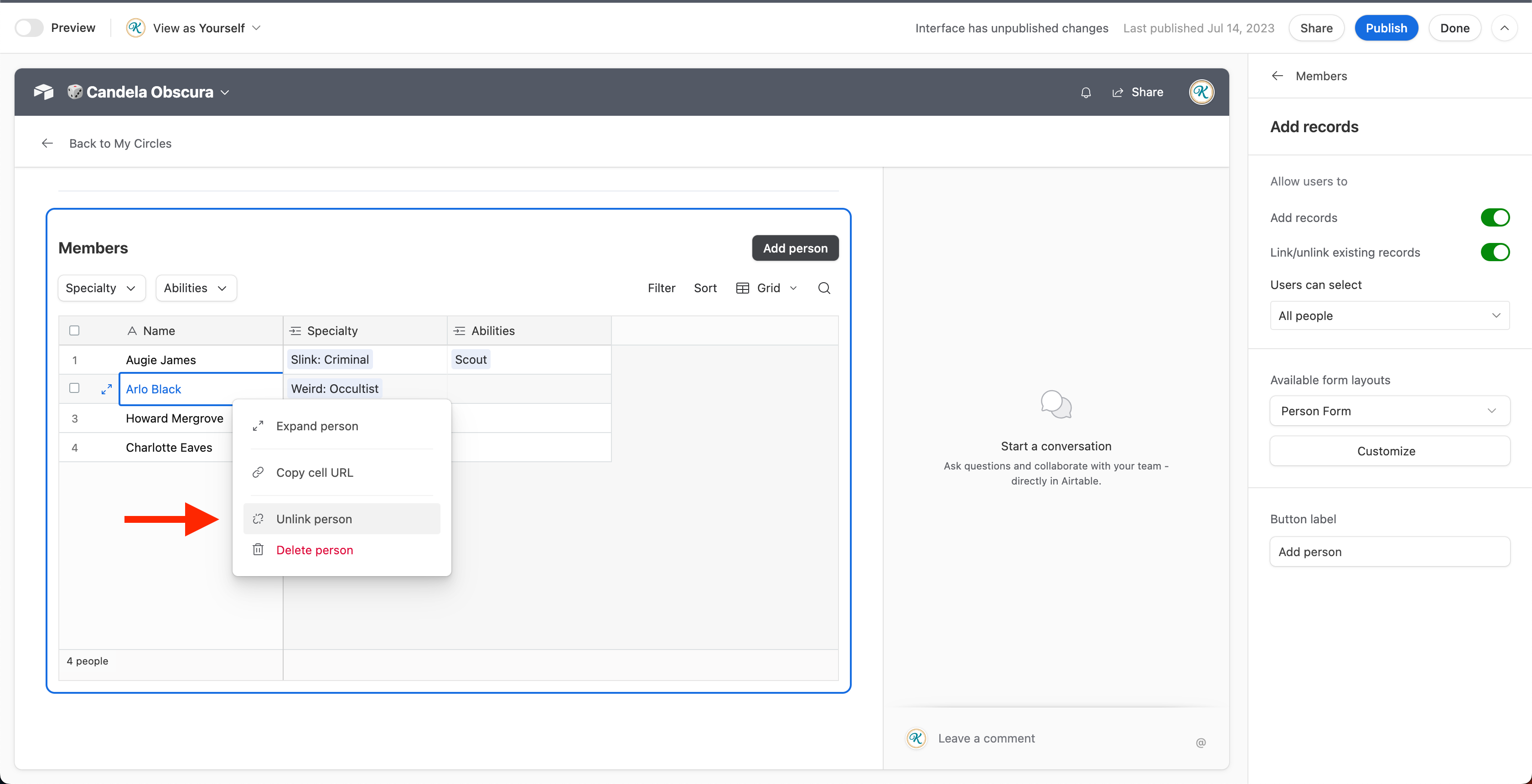
  • When you add a linked record field, you have the option of changing its display from cards or pills, to grids, galleries, etc. See the image example for "Members".
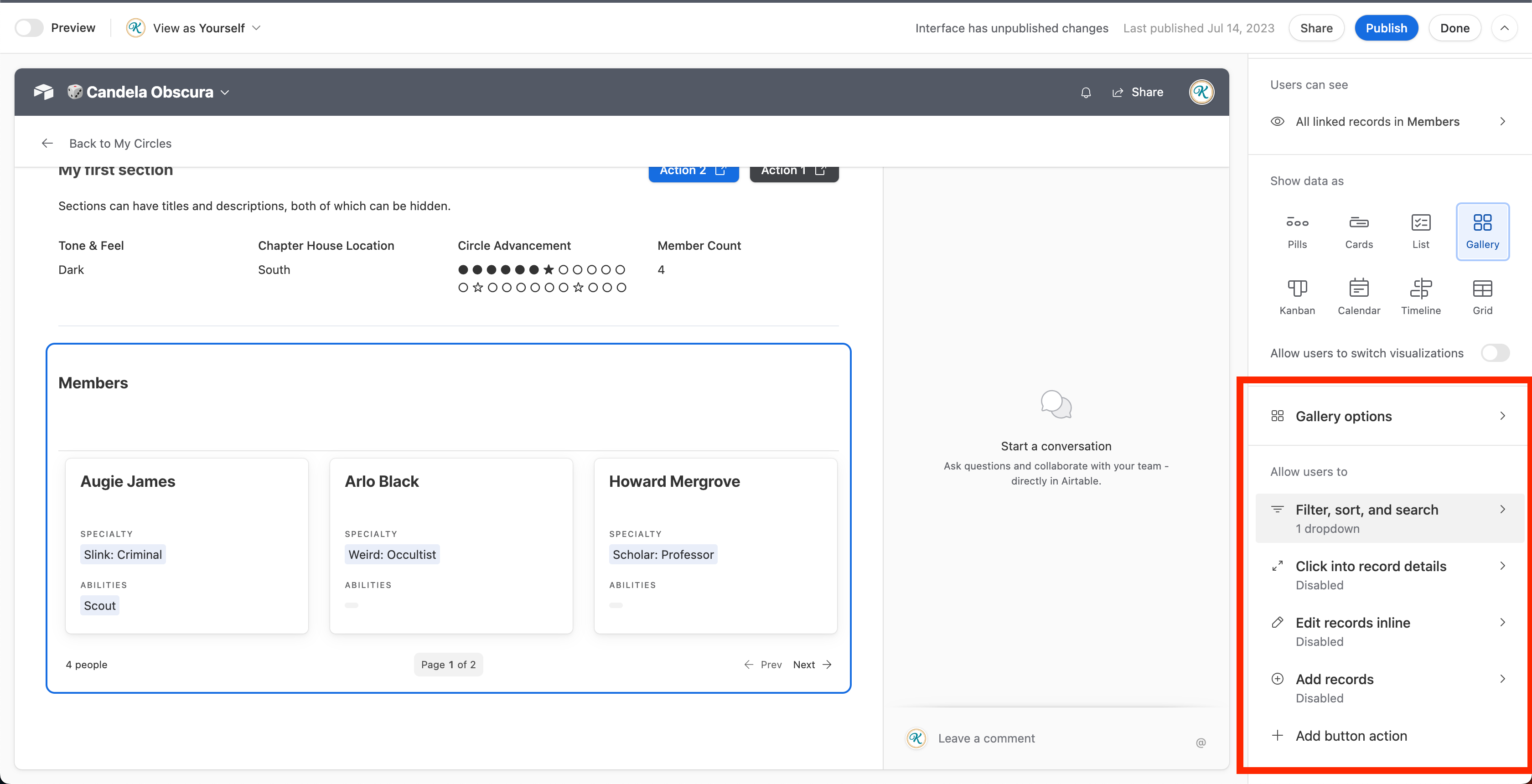
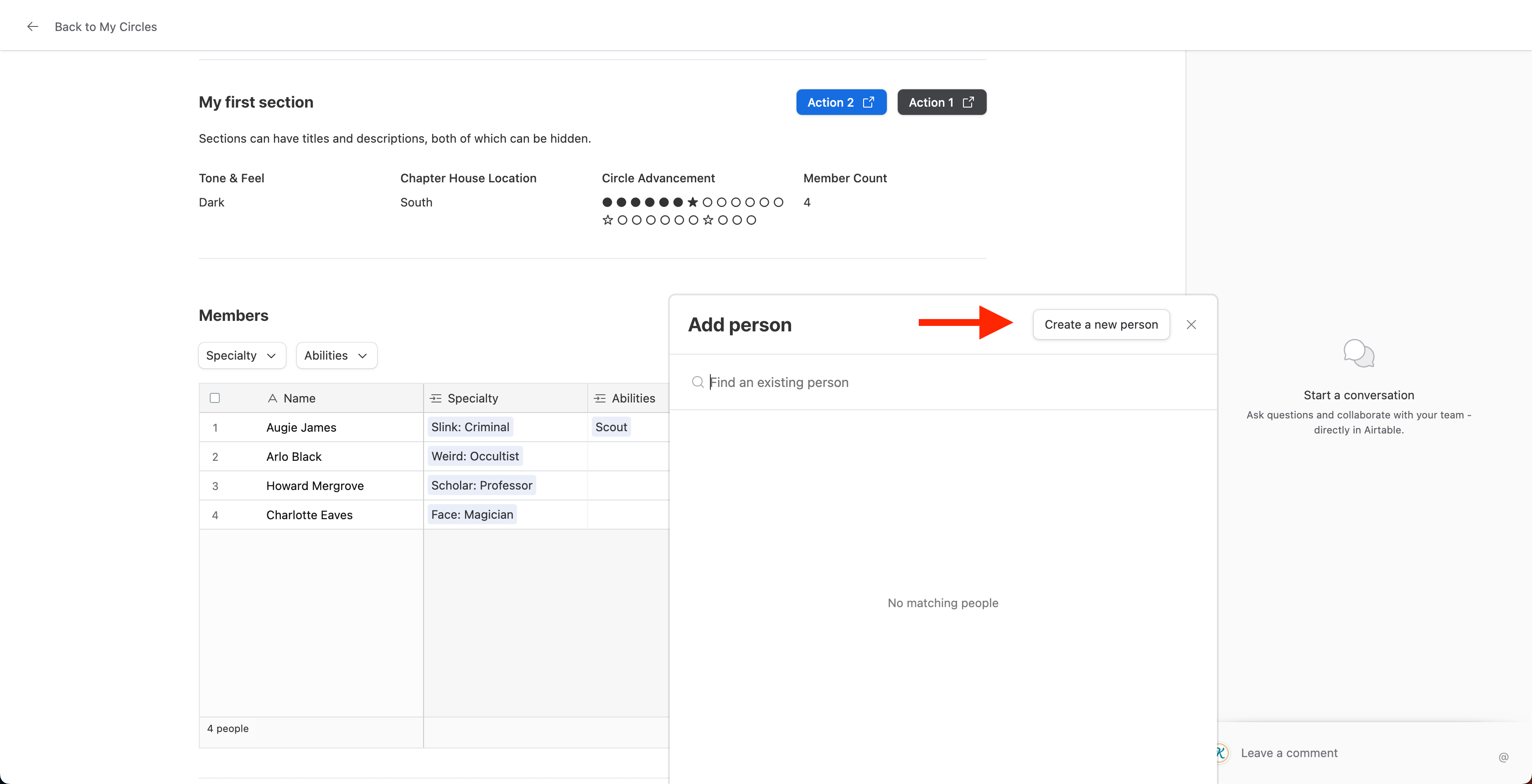
  • If you do the above, you can use Tabs/Dopdowns filter like you can on the newer "full" interface pages. **Very helpful,** likely the best part about the changes in my book, and something many have been requesting. See screenshot below.

Screenshot 2023-07-14 at 4.17.49 PM.png


  • None of my existing detail pages have been changed. The options are only there for brand new detail pages.


Major Negatives (my personal opinion):

  • While yes, you can still have horizontally placed fields, you have to create a section for each row, select the "row" option instead of the default (which is column).
    • You also can't decide which field should be what width. The field width is evenly distributed, which will not work in all cases.
    • The maximum number of side-by-side fields is 4, the 5th and so on fields will wrap to a new row. That's not inherently bad, but again I have no control on the width of fields.
  •  It doesn't seem like sections in full-screen detail pages can span the full width of the page anymore. There used to be options for "narrow" and "wide" rows, now we can only have narrow sections but not wide sections. I have a lot of screen real estate and I want to use it, but can't.
  • Colored backgrounds are gone. They were helpful in visually breaking up pages.
  • You can't make the title of the page/record sticky (remain in view on scroll, as the back button is) anymore.
  • Record Pickers aren't placeable anymore. Neither are arbitrary text elements (which appear by default as Section titles/descriptions) or dividers or filters, but that is trivial (to me) than not being able to place a record picker. Since filters get baked into the liked record elements, that one isn't such a negative to me.

Nitpicking (still my personal opinion):

  • Action buttons applied to sections feel backwards to me. The first button I added is named "Action 1". As you can see, the more buttons you add, the get added to the left. In left-to-right languages, it feels like that should be the other way around. Minor, but strange.
  • While I appreciate the placement of comments in the fullscreen and side sheet layout (comments are optional, and can be turned off), it would be better to allow multiple different options for this. Maybe I want comments to be at the bottom and not the side. If their on the side as shown in the picture, I would like them to be collapsable.
  • Each section gets a divider put underneath it automatically. You can't turn this off, or adjust the spacing between sections. Would be great if you could.
  • Somebody out there probably wants to use a grid/gallery/etc. on a detail page that doesn't relate to linked records. That person isn't me, but that feature is now gone.

Potential:

  • Sections might open the door to anchor tags to allow you to direct link to a part of the page (i.e. a section at the bottom of a really long page). That would be very useful.
  • A more rigid building experience does mean it will be easier for Airtable to turn these into mobile-ready views, at least in theory.

In short:
Not as bad as I was expecting from looking at screenshots of un-designed pages, but worse than I'd like for the reasons above. I'm sure they can fix what I've pointed out, the question is will they (assuming many people agree that what I think are issues actually are issues)

Thank you @kuovonne you explained many of the issues I was afraid to even attempt, and some that I was far too upset to describe in detail.  

Even at the basic level, previously you could use the interface to create a form that was intuitive and followed a workflow, and with the sidesheet come very close to replicating the look and feel of the form.  Easy for onboarding users.  Not any longer I guess.

I also have buttons placed in sheets to update statuses based on conditions and if we can't position them correctly it's back to using automations and catching errors after the fact rather than controlling the flow.  

Where is the product management?  Where is the consideration for clients?  Airtable as an organization just doesn't get it. It's not just the people here, it all the potential clients, even enterprise level, that get enthused by prototypes and demos only to be permanently turned off by things like the left sidebar and this mess showing up without any warning.

@Kamille_Parks 

Thank you for your input.  I appreciate the positives you mention, but for a change like this there should have been advance warning.