Help

Announcing our new Help Center 📚

cancel
Showing results for 
Search instead for 
Did you mean: 
Jason
Airtable Employee
Airtable Employee

Browse the Help Center

Hi Airtable Community,

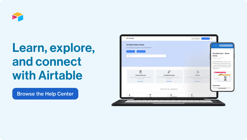
I’m excited to share that we have launched a brand new Help Center!

Airtable’s Help Center is the go-to learning resource to find documentation about every Airtable feature - from automation guides to formulas, our goal is to ensure the Help Center has the answers you need. And, if you aren’t finding the help you need, you can always get in touch with our Support team directly through the Help Center.

In the new experience, you’ll have access:

  • Improved search to more easily discover content
  • A dedicated page to see articles that have been recently updated
  • Better navigation to visually browse through specific product areas
  • Integrated article feedback to let us know how we can improve our content

Please head over to support.airtable.com to check it out and share your feedback (you’ll see a feedback option at the bottom of every article)!

21 Comments
Lauren_Briskin
6 - Interface Innovator

Hi! I'm afraid I can't find the feedback option at the bottom of each article (I think you mean the thumbs up/down option that then expands a feedback box, which is limited to 500 characters), but I wanted to share that, though I used to love and spend a lot of time with the forum/discussion, I'm now finding it quite difficult. A couple suggestions:

1.  Probably the biggest factor contributing to the disappointment with the updated UX. The scroll bar seems to be stylized into a narrow bar, which makes it very hard to "grab" and slide. (I've attached a screenshot.) As a user, I expect the scroll bar to be standard across the web and AT products (it doesn't look like this in the support hub or in bases), and I want to be able to use it without friction.Screenshot 2022-12-25 at 8.24.59 AM.png

2. Articles should open in the same tab (this is a best practice for accessibility). That way users can select if they want to open a link in a new tab, as opposed to forcing it.

3. This is possibly just a personal preference that doesn't bother anyone else, but there is a LOT going on now on each page- the search results page and the posts. For example, the big blue box at the top seems unnecessary, and then I have to scroll with that tricky scroll bar to get where I'm trying to be. There are tons of colors and words that I don't need or know what to do with- Icons before and after the user name, information next to and below the user name, the sidebar on the right of each comment that repeats information (See Solution in Thread, Comment Options, date), the giant "Kudos" button, the labels and recommendations, etc.The pages listing posts are similarly complicated with the orange announcement bar that I can't make go away, two sets of breadcrumbs, the GIANT blue box, the three grey boxes (with titles that seem overly complex- what is "Ask a Question" if it has 20801 posts? As a user, I expect it to be a link to start a post- ask a question, but it's not.) The names above the posts are similarly extraneous- what are the titles next to them and why do I care?

Overall, the UI seems unnecessarily complicated and that makes it hard to get to what a user really needs: the answers and discussion. 

Sorry for the long post- I would have sent this feedback privately but it is over 500 characters. I hope the scroll bar at least can be fixed.