Help

Formatting table for Likert ratings chart

Topic Labels: Base design Views
Solved
Jump to Solution
349 7
cancel
Showing results for 
Search instead for 
Did you mean: 
thezime
4 - Data Explorer
4 - Data Explorer

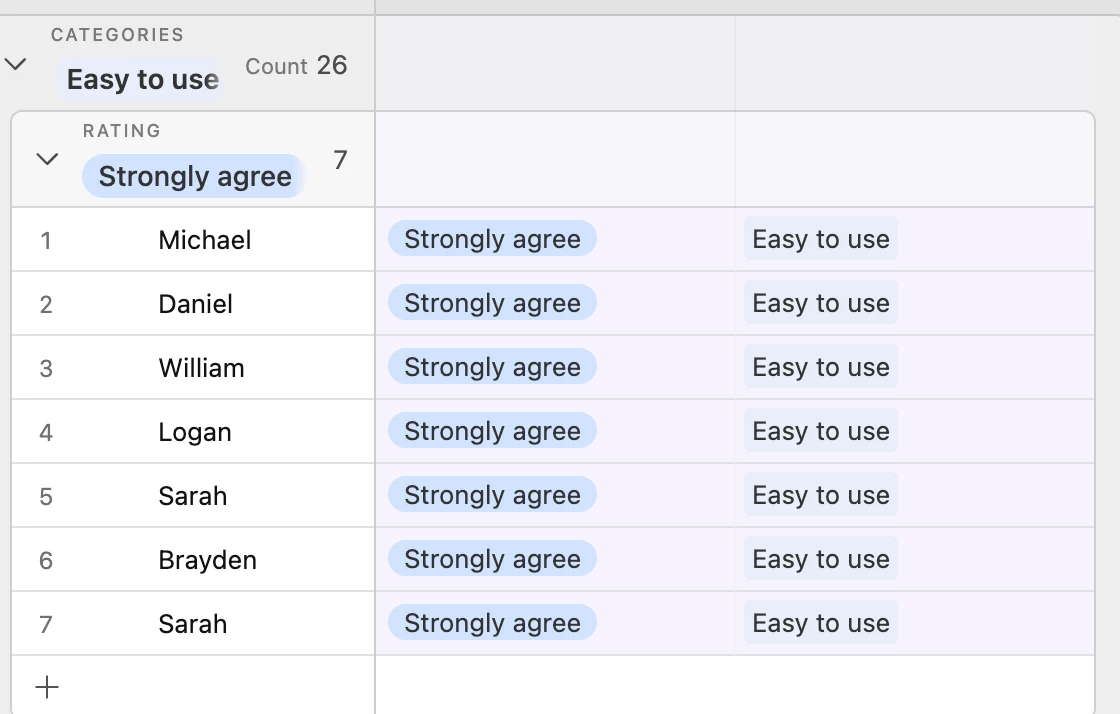
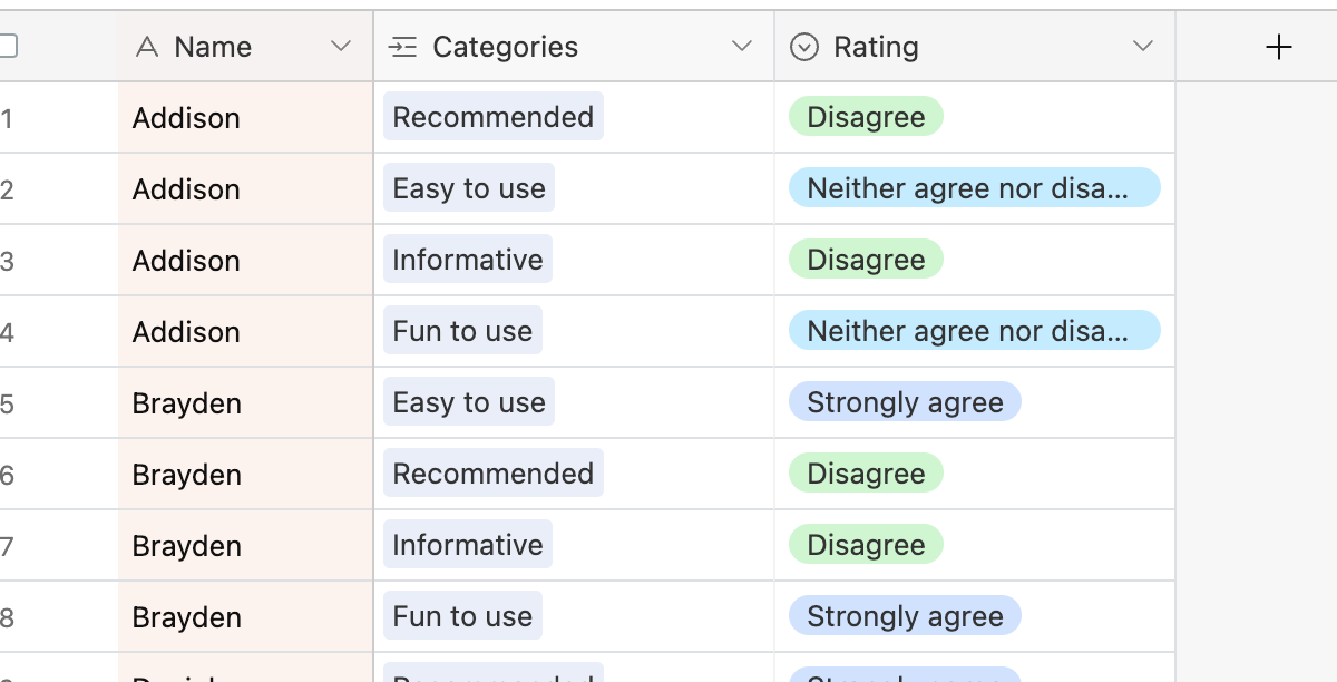
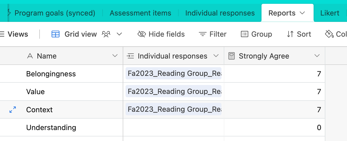
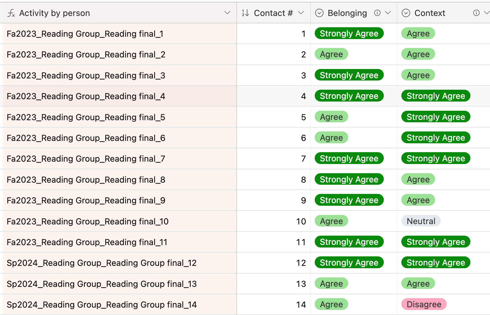
I have a base set up to log participant feedback after people attend a program. Respondents fill out a form and give ratings to questions related to different dimensions (belongingness, context, etc.); I currently have responses linked to activities and program profiles, which determine the specific dimensions that are presented in the survey.

Screenshot 2024-05-17 at 9.54.53 AM.png

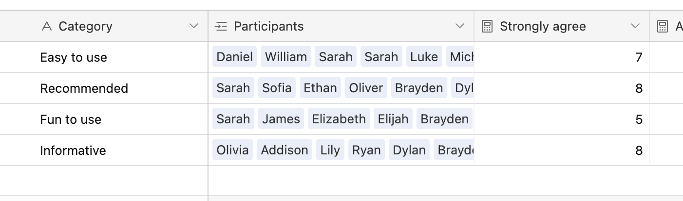
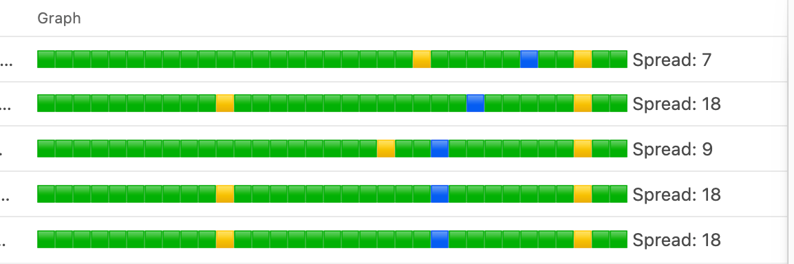
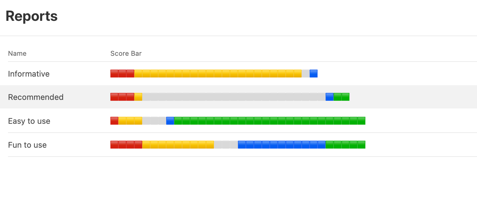
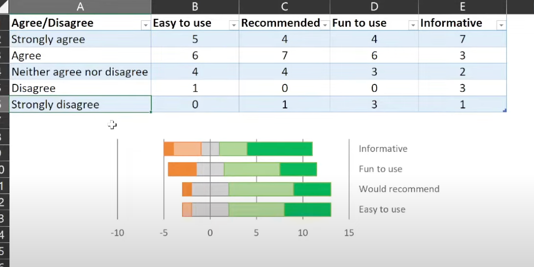
I want to make a Likert chart for each program that shows the distribution of ratings for each dimension. To do that, the response data needs to be arranged as below, where the cells are counts of the number of people giving each response for each dimension:

Screenshot 2024-05-17 at 9.59.25 AM.png

I've played with creating different views, experimented with rollups and formulas, but I haven't found an approach that gives me the output I need without requiring me to transcribe counts manually into the correct table format.

Any help or insight (ideally without requiring the purchase of additional extensions) is greatly appreciated!!

1 Solution

Accepted Solutions
Dan_Montoya
Community Manager
Community Manager

I changed the data to make sure everyone rated multiple dimensions.  The structure still works.Screenshot 2024-05-18 at 12.56.37 PM.png

Here there are 7 people who selected strongly agree to easy to use.

Screenshot 2024-05-18 at 12.59.05 PM.png

The  "Strongly Agree " column counts participants where Easy to use was set to Strongly agree.  


The problem is how your data is setup.  You have it setup where one survey response has all answers in a single row.

To be able to report using this type of model, each answer has to be on it's own row.

Screenshot 2024-05-18 at 1.03.54 PM.png

 You can use an automation to convert your data from a flat model to a model that has one survey item and ranking per row.

See Solution in Thread

7 Replies 7
Dan_Montoya
Community Manager
Community Manager
IF({finished grades},
 CONCATENATE(
   REPT("🟩", Low) & "🟨"  & 
  REPT("🟩", FLOOR({Average Score}) - Low) &"🟦"  & 
  REPT("🟩", High-FLOOR({Average Score}))& "🟨" & 
  REPT("🟩", 30-High) , " Spread: ", Spread), 
    "No Grades yet")

You can use a formula like this to generate bar graphs that look like what you are looking for.Screenshot 2024-05-17 at 2.19.28 PM.png


Hi @Dan_Montoya, and thanks so much for your reply. I'm relatively new to AirTable, so I'm having some trouble parsing the formula you shared. 

To apply this to my example, what do "Low" and "High" refer to? It looks like that is the number of times that I want the green block to repeat in order to determine the length of the interval. But how do I get that count (which I think would be the number of "strongly agrees" for a particular dimension in my example)?

And what does the FLOOR() function do? The formula description says that it returns an integer, but I have categorical data instead of an {Average Score} like your example...

So I understand the components of the formula you gave to generate the chart, but I don't see how to transform my data into a format where I have counts of the total number of times a response is given (across individuals) for each specific question/dimension (and calculated separately for each individual activity) 😬


Here is a more relevant example for you.


Screenshot 2024-05-17 at 5.10.17 PM.png


In that example, it looks like each person is only giving a rating for one dimension; so when you link to Reports and do the calculation for Strongly Agree, it's only counting "Strongly Agree" for the one dimension that person has entered. 

In my data, each person rates multiple dimensions. So when I link to a report name and then calculate "Strongly Agree", it counts "Strongly Agree" from all dimensions rather than just one. For example, if I'm looking at the Belongingness dimension, I set the count in the Reports table to only include linked records where Belongingness = Strongly Agree ; but then the "Value" dimension and the "Context" dimension just have the same counts as Belongingness that Strongly Agree column...

Screenshot 2024-05-18 at 12.39.55 PM.png

I'm sorry this isn't clicking for me. Maybe I've just been staring at it for too long, but I feel like I'm going in circles.

Dan_Montoya
Community Manager
Community Manager

I changed the data to make sure everyone rated multiple dimensions.  The structure still works.Screenshot 2024-05-18 at 12.56.37 PM.png

Here there are 7 people who selected strongly agree to easy to use.

Screenshot 2024-05-18 at 12.59.05 PM.png

The  "Strongly Agree " column counts participants where Easy to use was set to Strongly agree.  


The problem is how your data is setup.  You have it setup where one survey response has all answers in a single row.

To be able to report using this type of model, each answer has to be on it's own row.

Screenshot 2024-05-18 at 1.03.54 PM.png

 You can use an automation to convert your data from a flat model to a model that has one survey item and ranking per row.

ClarifyThis
5 - Automation Enthusiast

I agree with Dan regarding the data model: it's extremely difficult to materialise columns into rows using just the no-code elements of Airtable. Setting up automations to normalise your incoming data per Dan's is best

Otherwise, working with where it seems you're at right now (and noting that this is not ideal):

1. Make sure each Survey is its own record, in its own table of Surveys, and that each of the relevant survey responses is linked to the right Survey. (I can't tell if you already have this in your Base).

2. In the Survey table, create a Rollup field, rolling up the linked Responses records, of a dimension field (e.g. Belonging), with a condition on value (e.g. Belonging="Strongly Agree"), and your aggregation function will be COUNTALL(). 

3. Now you have to rinse and repeat, for each value, for each dimension... So if you have 4x dimensions each with 5x possible values, that's 20x fields...

You can already see why this is not ideal / scalable; hard-coding 'data' into columns is bad practice. This also will not work if you have many different dimensions between surveys, unless you genericise them to 'Q1, Q2, ...' However if the dimensions & their values are the same throughout all your surveys, it MAY be sufficient to tide you over without getting into automations.

4. In each Survey row, you should now have the right numbers (across potentially very many columns) to do whatever additional calculations you need, or ascii visuals like the one in Dan's original response. Each ascii chart will be a new formula, so you'll have 4x more formula columns for 4x dimensions.

Still, see if you can create time to get into automations, which will unlock better solution-making for you in general. But in the meantime, hope that helps you keep it in the no-code sphere of Airtable for you. And if all else fails, spreadsheet gluing (which I can see you've already got) will still get you through the next management presentation!

thezime
4 - Data Explorer
4 - Data Explorer

Thank you so much, @Dan_Montoya and @ClarifyThis -- I finally got it to work using an automation to convert the columns as Dan suggested ::triumphant::

I will definitely note that this is not the ideal setup (in contrast to what I'm used to in Excel and SPSS); with more reading and practice, maybe I can figure out a way to structure the dataset so that it is more straightforward without having to rely on the automation.