

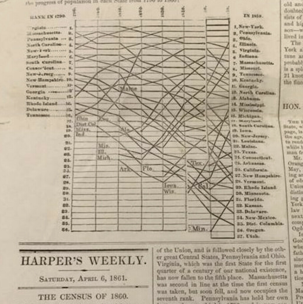
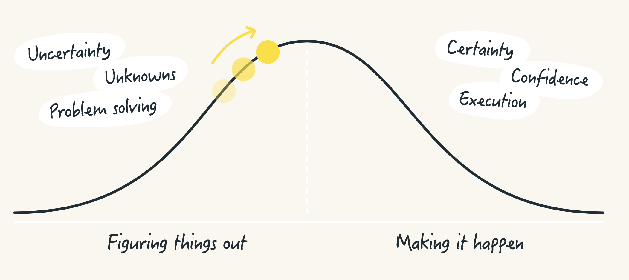
I love hill charts and I’ve used them with a number of clients. While the work at Basecamp was certainly inspirational, there are many instances of this data visualization that intersect with the basic concepts. It is truly an appealing visual and when people look at it, they get it immediately, not so much the case with the 1861 version, but certainly with modern versions.
Courtesy of Edward Tufte, here’s the first “hill chart” - 1861:
I’ve certainly derived original inspiration from other Tufte works and shaped new elements (simplification mostly) by Tufte and the folks at BaseCamp whose engineers describe it like this:
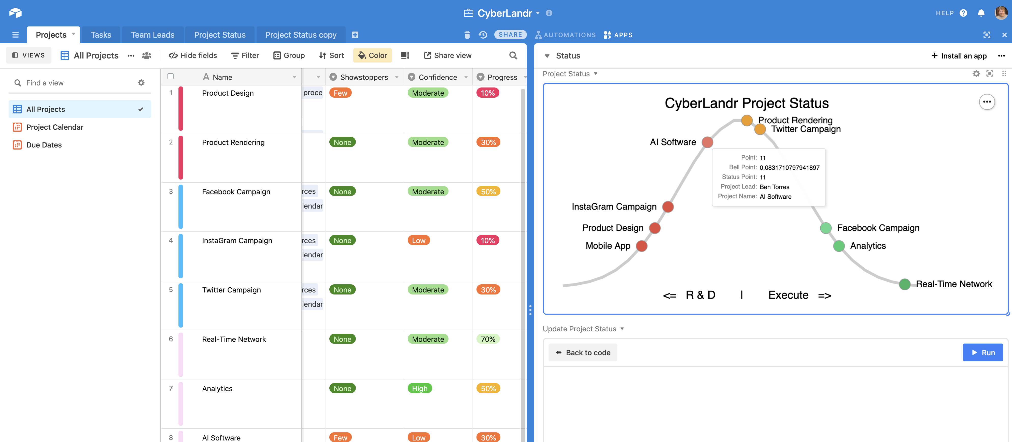
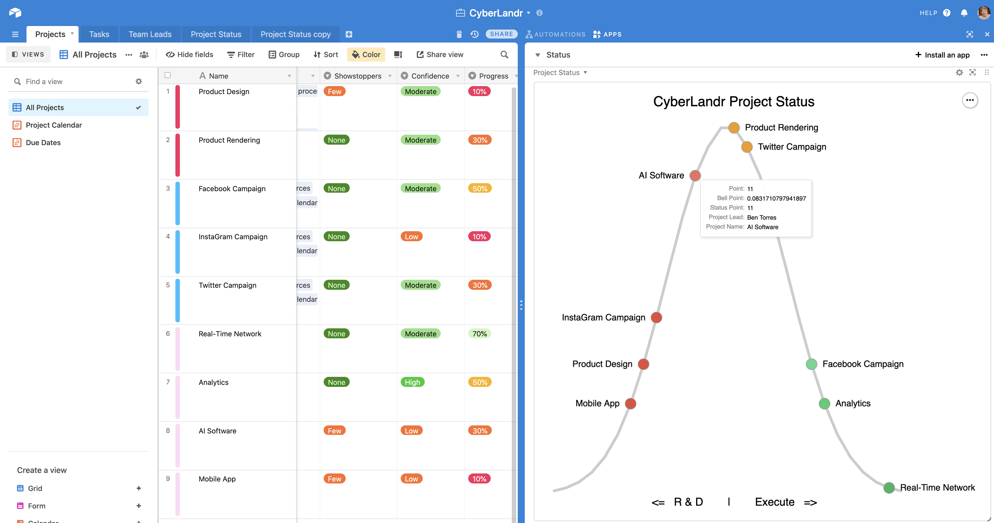
Here’s a recent example working in Airtable.
One of the issues with the Basecamp example is that it depends on human inputs over and above the usual and customary data collection in a project management process. Using actual project data to allow the projects to fall where they may instead of allowing users to influence placement on the hill or to forget to update the chart or allow people to make mistakes in estimating progress – is a mess waiting to happen.
Data Visualization Rule #1 - If the visualization is dependent on people who must drag a single control to show high-level project status, it will almost always be misleading.
Instead, I tend to fully automate hill chart interpretations based on status indications in the project management data. This could be a collection of sub-tasks, or a long list of classified tasks. Whatever the case, hill charts should ideally…
- Render objective measures as much as possible
- Do so automatically
- Be able to drill in to display increasingly granular views
#3 is critical for teams - they need to see the big picture and a similar vision that breaks the project into smaller chunks - i.e., classes of tasks should be plotted on the same hill.
By combining the new Vega-Lite charting feature with some relatively intricate javascript (through automation or script block), you can fashion a charting system that transforms your project data into a clean visual like this:
Can You Share a Copy?
No. Sorry. Unfortunately, it’s not that simple. The Vega code is 300 lines alone with many external dependencies.
This approach to seemingly very simple visuals is not a trivial undertaking, although I’m sure someone will do a far better job of making this a simple one-click reality someday. Bear in mind, this approach was created long before custom apps were possible and I suspect a React SDK version would be far simpler and a better place to implement this feature.
My approach requires an extremely complex collection of Vega layers embedded with conditions based on another set of Airtable conditions. Then there’s the script process that keeps the Airtable resources up to date. Lastly, there’s the normal distribution math (Gaussian algorithm) that is not easily performed in Airtable.
I shared this entire approach with a colleague last year and it resulted in an endless time-sink that cost me a week. It requires a lot of polish and documentation before it can be released openly. This is in a similar category to my research and solution for full-text indexing; I want to share it openly but doing so has proven to be a liability so I will do so only under a professional services project.
My approach is possible and anyone can tackle this - here are some hints.
- Vega layers - 5 in all; each of three-layer separates the distribution line, circles, and project names. Two additional layers provide right and left transformations. The layers are required for a host of reasons.
- Vega conditions - these serve to apply color and left/right renderings.
- Web service (or another script process) to fit a normal distribution curve of the dynamic array of tracked projects.
- An Airtable table to manage the rendered project data and provide the hover points in alignment with the normal distribution.
- Script action to update the table and interpret the status of each project.
For my clients who deeply care about project management, this is practical, but certainly not practical in every case. Cool doesn’t always mean practical when the price of cool is added complexity.
But… one thing that is undeniable is how well this visualization technique is appreciated by managers.