- Mark as New
- Bookmark
- Subscribe
- Subscribe to RSS Feed
- Permalink
- Report Inappropriate Content
Jun 10, 2020 02:56 PM
Team, I know in Project/program management “Gantt Chart” is often thought as the best tool to show and manage dependencies, but was curious if there are any other methods that are more useful. Most of our projects are related to Digital and Business transformation.
I have seen some examples of network diagram, dependency maps etc. Wanted to see if some one has used it effectively and share best practices?
Thanks
- Mark as New
- Bookmark
- Subscribe
- Subscribe to RSS Feed
- Permalink
- Report Inappropriate Content
Jun 10, 2020 03:21 PM
Following, as I am interested in this concept as well.
- Mark as New
- Bookmark
- Subscribe
- Subscribe to RSS Feed
- Permalink
- Report Inappropriate Content
Jun 10, 2020 03:37 PM
Wild-a** suggestion (which doesn’t allow you to manage dependencies, but neither does a Gantt Chart) -
- Airtable now supports Vega-Lite.
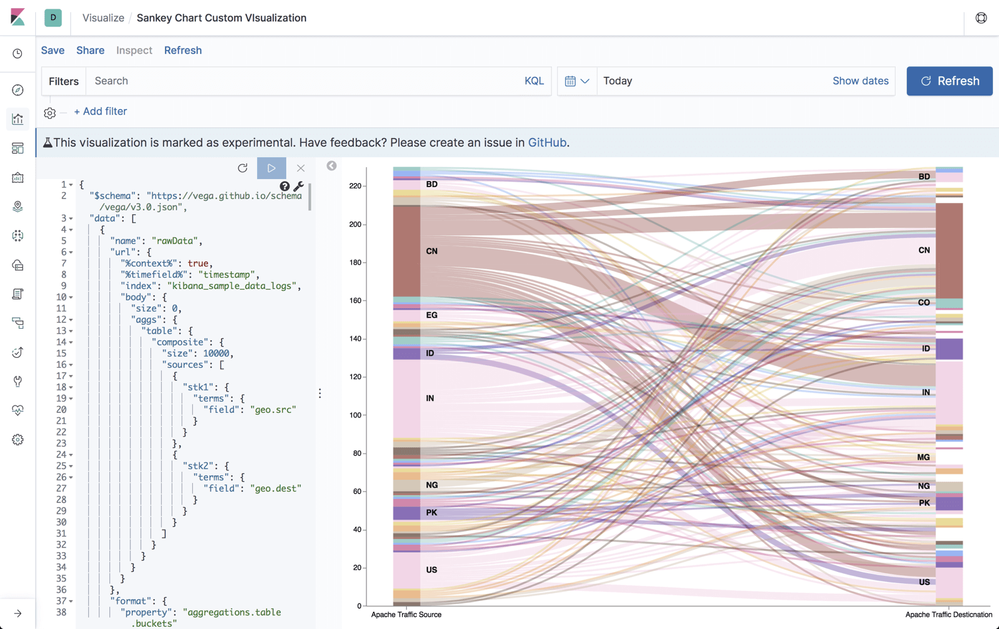
- Vega-lite provides Sankey charts (I use them in Kibana a bunch).
- Mark as New
- Bookmark
- Subscribe
- Subscribe to RSS Feed
- Permalink
- Report Inappropriate Content
Jul 10, 2023 06:34 PM
Hi @Bill_French , where did you find the info in that screenhot? The current vega-lite implementation doesn't seem to include a Sankey diagram in it's examples dataset
- Mark as New
- Bookmark
- Subscribe
- Subscribe to RSS Feed
- Permalink
- Report Inappropriate Content
Jul 10, 2023 08:38 PM
- Mark as New
- Bookmark
- Subscribe
- Subscribe to RSS Feed
- Permalink
- Report Inappropriate Content
Jan 12, 2024 01:30 AM
Hi @nedcr can you now confirm that it offers a Sankey Diagram?
- Mark as New
- Bookmark
- Subscribe
- Subscribe to RSS Feed
- Permalink
- Report Inappropriate Content
Jan 12, 2024 01:38 AM
@Bill_French can you confirm that you are able to use the Sankey diagrams from VegaLite in AirTable?
Happy to share some sample visuals?
- Mark as New
- Bookmark
- Subscribe
- Subscribe to RSS Feed
- Permalink
- Report Inappropriate Content
Jan 12, 2024 09:30 AM
Yes. As the link above demonstrates, vega lite can render a sankey visual. Doing it in Airtable probably requires some effort, but if the extension supports vega lite, then by definition, it is possible.
No one thought a hill chart was possible either.

