
Building Better Graphs

  • June 5, 2020
  • 3 replies
  • 27 views

Forum|alt.badge.img+5

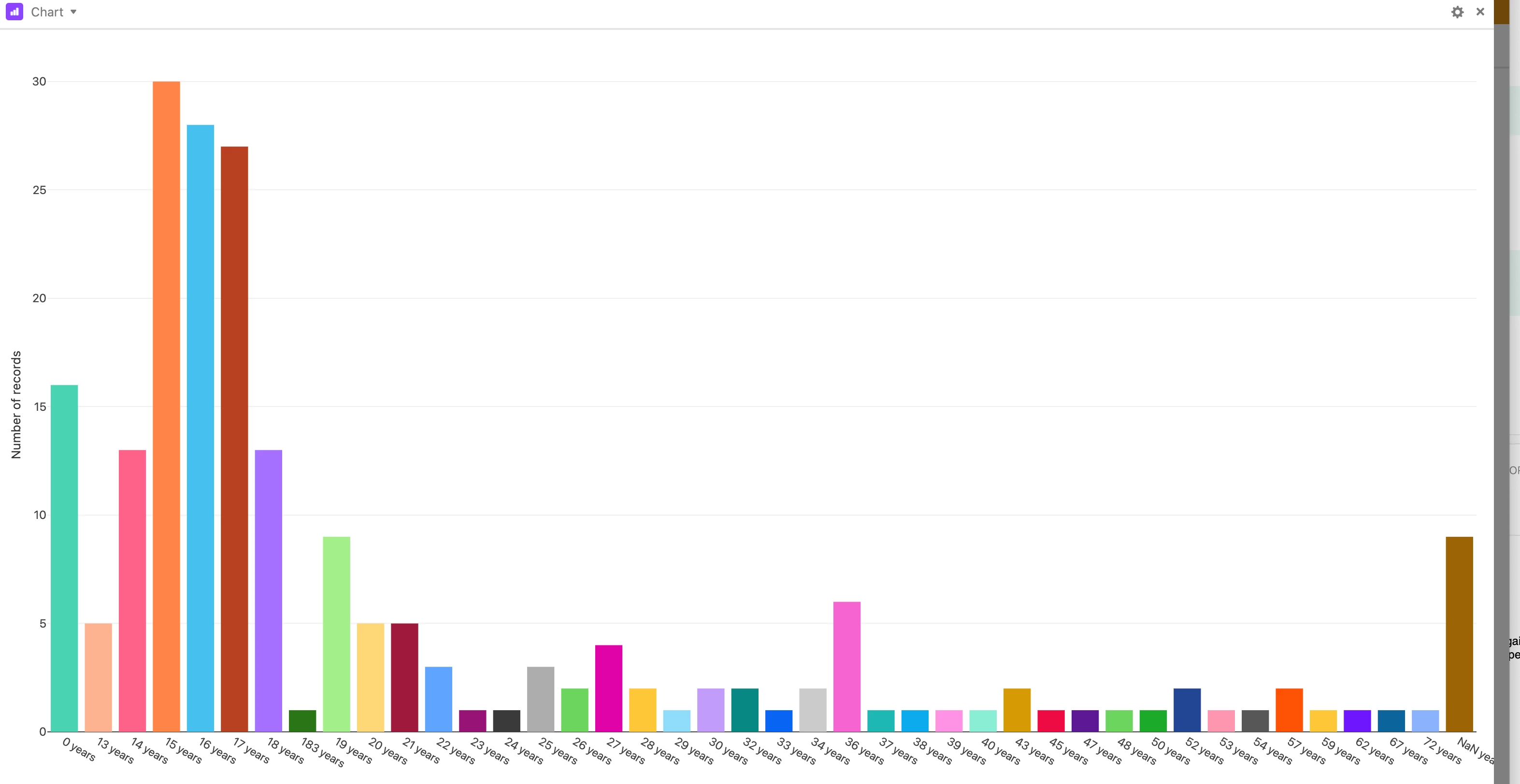
Hey Airtable Fam. I would love to build better graphs. Is the chart block super limited or am I just doing it wrong. Here is a graph of the ages of my database. I can only see the number if I hover over the age block. How can I get it to show the number of entries per age? or if I had them as percentages (I guess by building a formula to show percentage of the age and then making a chart from that)

Any help to make my charts better would be massively appricaited.

Thank you

3 replies

Mohamed_Swella1
Forum|alt.badge.img+17

Hi @Celina_Rollon,

This is unfortunately not possible, it is one of the Product Suggestions that many requested and hopefully Airtable will do it some time.

BR,
Mo


Forum|alt.badge.img+19
  • Inspiring
  • June 5, 2020

You’re not doing it wrong; Airtable is.

The workaround is ugly but might be worth it.

  • Airtable provides a web plugin; Google charts can be published to the web.
  • Zapier can export Airtable data to Google Sheets.
  • Google Sheets can generate pretty good charts.

Forum|alt.badge.img+5
  • Author
  • Known Participant
  • June 6, 2020

You’re not doing it wrong; Airtable is.

The workaround is ugly but might be worth it.

  • Airtable provides a web plugin; Google charts can be published to the web.
  • Zapier can export Airtable data to Google Sheets.
  • Google Sheets can generate pretty good charts.

I was actually wondering if this would work earlier today! Thank you so much, I’ll keep playing!