- Airtable Community
- Discussions
- Ask A Question
- Other questions
- Re: Colour picker is having a bad day
- Subscribe to RSS Feed
- Mark Topic as New
- Mark Topic as Read
- Float this Topic for Current User
- Bookmark
- Subscribe
- Mute
- Printer Friendly Page
Re: Colour picker is having a bad day
- Mark as New
- Bookmark
- Subscribe
- Subscribe to RSS Feed
- Permalink
- Report Inappropriate Content
Aug 31, 2021 01:47 PM
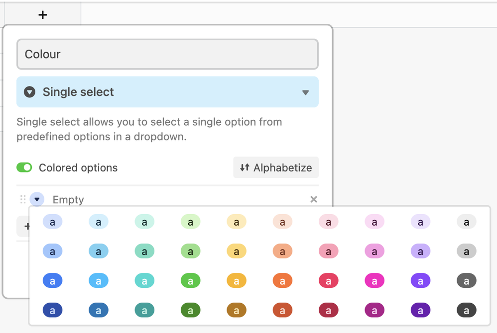
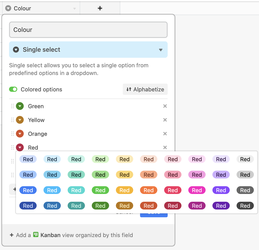
What’s going on with quality control at Airtable this week? First the table picker and now this:
C’mon people. Do some testing before you push to prod.
Solved! Go to Solution.
Accepted Solutions
- Mark as New
- Bookmark
- Subscribe
- Subscribe to RSS Feed
- Permalink
- Report Inappropriate Content
Sep 01, 2021 04:45 AM
Thanks for the explanation.
I don’t remember. I can’t recall ever picking a color before typing text for the option.
Now that you point it out, I can see how the letter “a” seems a bit arbitrary when the user has not typed any text.
If you want to be sure that Airtable receives your message, you should contact support. This is a community forum, and there is no guarantee that Airtable staff will read this thread.
- Mark as New
- Bookmark
- Subscribe
- Subscribe to RSS Feed
- Permalink
- Report Inappropriate Content
Aug 31, 2021 03:38 PM
:face_with_raised_eyebrow:
- Mark as New
- Bookmark
- Subscribe
- Subscribe to RSS Feed
- Permalink
- Report Inappropriate Content
Aug 31, 2021 06:47 PM
I’m not seeing the problem with the colour picker. Could you please explain what now the screen capture is different from what you expect?
I understand that the words on the color do not match the colors displayed, but they are not designed to match. You can enter whatever words you like for the single select options, and pick whichever color you want for each option. They do not need to match.
- Mark as New
- Bookmark
- Subscribe
- Subscribe to RSS Feed
- Permalink
- Report Inappropriate Content
Aug 31, 2021 10:04 PM
Hmm but that first instance where they’re all showing as a, which is the default if the value is blank, I’m certain that’s not what it used to show. Just showing a tiny a doesn’t feel right? It certainly looks terrible.
But I don’t have a screenshot of what it used to show, so I don’t know what that used to be. Instinct tells me that it was the names of the colours but maybe not? Was it just a blank pill shape?
- Mark as New
- Bookmark
- Subscribe
- Subscribe to RSS Feed
- Permalink
- Report Inappropriate Content
Sep 01, 2021 04:45 AM
Thanks for the explanation.
I don’t remember. I can’t recall ever picking a color before typing text for the option.
Now that you point it out, I can see how the letter “a” seems a bit arbitrary when the user has not typed any text.
If you want to be sure that Airtable receives your message, you should contact support. This is a community forum, and there is no guarantee that Airtable staff will read this thread.


