- Airtable Community
- Discussions
- Ask A Question
- Other questions
- Re: Is it possible to make a Pareto chart in Airta...
- Subscribe to RSS Feed
- Mark Topic as New
- Mark Topic as Read
- Float this Topic for Current User
- Bookmark
- Subscribe
- Mute
- Printer Friendly Page
Re: Is it possible to make a Pareto chart in Airtable?
- Mark as New
- Bookmark
- Subscribe
- Subscribe to RSS Feed
- Permalink
- Report Inappropriate Content
Feb 21, 2023 09:27 PM
Hello Airtable community,
Wondering if it's possible to make a pareto chart in Airtable. I'd appreciate your help!
- Mark as New
- Bookmark
- Subscribe
- Subscribe to RSS Feed
- Permalink
- Report Inappropriate Content
Apr 11, 2024 08:18 PM - edited Apr 11, 2024 08:19 PM
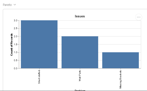
Yes! I found this post when Googling how to reply and have just figured it out. All AirTable plans can add the Vega-Lite extension, and the page https://vega.github.io/vega-lite/docs/sort.html#specifying-custom-sort-order is a good start.
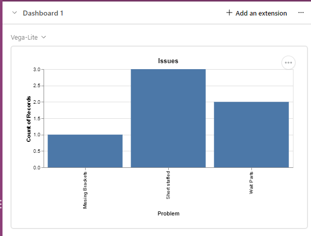
In my case I have a table called "Issues", with a field called "Problem".
The default definition after adding that exentsion and choosing the correct table is:


