Help

Re: Views Sidebar/toolbar

828 0
cancel
Showing results for 
Search instead for 
Did you mean: 
Rob_Wicks
5 - Automation Enthusiast

Hi All,

so this might be dead simple but its killing me.

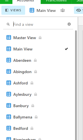
We are rolling out airtable to many people within the business, however some have access/are visably able to see the “Views sidebar”, and some it is a dropdown.

i mean this:
image

but some can only see this:

image

so what my question is, how can i switch between the two. I have tried the SHIFT+ CONTROL+K, but this just opens the dropdown menu.

surely there is a way to toggle between the two.

thanks!

Rob

1 Reply 1

Welcome to the community, @Rob_Wicks.

Unfortunately, the Airtable team enjoys frequently rolling out “tests“ of their new ideas to randomly-selected portions of their user base, with no way for users to opt out or opt into these tests.

They have several of these tests going on right now, including a test where some users (but not all users) can grant additional permissions to shared view links.

Not only does this give Airtable an inconsistent & confusing experience across different users, and not only does it make my business of consulting/training of people on the product extremely difficult, but worst of all, this sidebar/toolbar idea that you’ve stumbled upon is arguably the #1 worst interface decision in Airtable history.

The original dropdown menu is clearly the superior interface choice for at least 10 different reasons, and the vast majority of users despise the new sidebar, as discussed in this thread.

Yet even though the vast majority of users really dislike the new sidebar for extremely valid reasons (including the fact that it even cuts off the names of lengthy view names), the Airtable team seems insistent on rolling out the new sidebar and destroying an interface that worked perfectly in the past.

To me personally, this represents my biggest personal disappointment with Airtable: it often feels to me like there is a disconnect between the Airtable team and the users who are using their product. It often feels to me like they do not have a culture of listening to feedback from their users, which makes me disheartened a bit because I feel voiceless.

As you suggested, if ONLY the Airtable team would simply give us the ability to toggle between the 2 interface choices (sidebar vs. dropdown), that would be the perfect solution.

Give people a CHOICE. If people want to suffer through the new sidebar, then let them switch to it. But if people want a clean interface that works perfectly (especially on smaller laptop screens), then let them choose the new dropdown menu.

I’m not sure why they won’t even offer that as an option, since you have clearly nailed the perfect solution here.

Please chime in on this thread here, which Airtable employees may or may not be monitoring: