Help

Why do record selectors look better in edit than in actual forms?

Topic Labels: Views
1054 0
cancel
Showing results for 
Search instead for 
Did you mean: 
Thom_Hounsell
6 - Interface Innovator

In the form edit view, a record selector shows multiple fields, nicely formatted:
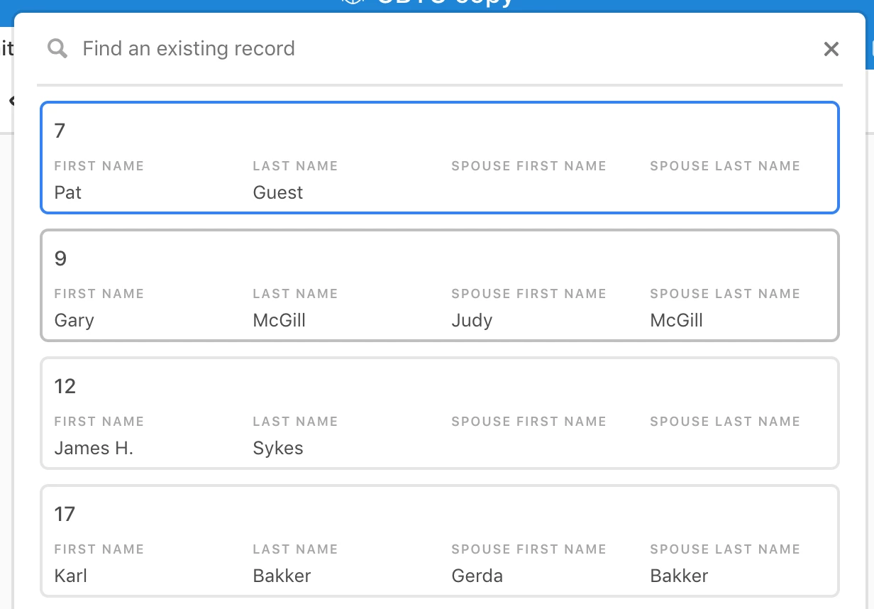
Screen Shot 2018-11-04 at 12.13.19 AM.png

But with the same data, the actual form only shows the index field:
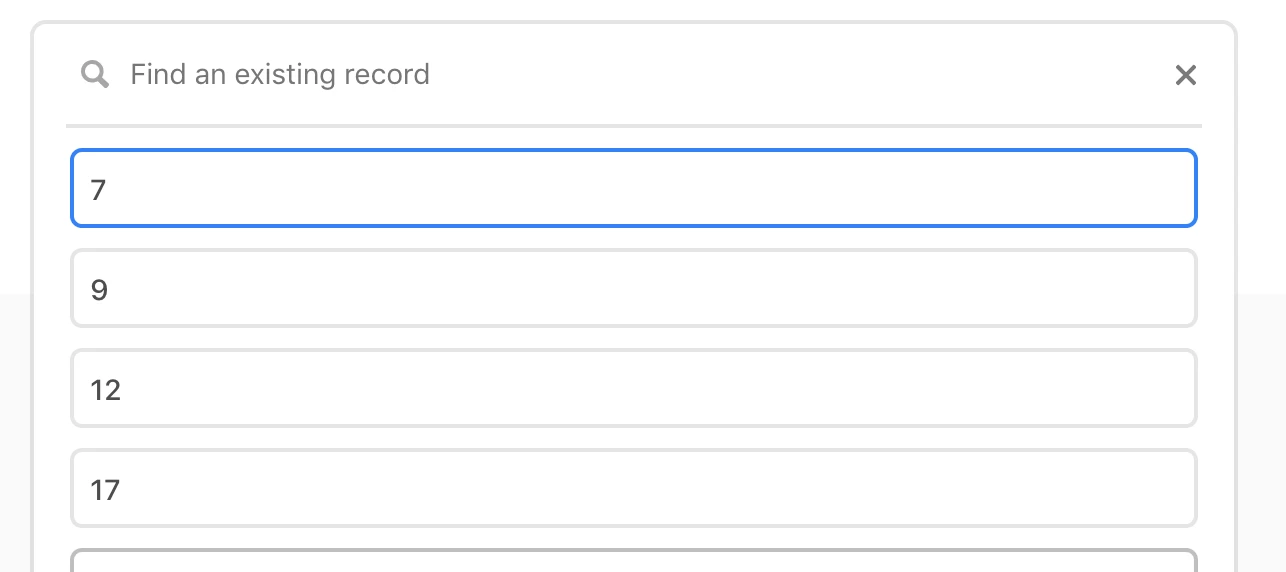
Screen Shot 2018-11-04 at 12.12.58 AM.png

How come I can’t show the better, fuller selector that is displayed in the edit view on the live form page?

0 Replies 0