- Airtable Community
- Discussions
- Ask A Question
- Other questions
- Re: Why is filepicker UI so ugly? Somehow I don't ...
- Subscribe to RSS Feed
- Mark Topic as New
- Mark Topic as Read
- Float this Topic for Current User
- Bookmark
- Subscribe
- Mute
- Printer Friendly Page
Re: Why is filepicker UI so ugly? Somehow I don't trust it
- Mark as New
- Bookmark
- Subscribe
- Subscribe to RSS Feed
- Permalink
- Report Inappropriate Content
Jun 28, 2018 08:09 PM
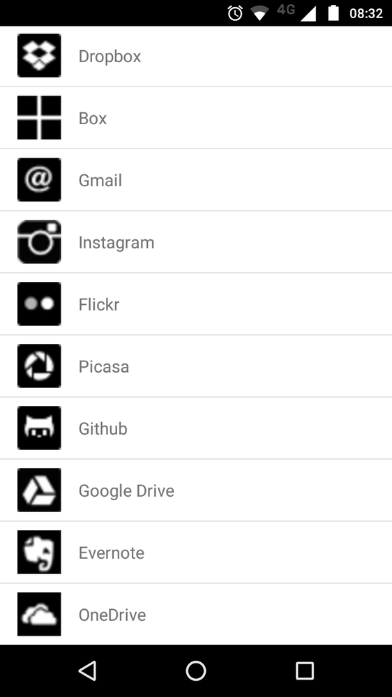
Airtable has a beautiful interface but when I have to upload a file and the filepicker interface opens, I feel like I am using a shady service. Just look at this 
I really don’t trust them with my personal data.
- Mark as New
- Bookmark
- Subscribe
- Subscribe to RSS Feed
- Permalink
- Report Inappropriate Content
Jun 28, 2018 11:29 PM
Welcome to software development, circa 2015 onward. Used to, if you wanted to drop in a monolithic chunk of functionality without having to reinvent it yourself, you incorporated a third-party library and programmed to its API. Nowadays, you still program to the API — but the library performing the function is on someone else’s server. In this case, IIRC, the server (and library) in question belong to FileStack, who seemingly have a different philosophy as to what to prioritize in their development. You may want to inquire there. :winking_face:
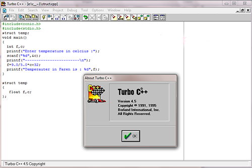
In all seriousness, I sympathize with you. This particular case doesn’t bother me as much, probably because their desktop interface is less jarring — but I remember how Borland’s atypical checkbox style used to drive me to distraction whenever I used an app coded in Turbo C++ or Delphi!
- Mark as New
- Bookmark
- Subscribe
- Subscribe to RSS Feed
- Permalink
- Report Inappropriate Content
Jun 28, 2018 11:50 PM
Oh yes, I work in tech industry, I see your point of how 3rd party services are not in control of the publisher.
But still, the discretion to use a particular 3rd party library is with airtable, and if I were the product manager here, I will either ask filepicker guys to do something about it or I will switch to a better service.
It is a matter of trust, not just UI. When I see a set of blurry icons and a jarred interface, what I interpret is that they don’t really take their job seriously. And if so, how seriously do they take my data?

