Turn on suggestions
Auto-suggest helps you quickly narrow down your search results by suggesting possible matches as you type.
Showing results for
This Product Ideas board is currently undergoing updates, but please continue to submit your ideas.
- Airtable Community
- Product Ideas
- Compact Display Option For Kanban Cards
Idea Options
- Subscribe to RSS Feed
- Mark as New
- Mark as Read
- Bookmark
- Subscribe
- Printer Friendly Page
- Report Inappropriate Content
Compact Display Option For Kanban Cards
Turn on suggestions
Auto-suggest helps you quickly narrow down your search results by suggesting possible matches as you type.
Showing results for
Fernando

5 - Automation Enthusiast
Comment Post Options
- Subscribe to RSS Feed
- Mark as New
- Mark as Read
- Bookmark
- Subscribe
- Printer Friendly Page
- Report Inappropriate Content
Apr 14, 2017
10:55 AM
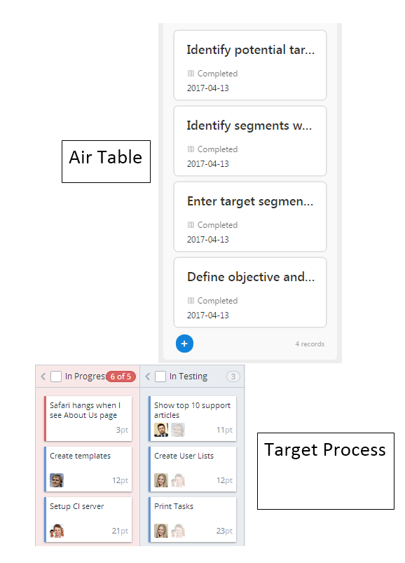
Please add better default display options to Kanban cards. The current options are very limited, and the default display makes terrible use of space. This is specially applicable to Task based cards with no image or attachment associated.
For example, my default display can only displays 2-3 words in the card title (see image below). This makes it very hard to have a broad view of tasks without having to click on each one individually. By contrast, Target Process resolves this by wrapping titles and making better use of space (see image below).
IMHO this is major limitation of the Kanban view that largely renders it useless.
Idea Statuses
- New Ideas 833
- Already in product 11
- Considering 0
- In development 0
- Not on the roadmap 2
- Launched 27

