Help

Making Airtable's Script Editor less cramped

2987 8
cancel
Showing results for 
Search instead for 
Did you mean: 
Tim_Mackey
6 - Interface Innovator

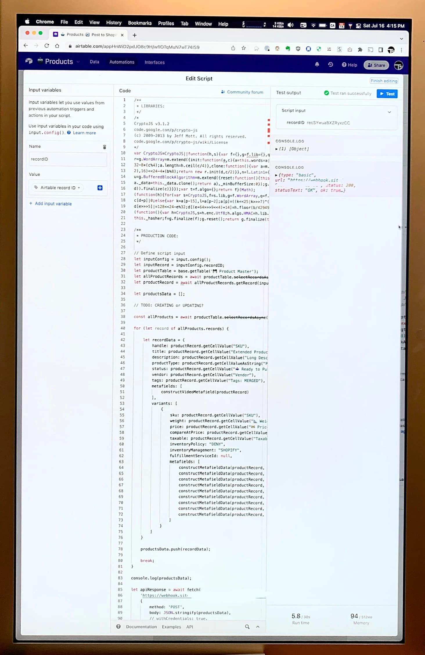
Airtable’s Script Editor is great, but one flaw that’s bothered me for a long time is how much space the side panels take up, especially on small screens. There’s no way to collapse them, and no way to resize them.

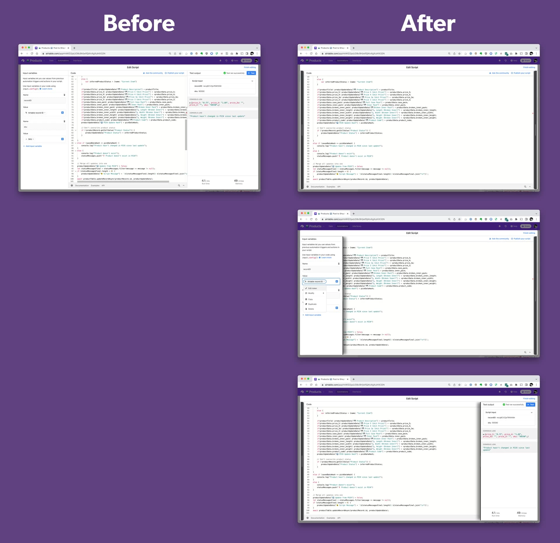
Soooo, I spent a few hours writing a userscript with some absolutely insane CSS rules to fix this. Now, the side panels in the Script Editor are collapsed by default, and can be shown by hovering over the handlbars to the right and left. The script is designed to work in both the Scripting Extension, and in the Automations editor.

I haven’t released the script publicly yet, as it’s currently written using some experimental CSS properties which allow the CSS rules to be less complex. However, I already figured out a version of the code previously that doesn’t use these experimental properties and is compatible with current browsers, so it would just take a little time to fix up the code before I can share it.

If you’re interested in getting ahold of this userscript, please let me know! It will give me the motivation to fix it up and share it, otherwise I probably won’t get around to it.

Video Demo:
Airtable-Script-Editor-Userscript

8 Replies 8

This is really cool. I agree that being able to get more screen real estate is awesome.

However, as much as I like what you’ve done, I don’t think that I would personally use it. (I am satisfied with the width of my monitor.)

Thanks! You’re right about the space issue, it’s not that bad if your working on a big widescreen monitor. I’ve been out of the office for the past few months though and using my laptop a lot more, and that’s where I’ve been feeling the lack of space. What really got me frustrated enough to make this is that I decided to try out my widescreen monitor at home in vertical orientation, and the permanent sidebars really become an issue in this setup:

image

If I was designing the editor from the ground up, I’d make the two sidebars look and function the same as the documentation, um, “footbar”? Click to expand, click to collapse. Within the limitations of a userscript though, I wasn’t able to get the editor area to dynamically resize, so I opted instead for sidebars that are hidden offscreen and pop in when you hover them.

Neat idea. But yeah, the scripting editor is unusable at that width.

If you want to be sure that Airtable sees your suggestion, I recommend sending a copy of your post to support, including the screen shot.

Love it! The Airtable engineering team should buy you a sandwich for spending hours creating their new requirements specifications. :winking_face:

But… and it’s a few really big buts!

  1. CSS manipulations like this tend to be very brittle and almost always fail, even in the short run. Their CSS is notoriously changing all the time. This will pressure you to maintain the code, and for what? Pleasure?

  2. Developers tend to avoid becoming dependent on anything that cannot be sustained, and this appears to fall into that category.

Last comment: The more insanely complex something is, the more valuable it is. But this is not true in this case because Airtable could implement these features without significant effort or complexity; they just need the will to embrace this idea. Maybe your video will help them conjure the will.

@Tim_Mackey If you could just integrate CoPilot into their editor, that’s something they would not likely ever do, and you could sell that starting with me.

Lol! I’ll accept that sandwich :stuck_out_tongue_winking_eye:

In regards to #1, it’s absolutely for pleasure :winking_face: . That being said, I’m willing to make a gamble that the way I’ve written the styles should be pretty robust over time. I’m relying primarily on tag selectors and child selectors rather than style selectors, since as you pointed out the css styles aren’t stable. Since their UI is built on a framework though, the structure of the HTML should be less subject to change. In any case, I’d much rather that Airtable improve the editor rather than needing to rely on hacks like this.

As for the rest, you make good points. I probably wouldn’t want to rely on something like this if I didn’t have the ability to fix it myself when it break.

Thanks for the feedback!

Maintenance is not the primary driving factor as most developers have near-zero time to maintain tools. Tools – above all – are “hired” to do a job, and when they don’t do that job, they’re usually fired.

BenFortunato
6 - Interface Innovator

This should be a native feature, collapsible side bars. There is no reason to be staring at the input panel and output panel. Anouther option would be to have the input panel on top and output on the bottom. This layout is tough, drives me crazy!!!!