I use Airtable for budgeting, because I'm that guy who finds a few little things that I don't like about every piece of software I use, and would rather be in control of how something as important as my budgeting system works... even if it means working within the constraints of something like Airtable :smirk:
In any case, one of the things I was missing from good budgeting software, when I switched to using Airtable, was monthly tracking charts. But something that I like to do, and which isn't supported by many other budgeting softwares is annual tracking charts. For our family, tracking something like a "Clothing" budget doesn't really make sense to do on a monthly basis -- there are some months we don't buy any clothes, and some months when we buy ALL THE clothes. Using the monthly "sinking fund" style of budget for this made it difficult for me to determine how well we were doing at actually keeping to the budget. Much easier to do within the scope of an entire year.
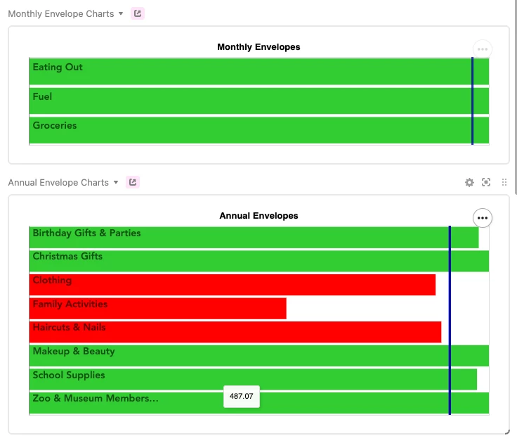
So, one of the things I have become pretty satisfied with having implemented is tracking charts for both monthly and annually tracked budget categories, using the Vega-lite Extension. Here's what they look like:

The green and red horizontal bars represent the % balance of the budget category (or "Envelopes", as I like to call them). The dark blue vertical bar on each chart represents the % of the current month or year that has elapsed. This screenshot was taken on February 1st, so on the monthly chart the vertical bar is about 1/28th of the way elapsed, and on the annual chart it's about 1/12th of the way elapsed.
This gives me a quick visual representation of how I am tracking with those particular budget categories -- we went on a 2 week vacation in January, so a good chunk of our "Family Activities" budget for the year has already been spent. That horizontal bar is red to indicate that, at this point in the year, we are overspent in that area -- might be a good idea to slow down the "Family Activity" spending for a bit and let the year catch up to it!
The horizontal bars represent % balances, not actual balances -- each bar is the same length, but it's not the case that each of those envelopes represents the same amount of money. If I want to see the actual balance of the envelope, I can mouse over the bar, as I've done with the "School Supplies" envelope in the screenshot above.
Cool! So, how does it work? Here's the json powering the "Monthly Envelope Charts":
{
  "$schema": "https://vega.github.io/schema/vega-lite/v4.json",
  "title": "Monthly Envelopes",
  "width": "container",
  "height": "container",
  "config": {
    "legend": {
      "disable": true
    }
  },
  "transform": [
    {
      "calculate": "1 - datum['% of Budget Left']",
      "as": "budget spent"
    },
    {
      "calculate": "datum['Month - % Left vs % Elapsed'] > 0 ? 'Green' : 'Red'",
      "as": "Env Color"
    }
  ],
  "layer": [
    {
      "mark": "bar",
      "encoding": {
        "x": {
          "aggregate": "sum",
          "field": "% of Budget Left",
          "type": "quantitative",
          "stack": null,
          "scale": {
            "domain": [
              0,
              1
            ]
          },
          "axis": null
        },
        "y": {
          "field": "Title",
          "type": "ordinal",
          "title": null,
          "axis": {
            "ticks": false,
            "labelAlign": "left",
            "labelOffset": -6,
            "labelFont": "Avenir",
            "labelFontSize": 14,
            "labelFontWeight": "bold",
            "labelColor": "black",
            "labelOpacity": 0.6,
            "labelPadding": -5,
            "zindex": 100
          }
        },
        "color": {
          "field": "Env Color",
          "scale": {
            "range": [
              "limegreen",
              "red"
            ]
          },
          "type": "nominal"
        },
        "tooltip": {
          "field": "Current Balance",
          "type": "nominal"
        }
      }
    },
    {
      "mark": {
        "type": "rule",
        "color":  "#0609A6",
        "size": 3,
        "opacity": 0.45
      },
      "encoding": {
        "x": {
          "field": "% of Month Left",
          "type": "quantitative"
        }
      }
    }
  ]
}
I used the "layer" feature, providing 2 layer objects, one for the horizontal bars, and one for the vertical bars. The horizontals are pretty straight forward, just turning your typical bar chart on its side. The vertical bar is only provided "x" axis data, and is styled as a "rule".
I also made use of the "transform" feature to provide some dynamic coloring to the horizontal bars based on their % Left relative to the time period % Elapsed. That took a bit of trial and error to figure out, and I'm still not entirely sure I've got it configured totally right, but it's working pretty well.
And of course, I had to create the fields in my table to support these data points. As an example, here's my formula for % of Month Elapsed:
DAY(TODAY()) /
DAY(
  DATEADD(
    DATEADD(
      TODAY(),
      1, 'month'
    ), -
    DAY(
      DATEADD(
        TODAY(),
        1, 'month'
      )
    ),
    'days'
  )
)
And then using that to get % of Month Left:
(100 - ({% of Month Elapsed} * 100)) / 100
And finally, the comparison with the envelope balance, in Month - % Left vs % Elapsed:
formatted as a %
IF(Type = "Monthly Varying", {% of Budget Left} - {% of Month Left})
The Vega-lite extension is a bit intimidating at first, but if you put in some time experimenting and playing with the different features it makes available, you can do some pretty cool stuff!

