- Subscribe to RSS Feed
- Mark as New
- Mark as Read
- Bookmark
- Subscribe
- Printer Friendly Page
- Report Inappropriate Content
:wave: Hi all! I’m Kelly - a product manager at Airtable focused on helping users build powerful, secure apps for their org. I’m excited to introduce some powerful new features (including my personal favorite, granular permissions), as well as a new way to think about what you’re building in Airtable.
Today most teams have the autonomy to choose the software and tools that work best for them. While this allows teams to move fast, it can also create massive data silos, misalignment, and disjointed collaboration. There’s critical data spread across dozens of applications, and no team has access to all of it, which can cause work to slow way down
We believe it’s time to reject the trade-off between moving fast and moving together. That’s why we’re introducing the Airtable Connected Apps Platform™.
The Airtable Connected Apps Platform™ lets every team create powerful applications to be shared across the organization, built on shared company data, and on the same connected platform.
Building apps in Airtable isn’t new. To help teams create even better apps, we’re releasing new features to make them more powerful, more secure, and more connected.
Updates available today:
We’re rolling these updates out over the course of the day; if you don’t see them reflected in your workspace, hold tight! You should see them updated by the end of the day.
Interface Designer is now officially out of beta for all Airtable users. You can transform data into intuitive and interactive app interfaces that can be quickly customized for each team member. These foundational updates and improvements make it easier for your team to interact with your app. New updates to Interface Designer include:
-
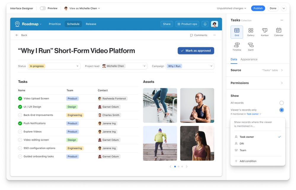
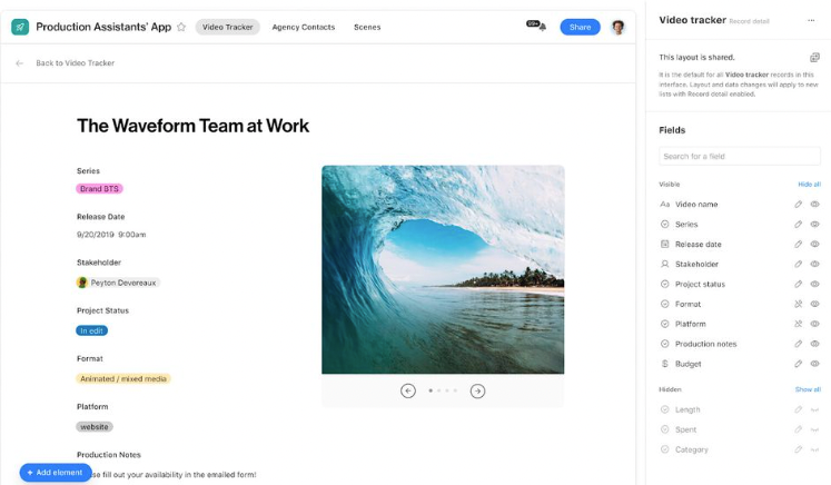
A redesigned editor in the sidebar provides a central place to make changes to your interface—all in real-time and keeping your canvas clutter-free. Whether you’re using a calendar to track deadlines or a visual gallery to look through creative assets, you can easily manage what you show and how it appears from a single location With the new editor, it only takes a click to change how your data is visualized.
-
A new top navigation bar within your interface allows your users to easily navigate between relevant pages in a cinch
-
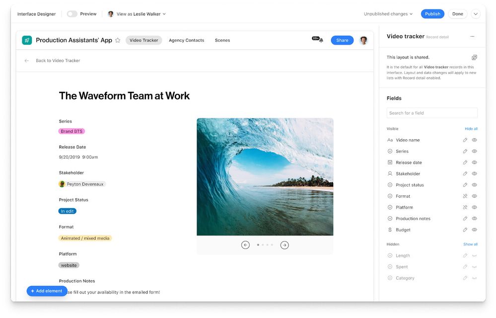
And, our new full page record detail experience gives you the ability to fully customize what others can see and edit when they click into the details of a record. So if you want your team to update project status without seeing every project detail you’re tracking, you can customize exactly which fields they can view and edit.
Introducing granular permissions. Now, Pro and Enterprise users can decide how others interact with your app. Gone are the days of setting up a new personal view, shared view, or base to customize data for every new collaborator, department lead, or team. Now, you can simply drag and drop the data you want to share into an Interface, add rules and a dynamic current-user filter to personalize content for each collaborator, and share the Interface to the intended audience(s).
So, whether you want to share the entire app, only certain pieces via an interface, or choose exactly what data is shown to each user —your app is as dynamic and secure as you choose it to be. New updates to permissions include:
- The ability to share an interface without sharing the underlying base through Interface-only editor, commenter, and read-only permission levels. You can share interfaces via email or invite link, and choose to share silently when you don’t want an email notification firing off to a large group.
- Current-user filter improvements to personalize interface content. Add an element filter specified to “Viewer’s records only” to ensure each user only sees records tagged to them so they get all the information they need, and none that they don’t. You can also let end users adjust the filter themselves based on their needs by adding a Filter element and match a collaborator or email field to the current user. If you’re on Airtable Enterprise, you can also add a group user filter, and end users will be able to see tasks associated with their group.
- Admin panel support for Enterprise admins to manage interfaces. Admins will be able to see who’s creating or using interfaces as well as who has access to each interface.
Coming soon:
- Redesigned home screen: Discover and access the apps your organization relies on, right from the new home screen. Enterprise customers can opt into the new home screen today. We’ll be rolling out the new home screen to all users over the next few months.
- Interface insights: Coming in the next few weeks, Enterprise users will now be able to see exactly how interfaces are being used
- Verified data: Publish and mark key data so everyone can build apps with the same, accurate information. Verified data is currently in development and will be available in early 2023.
- Data map: Visualize your data and how everything connects, so you can build, manage, and scale work. Data map is currently in development and will be available in early 2023.
- Two-way sync: Automatically update data across multiple apps to ensure information is always current. Two way sync is currently in limited availability for Enterprise customers. It will be available more broadly in early 2023.
- Apps by Airtable: Get started faster with apps that can be used straight out of the box—each is hand-built for an essential use case—and based on industry best practices. The first set of these apps will be available in early 2023.
Learn more about these updates and what a connected apps platform can do for you and your team in our blog post!
Additional resources:
- Support Article: Interface Designer overview
- Support Article: Interface Designer permissions
- Support Article: Managing and sharing Interfaces
We can’t wait to hear what you think, and see what you build, with these updates!
We would also love to have you join us for a Community AMA on October 27 at 9 am PT where we will talk about all the updates to Interface Designer. I’ll be sharing some of our thinking behind these features, and will also be available to answer all your burning questions! You can register here and we hope to see you there!
You must be a registered user to add a comment. If you've already registered, sign in. Otherwise, register and sign in.
