- Airtable Community
- Discussions
- Ask A Question
- Base Design
- Re: How can I change the connecting line color in ...
- Subscribe to RSS Feed
- Mark Topic as New
- Mark Topic as Read
- Float this Topic for Current User
- Bookmark
- Subscribe
- Mute
- Printer Friendly Page
Re: How can I change the connecting line color in an org chart?
- Mark as New
- Bookmark
- Subscribe
- Subscribe to RSS Feed
- Permalink
- Report Inappropriate Content
Apr 09, 2024 04:38 PM
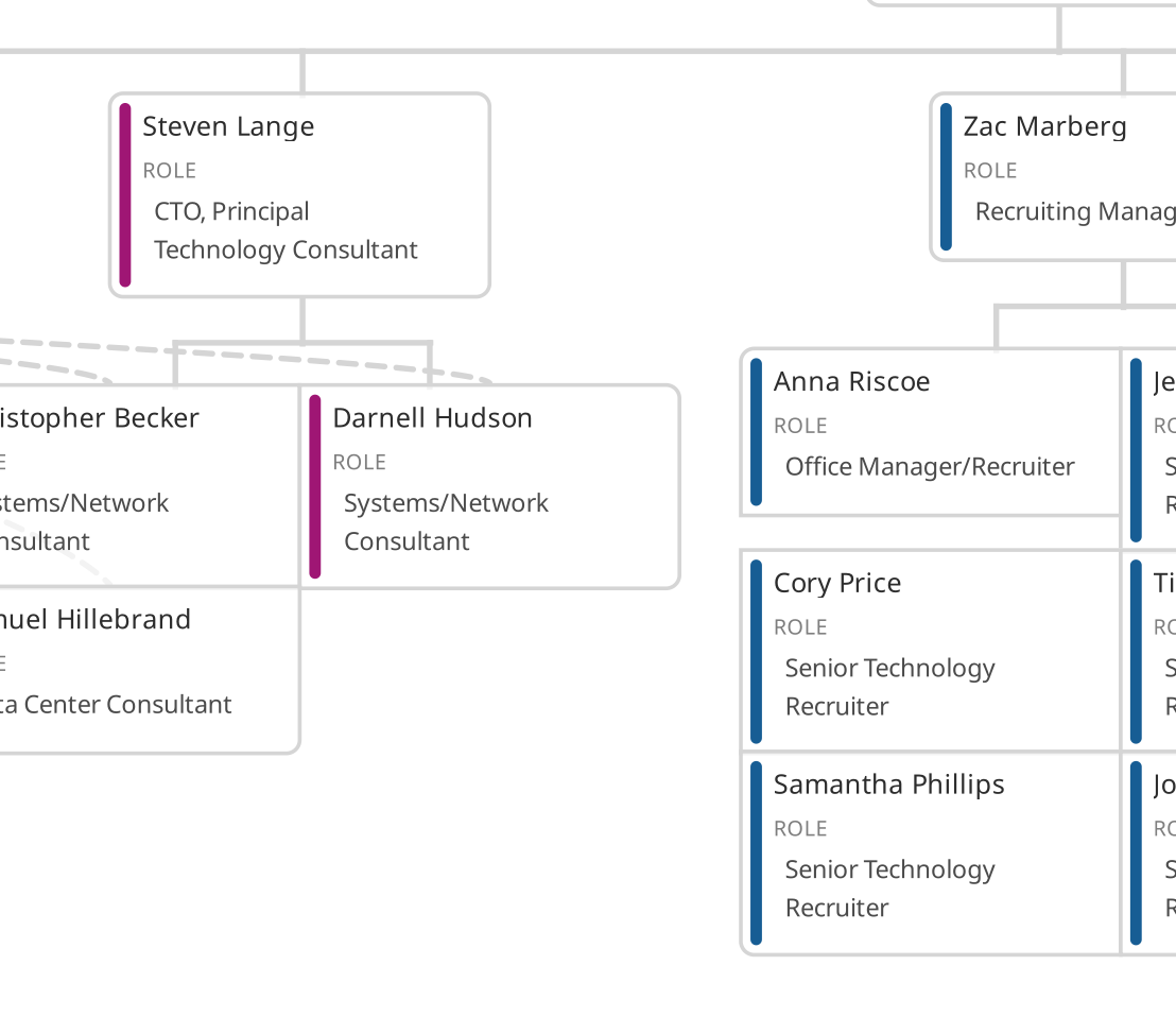
I have an org chart that's looking good except for one thing: the lines that connect the name cells are in a faint blue that is all but illegible. The help bot gave me irrelevant advice, so I'm trying here. How can I configure the color of those lines? It's unusable like this.
- Mark as New
- Bookmark
- Subscribe
- Subscribe to RSS Feed
- Permalink
- Report Inappropriate Content
Apr 09, 2024 06:02 PM
If you are referring to the org chart extension, you cannot change the color of the lines.
However you can add colors to the each item of the chart to make it look like in this example.

- Mark as New
- Bookmark
- Subscribe
- Subscribe to RSS Feed
- Permalink
- Report Inappropriate Content
Apr 09, 2024 07:06 PM
Thank you - but why are your lines grey and legible, and mine are faint blue and illegible?
- Mark as New
- Bookmark
- Subscribe
- Subscribe to RSS Feed
- Permalink
- Report Inappropriate Content
Apr 09, 2024 09:35 PM
Hello @EdwardHamlin
Can you please share some screenshot of it.
- Mark as New
- Bookmark
- Subscribe
- Subscribe to RSS Feed
- Permalink
- Report Inappropriate Content
Apr 10, 2024 11:59 AM
- Mark as New
- Bookmark
- Subscribe
- Subscribe to RSS Feed
- Permalink
- Report Inappropriate Content
Apr 10, 2024 09:53 PM
Hello @EdwardHamlin
If you don't want to use those colors on the Org Chart then create an extra view specific for that use, then remove colors-related options https://support.airtable.com/docs/record-coloring-in-airtable#removing-conditions-or-colors
Then connect the Org chart with that specific view.
Make sure you use proper structure supports by ORG chart hierarchy
- Mark as New
- Bookmark
- Subscribe
- Subscribe to RSS Feed
- Permalink
- Report Inappropriate Content
Apr 12, 2024 01:16 PM
Removing the condition colors in the data table has no effect on the connecting lines. All I need (and this hardly seems unreasonable) is an org chart with legible connectors. Attached is a screenshot of what I now see. There are lines, actually, but so faint as to be illegible. I cannot use this. Why is this so hard??
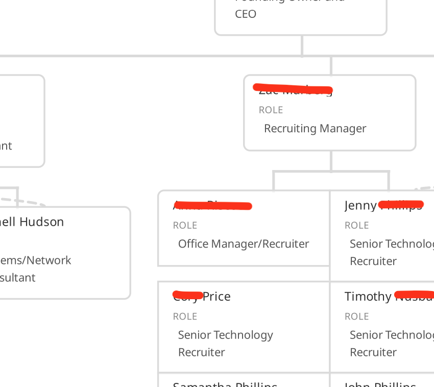
