- Mark as New
- Bookmark
- Subscribe
- Subscribe to RSS Feed
- Permalink
- Report Inappropriate Content
Dec 21, 2022 08:44 AM - edited Dec 21, 2022 08:44 AM
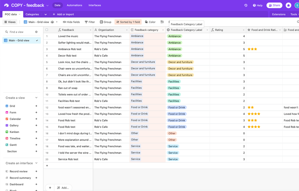
I have a table of feedback for two cafes in a base. Each bit of feedback has an assigned category.
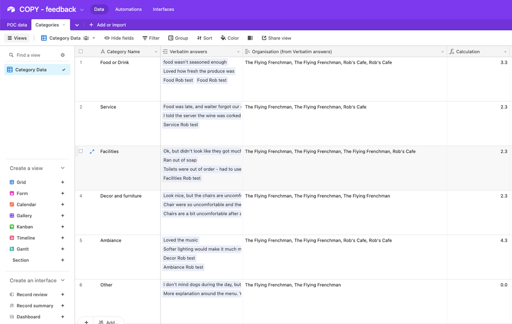
I have another base that is linked to the category so that I can view aggregated data such as average feedback score by category. This data is then visualized outside of Airtable.
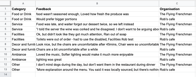
The problem is that in Airtable as category is the primary, it lumps the cafes together in each row, so from this table I can't distinguish one from another. I need an output where I can see organisation as a breakdown of the category. Something like this (almost like a pivot table structure):
How would I go about designing my base in order to achieve that?
IMPORTANT - the data needs to be in one view ideally rather than filtered views because my visualisation tool can read at the table level, but not view level (I do my filtering there).
Solved! Go to Solution.
Accepted Solutions
- Mark as New
- Bookmark
- Subscribe
- Subscribe to RSS Feed
- Permalink
- Report Inappropriate Content
Dec 21, 2022 09:26 AM
One way comes to mind is having the Categories Cafe specific. (this doesn't have to be on the form side, it can be done using a formula and automation on the backend).
So for example, in your 2nd table, instead of Service, it becomes Robs Cafe - Service
- Mark as New
- Bookmark
- Subscribe
- Subscribe to RSS Feed
- Permalink
- Report Inappropriate Content
Dec 21, 2022 02:10 PM
thanks for the answer @Mohamed_Swella1. The issue with that is that this data is the source of an app. The app filters data based on the organisation and linked emails. It then shows filtered data based on the organisation from the table (works fine when it's not aggregated) and visualise it. If I had categories for each cafe then I would have to create individual app instances for each cafe which isn't practical.
- Mark as New
- Bookmark
- Subscribe
- Subscribe to RSS Feed
- Permalink
- Report Inappropriate Content
Dec 21, 2022 07:59 PM
You can still have the category there, just not in the primary field. This should still work in your app
- Mark as New
- Bookmark
- Subscribe
- Subscribe to RSS Feed
- Permalink
- Report Inappropriate Content
Dec 21, 2022 09:21 PM
Hi Sean, here're instructions for what Mohamed_Swella1's describing
1. Create a new table called "Cafe specific feedback" or something, and link it to the table "POC Data"
2. Create an automation that triggers when records are created in the "POC Data" table
3. Give it an "Update Record" action that updates the original triggering record's linked field to the "Cafe specific feedback" table with the following values:
[VALUE OF THE {Organisation} FIELD] - [VALUE OF THE {Feedback Category Label} FIELD]
The new "Cafe specific feedback" table should now display the data in the manner you want
- Mark as New
- Bookmark
- Subscribe
- Subscribe to RSS Feed
- Permalink
- Report Inappropriate Content
Dec 09, 2023 11:47 PM
Automatic Pivotal table, CountIf, CountIfs
•Table A field a => Change Field type to link to another record of Table B, Allow linking to multiple records => Choose Blank Table B => Create Roll up field in Table B => Source : Table A, CountA(values) or CountAll(values) ,Only include link record , + add condition, add group)


