The Community will be undergoing maintenance from Friday February 21 - Friday, February 29 and will be "read only" during this time. To learn more, check out our Announcements blog post.
- Airtable Community
- Discussions
- Development & APIs
- Re: How to generate dynamically report?
- Subscribe to RSS Feed
- Mark Topic as New
- Mark Topic as Read
- Float this Topic for Current User
- Bookmark
- Subscribe
- Mute
- Printer Friendly Page
Re: How to generate dynamically report?
- Mark as New
- Bookmark
- Subscribe
- Subscribe to RSS Feed
- Permalink
- Report Inappropriate Content
Dec 15, 2020 03:21 AM
Hello there,
We are actually using Airtable for real estate reporting.
Actually we are sending raw reports from airtable to our clients.
The design and ergonomics are really poor for a common user so we looked for other solutions.
I didn’t found any interesting application to connect with zapier for now but I finally discovered page designer.
Page designer allowed me to reorganize datas but it’s hard to make something really clean with it.
I also have a big problem with page designer because it’s not dynamic.
I mean, we have many datas and their size can change and some of them can be filled or not depending of the report.
Our needs also includes photos (the number can vary) and clickage links.
So, using airtable can leave me with blank space of different size which is not really clean for our clients…
Can you suggest me a solution that could solve our problems and which is free or not too expensive ?
Thanks for your answers.
- Mark as New
- Bookmark
- Subscribe
- Subscribe to RSS Feed
- Permalink
- Report Inappropriate Content
Dec 15, 2020 05:15 AM
Hi @Ann-Michael_Team, and welcome to the community!
No. I can only suggest a premium solution that is both non-trivial to implement and typically costs hundreds of dollars (us) to get into production. Examples here, and here with results like these…
You probably should look to miniExtensions or Integromat for a cheap pathway (read this).
- Mark as New
- Bookmark
- Subscribe
- Subscribe to RSS Feed
- Permalink
- Report Inappropriate Content
Dec 15, 2020 05:28 AM
Hello Bill,
Thank you for your answer.
I can see that they are many charts in this kind of applications.
I already found some by the past.
However, nearly all of our informations are text, images, selected content or checkbox.
Do you know some solutions more oriented in this way ?
- Mark as New
- Bookmark
- Subscribe
- Subscribe to RSS Feed
- Permalink
- Report Inappropriate Content
Dec 15, 2020 05:48 AM
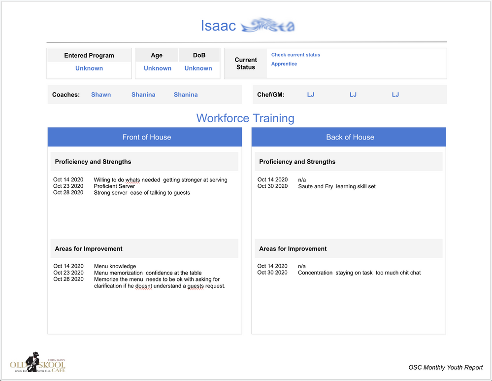
Data types do not matter when transforming Airtable information into reports. We typically render the content as the client wishes and this includes text, images, checkboxes as well as charts, grids, maps, and other nuanced content.
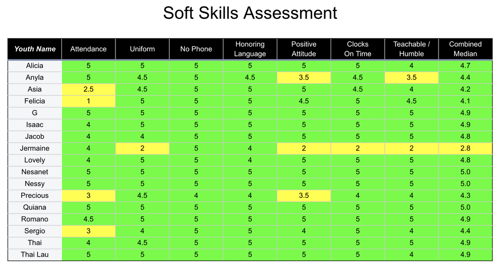
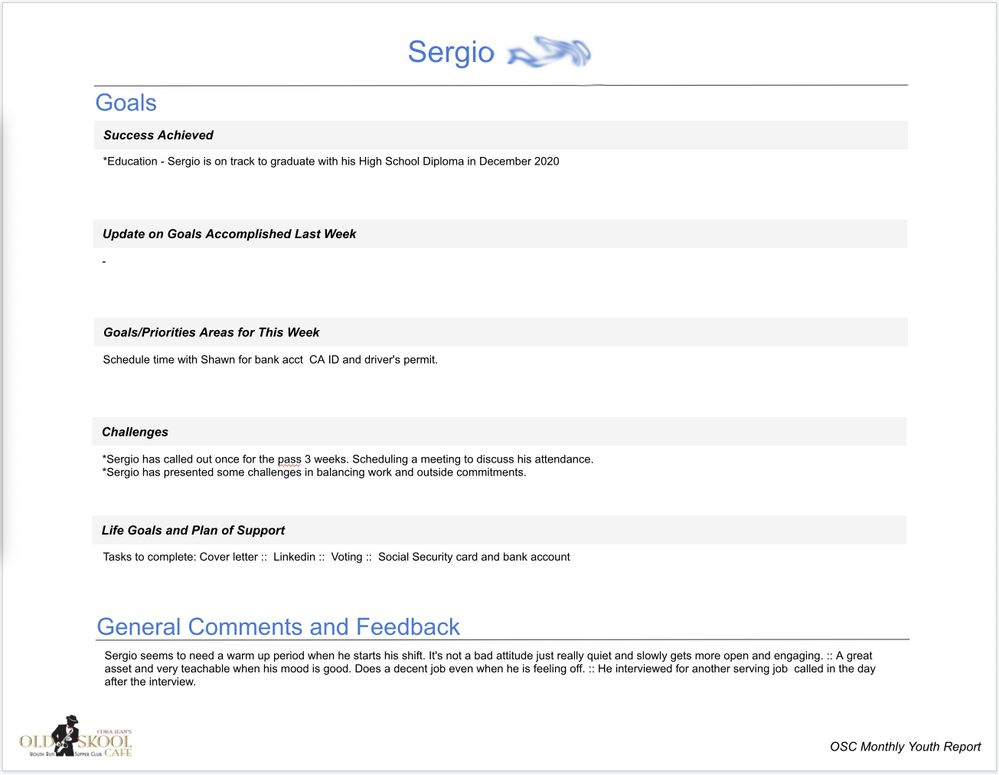
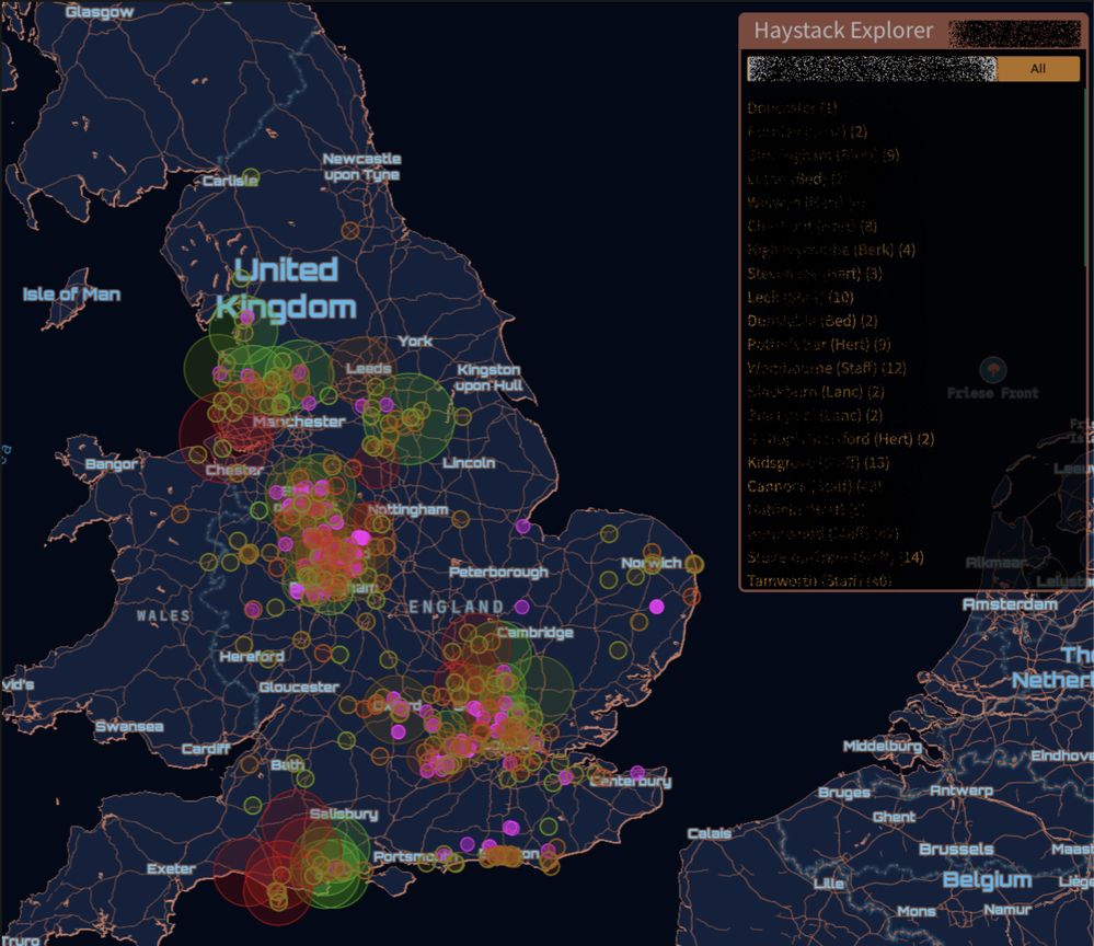
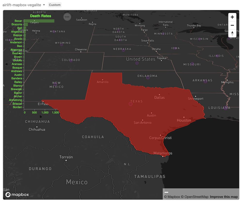
For example… this is Airtable data:
This is Airtable data…
This is Airtable data …
This is Airtable data …
This is Airtable data …
- Mark as New
- Bookmark
- Subscribe
- Subscribe to RSS Feed
- Permalink
- Report Inappropriate Content
Dec 15, 2020 09:33 AM
Hey @Ann-Michael_Team,
@Bill.French is spot on, with Airtable data you can make incredbily powerful visualizations and reports. The challenge is finding an easy to use tool or software to bring the data to life.
If you are using Google Workspace, a free solution I love for building reports and charts is Google Data Studio.
You can connect Airtable to GDS using a tool we built, Sync Inc. It will sync your Airtable data in real-time to a Postgres database. Then you simply connect that database to Google Data Studio’s prebuilt connector and you can build reports and dashboards in no time.
You can check it out → https://syncinc.so/
- Mark as New
- Bookmark
- Subscribe
- Subscribe to RSS Feed
- Permalink
- Report Inappropriate Content
Dec 15, 2020 10:05 AM
This is a key value proposition that I really haven’t considered a bunch but it makes complete sense now that you stated the obvious. :winking_face: Thank you for clubbing me with with a Nerf two-by-four.
There are so many reporting and data visualization tools that struggle with flattened JSON data but perform like really bendy Cirque acrobats with SQL data. The challenge - therefore - is not so much which reporting tool do I use, but which data format should I bring forth that is most conducive to the reporting requirements. It’s difficult to find any worthy reporting system that doesn’t hug it out with SQL.
I might also add that the upside of creating a following [SQL] database is that you completely avoid the API sh*tshow while also sidestepping the responsibility of re-fabricating the relational model from a cesspool of JSON extracts.
I’m sold!
