- Airtable Community
- Discussions
- Ask A Question
- Formulas
- Re: Making rows have different formulas
- Subscribe to RSS Feed
- Mark Topic as New
- Mark Topic as Read
- Float this Topic for Current User
- Bookmark
- Subscribe
- Mute
- Printer Friendly Page
Re: Making rows have different formulas
- Mark as New
- Bookmark
- Subscribe
- Subscribe to RSS Feed
- Permalink
- Report Inappropriate Content
Aug 07, 2020 05:47 PM
I want to recreate a table in google sheets with Airtable but each row has a different formula and in Airtable you can’t assign different formulas for rows and cells. What are some workarounds if I want to calculate assign different formulas to cell A1, A2, A3 and then calculate e.g. A3-A1?
- Mark as New
- Bookmark
- Subscribe
- Subscribe to RSS Feed
- Permalink
- Report Inappropriate Content
Aug 08, 2020 07:42 AM
When translating a spreadsheet into a table in Airtable, it’s not always possible (or wise) to aim for a 1:1 match. Airtable is closer to a database than a spreadsheet, and designing for that is often better than trying to force Airtable to do something that it’s not designed to do. Can you give a more specific example of the different formulas you’d like to use? There may be a way to accomplish what you want via other means, or possibly restructure the base more efficiently based on Airtable’s design options.
- Mark as New
- Bookmark
- Subscribe
- Subscribe to RSS Feed
- Permalink
- Report Inappropriate Content
Aug 10, 2020 11:01 AM
@Justin_Barrett Your input on structuring the base would be really great.
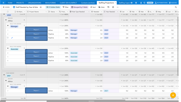
What I want to translate from google sheet to Airtable has to do with projecting staffing needs. I have a list of projects that I will need to forecast the number of managers and associates needed for each project by month and year.
Each project has a different status “active or pipeline” and probability %. Depending on 1) status and 2) probability, I want to sum the number of total staff needed by month.
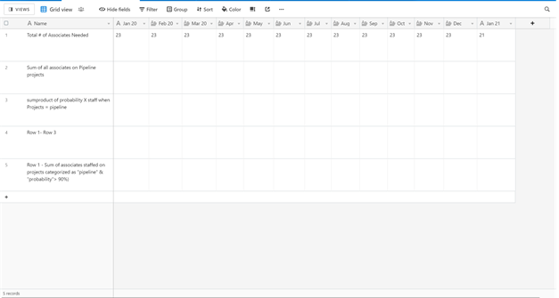
So the output table would show the months in the columns and in the rows I would like to include the following for managers and associates (separately):
Row 1: Total number of associate (manual input)
Row 2: Sum all associates staffed on projects categorized as “pipeline”
Row 3: Sumproduct of Probability x associates needed for projects categorized as “pipeline”
Row 4: Row 1 - Row 3
Row 5: Row 1 - Sum of associates staffed on projects categorized as “pipeline” & “probability”> 90%)
Projects table:
Output table:
- Mark as New
- Bookmark
- Subscribe
- Subscribe to RSS Feed
- Permalink
- Report Inappropriate Content
Aug 14, 2020 06:56 AM
any suggestions @Justin_Barrett?
- Mark as New
- Bookmark
- Subscribe
- Subscribe to RSS Feed
- Permalink
- Report Inappropriate Content
Aug 14, 2020 12:06 PM
Sorry, this fell off my radar. I’ll try to dig into it later today.
- Mark as New
- Bookmark
- Subscribe
- Subscribe to RSS Feed
- Permalink
- Report Inappropriate Content
Aug 14, 2020 12:35 PM
Thanks, would appreciate it a lot!
- Mark as New
- Bookmark
- Subscribe
- Subscribe to RSS Feed
- Permalink
- Report Inappropriate Content
Aug 14, 2020 03:32 PM
My gut impression is that your second table (the one you marked as the “Output table”) should be flipped: put the months (e.g. Jan 20, Feb 20, etc.) as individual records, and the other items as formula fields (I can’t read what they are because the screenshot is so small; as a side note you can upload full size screenshots, and the forum software will auto-scale them to fit). That makes more sense based on the type of data you want to calculate.
- Mark as New
- Bookmark
- Subscribe
- Subscribe to RSS Feed
- Permalink
- Report Inappropriate Content
Aug 18, 2020 08:28 AM
Thanks @Justin_Barrett. I actually did flip it and get the results I wanted, but visually it’s not intuitive for the viewers and doing that makes the input process very clunky.
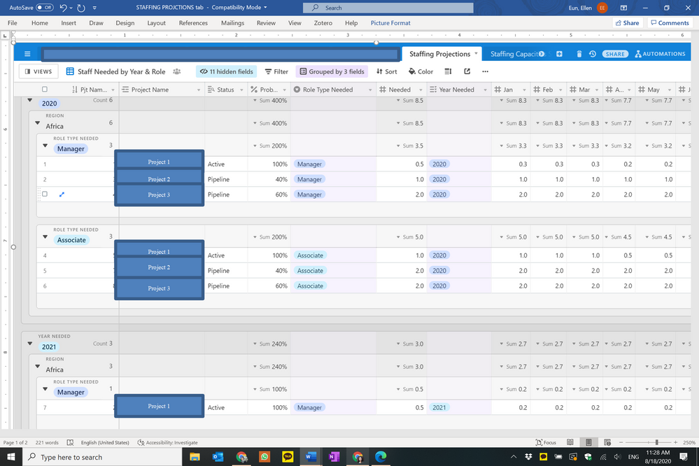
Is this screenshot better?
- Mark as New
- Bookmark
- Subscribe
- Subscribe to RSS Feed
- Permalink
- Report Inappropriate Content
Aug 18, 2020 09:29 AM
That’s a screenshot of your “Projects” table (based on how you’d labeled it above). In that table, things look fine because you’re tracking data at the project level. I was talking about flipping the axes on the one that you’d labeled your “Output” table, where you want to organize certain figures by month. In that context, having the months as records makes more sense from data organization perspective. While it may feel “clunky,” it’s how the data should be structured for the tool that you’re using.


