I SOLVED IT!!! Gah, I am so excited and a little proud of myself on this one! The idea hit me as I was falling asleep last night and I got up super early this morning because I had to test it out, and it works! Here's the solution I came up with:
Tables Needed:
- Pledges - This organization uses a system of pledges where a donor makes a commitment to donate
- Donations - These are the actual financial transactions for the donations
- Fundraising Goals - How much is trying to be raised
- Fundraising Progress - This is the key to solving my problem!
You start with a fundraising goal, say $1000 for a new piece of equipment. Set that up in the Fundraising Goals table, which includes a lookup to the pledge amounts (I'm considering adding a lookup to the Donations to be able to calculate the amount received monthly regardless of whether there is an associated pledge). Then assign all associated pledges and incoming donations are linked to that goal.
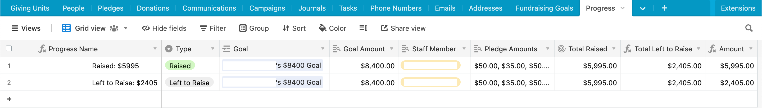
Then in the Fundraising Progress table, there are two records for every goal that MUST exist: Raised and Left to Raise, each of which is linked to a particular goal. The table has lookup fields for Goal Amount, Pledge Amounts (passed from Pledge table to Goal table to Progress table), and one rollup field for Total Pledge Amount. Then I created a field called "Total Left to Raise" and made a simple formula to subtract Goal - Total Raised. Now, at this point I've got two separate fields and two separate records - to make the Interface chart work, I need a single field where the Raised record has its associated value and the Left to Raise record has its associated value. To accomplish this, I did a final field with a formula that basically says, if the Type field is "Raised", choose the Total Raised field, otherwise choose the Total Left to Raise.
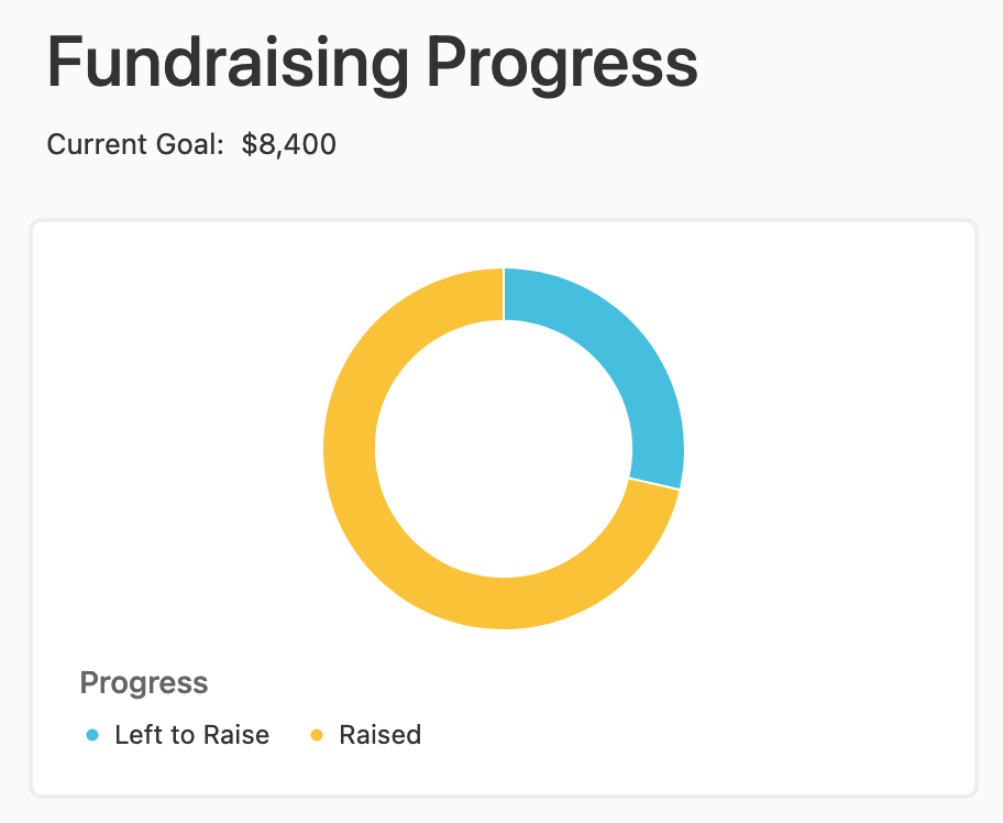
All that was left was to adjust the Interface chart and point it at the new table and fields and it works like a breeze!!! I am so excited! AND, I'm almost certain that with this new structure, I could use one base to track the progress of multiple staff members - that could be a very useful feature!!!
Here's a screenshot of my final setup (minus sensitive data) and the resulting Interface chart: