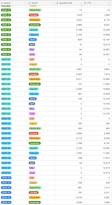
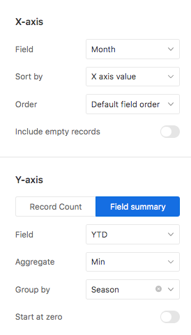
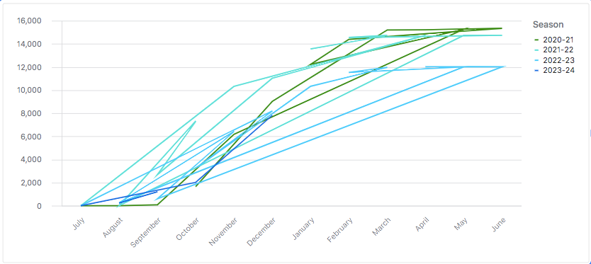
Hello! I am trying to use the line chart in interface designer to show multiple lines with YTD data across multiple seasons. I've used the "Group By Season" selection. The inputted YTD numbers steadily increase month by month across the x-axis monthly timeline, but the lines displayed in the chart look like scribbles. Can anyone help me understand why? See three photos attache of data, the chart, and my chart settings.


