Hi everybody!
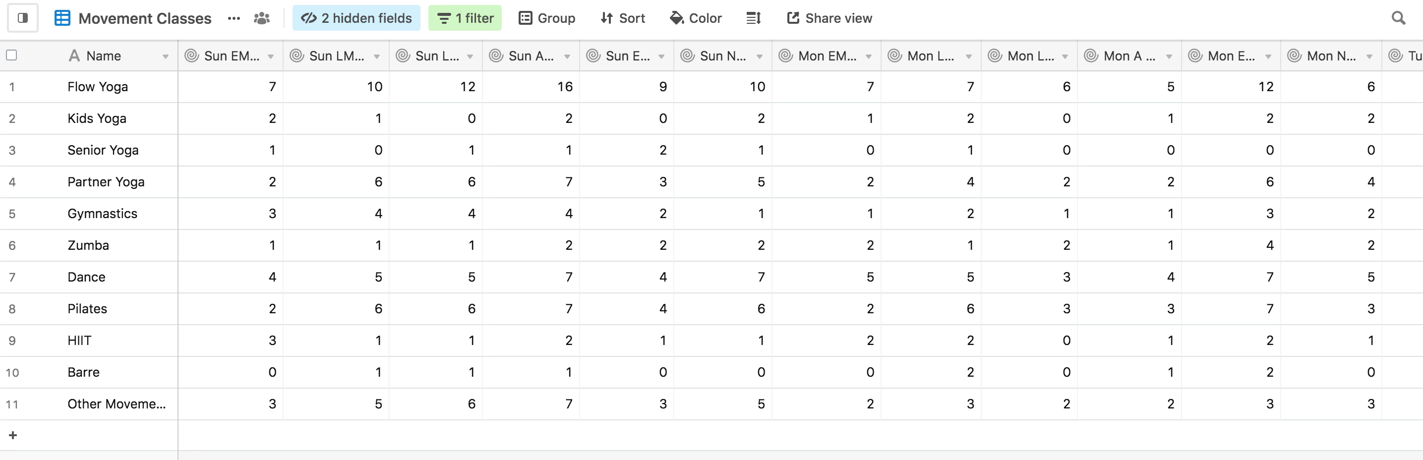
I am trying to visualize/compare the number of people interested in each type of movement class on different days and times, so I want to make a bar chart of the information within each Class Type record. For instance, I would like to get a bar chart comparing all of Flow Yoga’s field values in the first row of my table (see screenshot below).
This is very simple to do with something like Google Sheets, but I can’t seem to find a way to do it with the Chart App. Am I missing something?
Thanks so much!
-Allie