
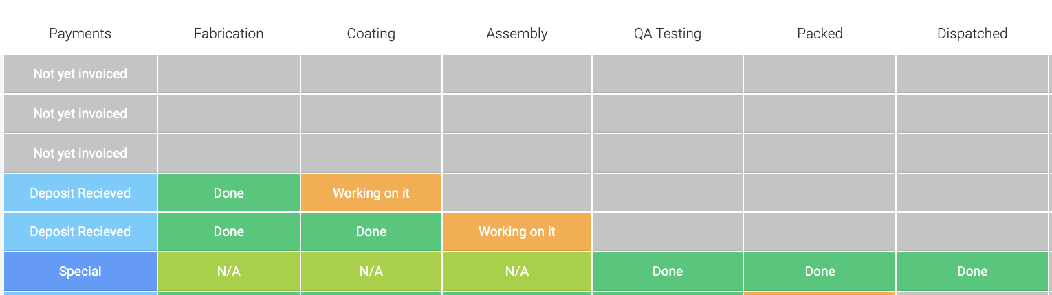
Hi team, long time Monday.com user, trying to move my company across to Airtable. One thing my team is pushing back on is the “look” of the status columns.
Here is an image of what my guys are used to seeing on Monday:
And then here is the corresponding data in Airtable
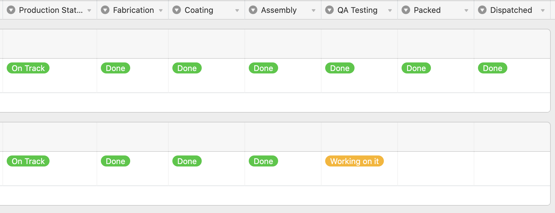
Is there a data type that looks similar to the Monday version? Alternatively, any browser tricks etc that I could use to make the data blocks bigger/more colourful? Custom CSS tool etc
Thanks
Andrew


