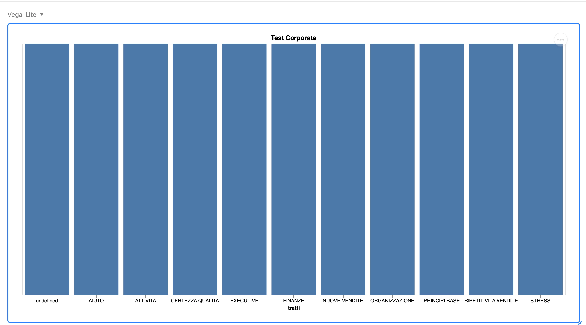
Hi all, we’re trying to create a bar chart using Vega-Lite app.
This is where we at right now:
{
“$schema”: “https://vega.github.io/schema/vega-lite/v4.json”,
“title”: “Test Corporate”,
“width”: “container”,
“height”: “container”,
“data”: {
“values”: [
{
“tratti”: “EXECUTIVE”,
“field”: “EXECUTIVE”,
“type”: “nominal”
},
{
“tratti”: “ORGANIZZAZIONE”,
“field”: “ORGANIZZAZIONE”,
“type”: “nominal”
},
{
“tratti”: “RIPETITIVITA VENDITE”,
“field”: “RIPETITIVITA VENDITE”,
“type”: “nominal”
},
{
“tratti”: “FINANZE”,
“field”: “FINANZE”,
“type”: “nominal”
},
{
“tratti”: “ATTIVITA”,
“field”: “ATTIVITA”,
“type”: “nominal”
},
{
“tratti”: “CERTEZZA QUALITA”,
“field”: “CERTEZZA QUALITA”,
“type”: “nominal”
},
{
“tratti”: “NUOVE VENDITE”,
“field”: “NUOVE VENDITE”,
“type”: “nominal”
},
{
“tratti”: “STRESS”,
“field”: “STRESS”,
“type”: “nominal”
},
{
“tratti”: “PRINCIPI BASE”,
“field”: “PRINCIPI BASE”,
“type”: “nominal”
},
{
“tratti”: “AIUTO”,
“field”: “AIUTO”,
“type”: “nominal”
}
]
},
“mark”: “bar”,
“encoding”: {
“x”: {
“field”: “tratti”,
“type”: “nominal”,
“axis”: {
“labelAngle”: 0
}
},
“y”: {
“aggregate”: “values”,
“type”: “quantitative”
}
}
}
But the result is not what we want since the chart shows every bar with the same value, as seen below.

This is the base we’re using with the data to create the chart.

Something in the instruction above has to be wrong, but we can’t figure out what and how. Can anybody help us?
We would also like to aggregate the chart at the “ID_Test” field, is it doable?
Thanks everybody.


