Help

Using the chart block to produce a "totaliser" like display for funding progress

Topic Labels: Extensions
3450 3
cancel
Showing results for 
Search instead for 
Did you mean: 
Simon_Borkin
4 - Data Explorer
4 - Data Explorer

I am exploring using Airtable as the underlying database for a funding campaign we are launching. We have a fundraising target and then the individual donations are being logged in Airtable. I am just unclear as to how I would use the Chart block to show progress against the target. I know I can easily sum the donations that are being recorded in a field in my table - but is there anyway to use this data in a chart block to visually show the progress of this donation running total against a target amount?

3 Replies 3
Pamela_Giles
5 - Automation Enthusiast

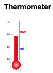
There’s no “big thermometer” if that’s what you were hoping for.
However, you could achieve the same thing in one of two ways:

  1. Use a pie chart, with “amount raised” in one colour and “amount yet to be raised” in another. You would have a formula (goal - amount raised) to calculate automatically the “amount yet to be raised.” You could also segment the “amount raised” by funds, or groups of people, or another divider if you wished. [A bar graph showing “amount raised” in one colour and “goal” beside it in another colour would achieve the same effect.]
  2. Use a line graph, with dates along the bottom and the line representing the cumulative total raised. You could play around with “group by” and “stack” if you wanted to show individual funds/groups within that.

The second option wouldn’t show as well progress towards the goal. However, as a professional fundraiser, I would sometimes recommend a graph that shows progress over time, which the pie chart (or the big thermometer) does not. It wouldn’t be effective if your fundraising mostly happened at the beginning of the campaign and has been crawling along since; for that, the pie chart would work better. But hopefully, the total has been steadily rising, the excitement building, and the line would show that.

Excel can do fancier charts. For your annual report or whatever, you probably want to export and do something in Excel. But the charts in AirTable are great for quickly whipping together visual results that automatically update.

But… Airtable Blocks do support web page embeds and a simple web app using the Airtable API plus a free javascript library could be used to craft something like this.

image
This, of course, is not an easy or simple approach, but it would provide an integrated block with the desired data visual.

Thanks Bill - I agree this is not immediately straightforward but good to know it’s possible!